Concept & direction
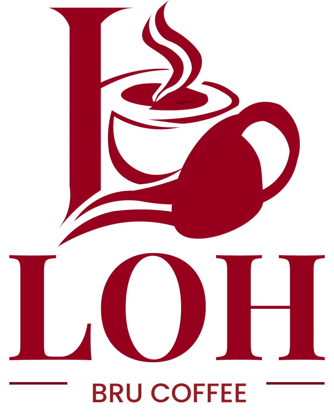
The design integrates a coffee cup and steam into the letter 'L', visually tying the brand to the coffee industry and emphasizing a classic, welcoming café mood.
An effective, highly legible logo with cafe-appropriate imagery that could benefit from balancing refinements and differentiation to increase distinctiveness.
This logo lockup has a workable foundation; improving visual balance is the clearest next step.
Focus on the changes that matter. Keep what makes the logo work.
The design integrates a coffee cup and steam into the letter 'L', visually tying the brand to the coffee industry and emphasizing a classic, welcoming café mood.
Logo preview unavailable. The written feedback is still available on this card.
upper coffee cup mark and wordmark alignment
The coffee cup illustration formed by the 'L' leans heavily to the right above the 'O', creating an uneven visual weight across the logo.
See the category reviewThe logo clearly expresses a coffee/cafe mood through its classic cup and steam illustration integrated with the letter 'L'; however, the concept is common, limiting its unique brand impact.
Wordmark 5/5 · Layout 4/5
Symbol 4/5 · Wordmark 4/5 · Layout 4/5
Symbol 3/5 · Wordmark 3/5
A coffee cup with steam is a very familiar and widely used motif in the cafe industry, so this concept risks blending in with competitors.
Symbol 3/5 · Wordmark 3/5 · Layout 3/5
The coffee cup illustration formed by the 'L' leans heavily to the right above the 'O', creating an uneven visual weight across the logo.
Try: Refine the coffee cup/steam mark to more evenly center or balance it with the underlying wordmark.
Logo preview unavailable. The written feedback is still available on this card.

Inspect spacing with the guide. Optical balance may differ from geometric centering.
The decorative swashes from the 'L' integrate the cup and also overlap toward the 'O', but the solid mark above and the bold serif font below show some difference in style and density.
Get a clear logo score, key risks, and priority fix ideas before your client or audience sees it.
More credits needed
Add credits to continue without losing your work.
Then $7/month. Cancel anytime.
Essential logo review with AI
Estimated progress