View review
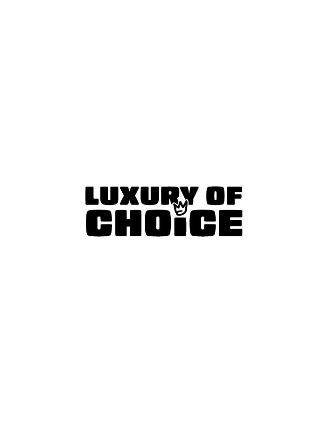
Logo review ofLuxury Of Choice
Review the detailed scores below to see what is working and what should be refined first.
Logo performance breakdown
Legibility
Text is highly readable due to strong contrast and bold font.
Font choice ensures visual impact and easy recognition.
Crowded letter spacing in 'LUXURY OF' could slightly hinder immediate reading.
Crown symbol slightly overlaps 'I', which could impact legibility at very small sizes.

Originality
Integrated symbol (crown with āIā) adds conceptual uniqueness.
Crown is a common symbol in luxury branding, lacking deeper creative twist.
Typography style is generic and widely used in bold branding.
Color harmony
Monochromatic palette is straightforward, timeless, and versatile.
High contrast aids visual clarity.
Black
#000000
White
#FFFFFF
Balance alignment
Good top-to-bottom stacking of words with matching width.
Crown disrupts the otherwise even horizontal alignment.
'LUXURY OF' line feels narrower and less visually weighted compared to 'CHOICE', causing a top-heavy imbalance.
Scalability
Simple bold form allows for good reproduction across print and digital formats.
Strong contrast works well on both light and dark backgrounds.
Crown detail above 'I' may be lost on very small applications such as embroidery or favicons.
200x250 px
100Ć125 px
50Ć62 px
Misinterpretations
No inappropriate or confusing forms detected in the overall composition.
Wondering how your logo performs?
Get a clear logo score, key risks, and priority fix ideas before your client or audience sees it.