Wondering how your logo performs? 🧐
Get professional logo reviews in seconds and catch design issues in time.
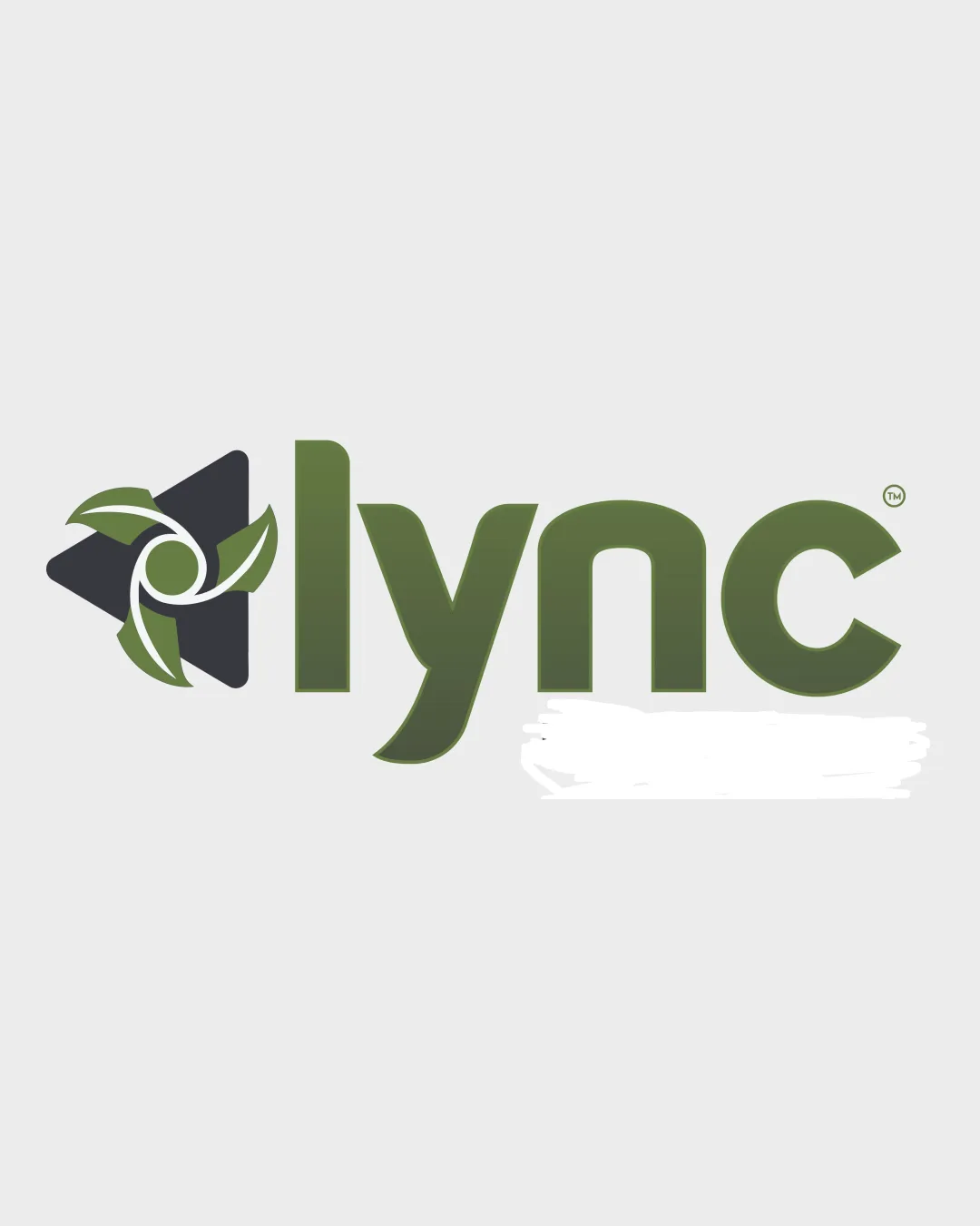
Try it Now!Logo review of lync
 Logo analysis by AI
Logo type:
Style:
Detected symbol:
Negative space:
Detected text:
Business industry:
Review requested by Helios0121
**If AI can recognize or misinterpret it, so can people.
Structured logo review
Legibility
![]() Text is clear and simple, set in a bold sans-serif typeface.
Text is clear and simple, set in a bold sans-serif typeface.![]() Letter spacing and proportions support readability.
Letter spacing and proportions support readability.
![]() The lowercase 'y' has a custom flourish that may slightly impact immediate recognition; slight gradient may also affect clarity at small sizes.
The lowercase 'y' has a custom flourish that may slightly impact immediate recognition; slight gradient may also affect clarity at small sizes.
Scalability versatility
![]() Mark is bold and distinctive, likely to hold up well on signage and digital applications.
Mark is bold and distinctive, likely to hold up well on signage and digital applications.![]() Simple color palette aids reproduction in various settings.
Simple color palette aids reproduction in various settings.
![]() Thin leaf details and inner swirl in the logomark may be lost in very small formats (e.g. business cards, embroidery).
Thin leaf details and inner swirl in the logomark may be lost in very small formats (e.g. business cards, embroidery).![]() Gradient and detail will not display well in monochrome or tiny icons; favicon usage will require simplification.
Gradient and detail will not display well in monochrome or tiny icons; favicon usage will require simplification.
200x250 px
100×125 px
50×62 px
Balance alignment
![]() Logomark and wordmark are well aligned vertically on the baseline.
Logomark and wordmark are well aligned vertically on the baseline.![]() Both elements have similar visual weight, preventing either from overpowering the other.
Both elements have similar visual weight, preventing either from overpowering the other.
![]() Negative space inside the mark may feel slightly off-balance due to leaf placements; mark may attract more attention than wordmark, subtly competing for hierarchy.
Negative space inside the mark may feel slightly off-balance due to leaf placements; mark may attract more attention than wordmark, subtly competing for hierarchy.![]() The transition between the round, organic mark and the geometric wordmark feels abrupt.
The transition between the round, organic mark and the geometric wordmark feels abrupt.

Originality
![]() Combination of a star/propeller with leaf motifs is less common, creating modest distinction.
Combination of a star/propeller with leaf motifs is less common, creating modest distinction.![]() Circular swirl at center adds unique visual movement.
Circular swirl at center adds unique visual movement.
![]() Leaf/green energy motifs are heavily overused in technology and environmental branding, risking generic perception.
Leaf/green energy motifs are heavily overused in technology and environmental branding, risking generic perception.![]() No strong, proprietary concept differentiating it from other eco-tech marks.
No strong, proprietary concept differentiating it from other eco-tech marks.
Logomark wordmark fit
![]() Both components use similar color themes for cohesion.
Both components use similar color themes for cohesion.
![]() The mark’s organic, flowing lines slightly clash with the straight, geometric wordmark. The logo as a whole doesn’t synergize as well as it could with more integrated design elements.
The mark’s organic, flowing lines slightly clash with the straight, geometric wordmark. The logo as a whole doesn’t synergize as well as it could with more integrated design elements.
Aesthetic look
![]() Clean and modern look, visually appealing to contemporary tastes.
Clean and modern look, visually appealing to contemporary tastes.![]() Good integration of eco and tech cues.
Good integration of eco and tech cues.
![]() Busy central mark with overlapping motives may appear cluttered at first glance.
Busy central mark with overlapping motives may appear cluttered at first glance.![]() Gradient effect feels slightly dated in modern flat-logo contexts.
Gradient effect feels slightly dated in modern flat-logo contexts.![]() Logo leans toward generic due to common motif choices.
Logo leans toward generic due to common motif choices.
Dual meaning and misinterpretations
![]() No inappropriate elements or unintended suggestive forms; clear, professional symbol.
No inappropriate elements or unintended suggestive forms; clear, professional symbol.
Color harmony
![]() Muted olive and dark grey colors complement each other, reinforcing an eco-tech feel.
Muted olive and dark grey colors complement each other, reinforcing an eco-tech feel.![]() Good contrast on a light background, modern palette.
Good contrast on a light background, modern palette.
![]() Slight gradient on wordmark may hinder consistent appearance in all media.
Slight gradient on wordmark may hinder consistent appearance in all media.![]() Very low overall vibrancy; might lack energy or visual punch for certain industries.
Very low overall vibrancy; might lack energy or visual punch for certain industries.
Olive
#6A7B4A
Gunmetal
#2E2F32
Whisper
#F3F3F3