 View review
Logo score
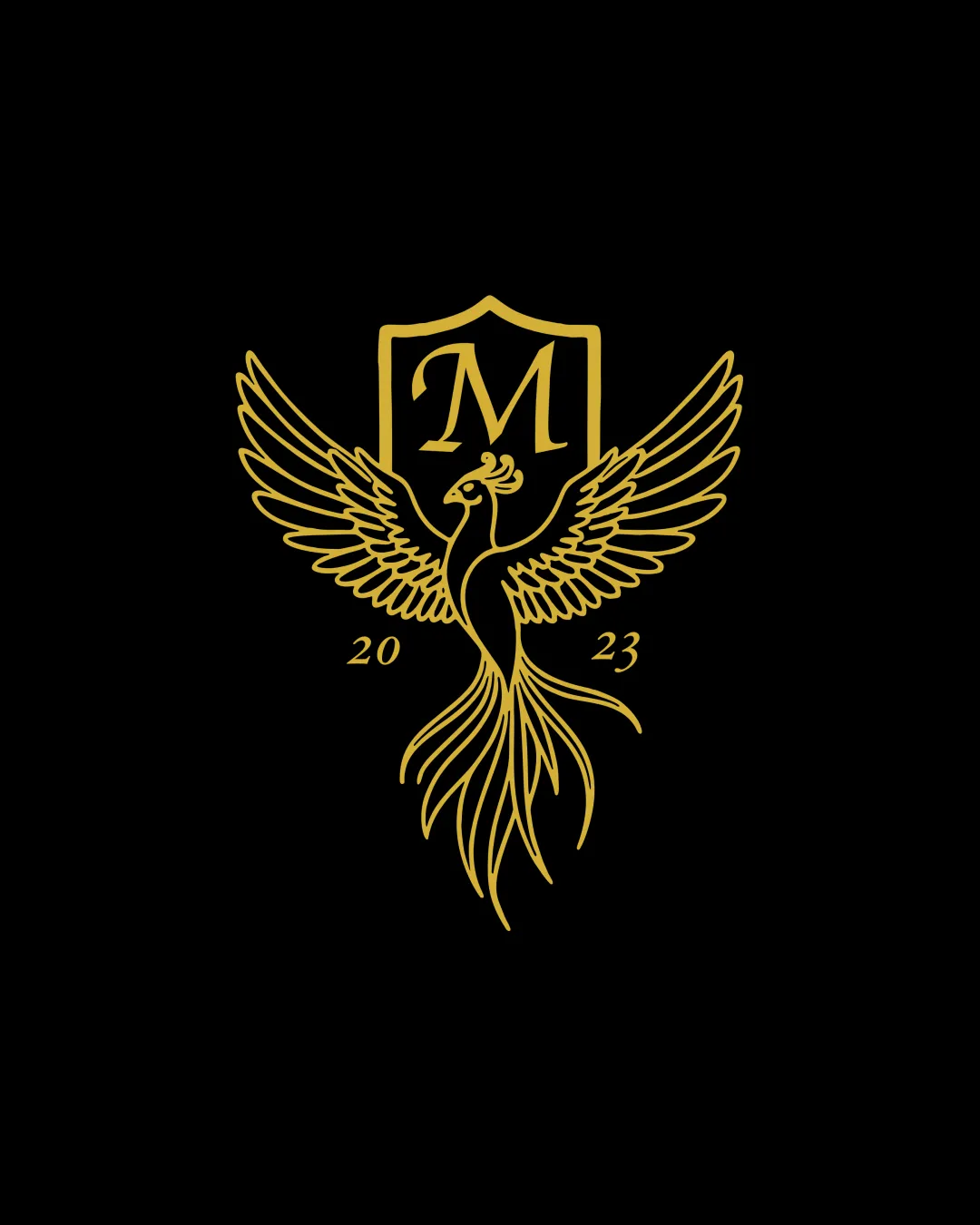
Logo review ofM, 2023
Review the detailed scores below to see what is working and what should be refined first.
Legibility
Originality
Misread
Balance
Scale
Detailed review
Logo performance breakdown
Legibility
![]() Letter M is prominently displayed and highly readable.
Letter M is prominently displayed and highly readable.![]() Year '2023' is legible and well spaced.
Year '2023' is legible and well spaced.
Originality
![]() Phoenix/bird theme with shield adds a unique touch of heritage and luxury.
Phoenix/bird theme with shield adds a unique touch of heritage and luxury.
![]() Use of phoenix/shield is a relatively common luxury or hospitality motif.
Use of phoenix/shield is a relatively common luxury or hospitality motif.![]() Letter-in-shield execution is standard and lacks significant creative twist.
Letter-in-shield execution is standard and lacks significant creative twist.
Color harmony
![]() Sophisticated gold and black pairing is classic for luxury sectors.
Sophisticated gold and black pairing is classic for luxury sectors.![]() Monochrome approach aids in maintaining a unified aesthetic.
Monochrome approach aids in maintaining a unified aesthetic.
Gold
#FFD700
Black
#000000
Balance alignment
![]() Symmetrical bird and central shield ensure good vertical balance.
Symmetrical bird and central shield ensure good vertical balance.![]() Wingspan is evenly distributed.
Wingspan is evenly distributed.
![]() Text '2023' feels slightly disconnected from the main shield and bird form, breaking some visual cohesion.
Text '2023' feels slightly disconnected from the main shield and bird form, breaking some visual cohesion.

Scalability
![]() Line art style can work well in large formats such as signage or luxury branding.
Line art style can work well in large formats such as signage or luxury branding.
![]() Highly detailed bird illustration will lose clarity at small sizes like business cards or favicons.
Highly detailed bird illustration will lose clarity at small sizes like business cards or favicons.![]() Thin lines may disappear in embroidery or small print applications.
Thin lines may disappear in embroidery or small print applications.
200x250 px
100×125 px
50×62 px
Misinterpretations
![]() No unintended inappropriate imagery detected.
No unintended inappropriate imagery detected.![]() Symbolism of phoenix conveys positive rebirth/renewal.
Symbolism of phoenix conveys positive rebirth/renewal.
Symbol & text fit
![]() Shield, phoenix, and letter 'M' all tie together well for a unified vintage look.
Shield, phoenix, and letter 'M' all tie together well for a unified vintage look.
![]() Serif M complements the traditional aesthetic.
Serif M complements the traditional aesthetic.
![]() Year '2023' feels stylistically less integrated compared to the main symbol and wordmark.
Year '2023' feels stylistically less integrated compared to the main symbol and wordmark.
Try your own review
Review my logo
Wondering how your logo performs?
Get a clear logo score, key risks, and priority fix ideas before your client or audience sees it.
Keep exploring


