Wondering how your logo performs? 🧐
Get professional logo reviews in seconds and catch design issues in time.
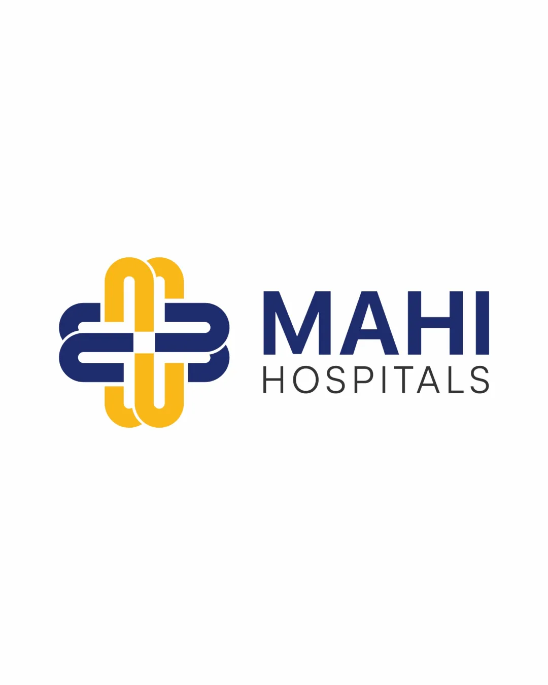
Try it Now!Logo review of MAHI HOSPITALS
 Logo analysis by AI
Logo type:
Style:
Detected symbol:
Negative space:
Detected text:
Business industry:
Review requested by Supertop
**If AI can recognize or misinterpret it, so can people.
Structured logo review
Legibility
![]() Text is very clear and easy to read
Text is very clear and easy to read![]() Typography choice complements the healthcare field and matches the symbol's modernity
Typography choice complements the healthcare field and matches the symbol's modernity
Scalability versatility
![]() Symbol and text maintain clarity at most sizes
Symbol and text maintain clarity at most sizes![]() Works well for hospital signage, letterheads, packaging, web and mobile icons
Works well for hospital signage, letterheads, packaging, web and mobile icons
![]() Complex interwoven details may lose clarity on very small applications (e.g., favicon, embroidery)
Complex interwoven details may lose clarity on very small applications (e.g., favicon, embroidery)
200x250 px
100×125 px
50×62 px
Balance alignment
![]() Good alignment between logomark and wordmark
Good alignment between logomark and wordmark![]() Visual weight of symbol and text are well balanced
Visual weight of symbol and text are well balanced
![]() Slight optical imbalance due to the heavy rounded corners of the symbol may compete with the thin word 'HOSPITALS'
Slight optical imbalance due to the heavy rounded corners of the symbol may compete with the thin word 'HOSPITALS'

Originality
![]() Interwoven band treatment adds uniqueness to an otherwise common medical cross
Interwoven band treatment adds uniqueness to an otherwise common medical cross![]() Positive impression of care and connectivity
Positive impression of care and connectivity
![]() Base cross form is a very frequent trope in healthcare logos
Base cross form is a very frequent trope in healthcare logos![]() Some aspects may still feel generic despite the custom weaving effect
Some aspects may still feel generic despite the custom weaving effect
Logomark wordmark fit
![]() Logomark and wordmark style are well matched
Logomark and wordmark style are well matched![]() Both use modern, geometric forms for cohesive brand perception
Both use modern, geometric forms for cohesive brand perception
Aesthetic look
![]() Clean, modern, and visually pleasing
Clean, modern, and visually pleasing![]() Choice of colors and typefaces contribute to a trustworthy image
Choice of colors and typefaces contribute to a trustworthy image
Dual meaning and misinterpretations
![]() No inappropriate or confusing visual references detected
No inappropriate or confusing visual references detected
Color harmony
![]() Colors are harmonious and professional
Colors are harmonious and professional![]() Strong contrast between yellow and blue ensures clear visibility against white background
Strong contrast between yellow and blue ensures clear visibility against white background
Prussian Blue
#183068
Maize
#F5C242
White
#FFFFFF


