View review
Logo score
Logo review of
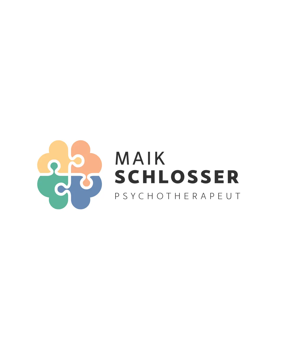
Maik Schlosser Psychotherapeut
Review the detailed scores below to see what is working and what should be refined first.
Objective AI feedback. Your creative decision.
Legibility
Originality
Misread
Balance
Scale
Detailed review
Logo performance breakdown
Legibility
 All text is clear, easy to read, and well-spaced Good distinction in hierarchy between name, surname, and title
Originality
Clever use of puzzle pieces to visually suggest mental health and problem-solving Gentle color palette adds a welcoming tone
 Puzzle-brain concept is somewhat overused in the mental health sector Shape and execution are clean but not highly distinctive versus competitors
Color harmony
Colors are well-selected, soft, and harmonize together for a non-threatening effect
Four colors may add complexity for certain print methods and low-budget branding
apricot
#F9D59D
peach
#FAA491
green
#67AF92
blue
#7B99C2
graphite
#292929
Your palette is close. Refine the color roles and combinations before updating the logo.
Build brand colorsBalance alignment
Logo symbol and text are visually balanced in horizontal alignment Negative space is well-distributed and cohesive

Scalability
Main symbol retains clarity at medium and larger sizes (social media, signage, print documents) Sans-serif typography scales well and remains legible
Fine lines between puzzle pieces could become faint or disappear in very small applications (favicons, embroidery) Multi-color palette may be less effective in single-color use
200x250 px
100×125 px
50×62 px
Misinterpretations
No inappropriate or ambiguous shapes detected; symbolism is relevant and positive
Symbol & text fit
Styles complement each other: modern symbol matches modern font
Proportion of mark to text is visually pleasing and professionally laid out
Try your own review
Review my logo
Wondering how your logo performs?
Get a clear logo score, key risks, and priority fix ideas before your client or audience sees it.
Keep exploring