 View review
Logo score
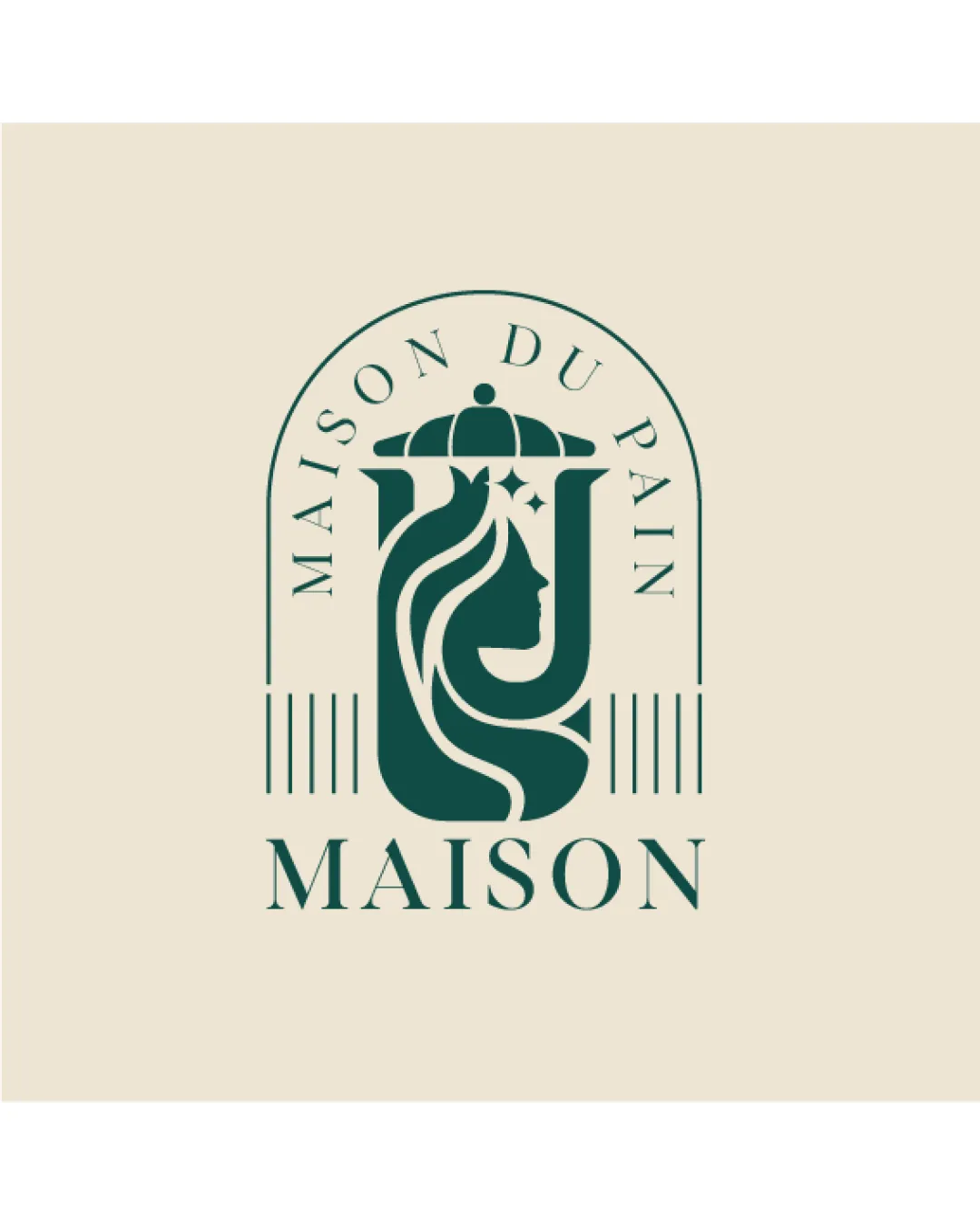
Logo review ofMaison Du Pain, Maison
Review the detailed scores below to see what is working and what should be refined first.
Legibility
Originality
Misread
Balance
Scale
Detailed review
Logo performance breakdown
Legibility
![]() Primary wordmark and tagline are highly readable due to clear serif typography.
Primary wordmark and tagline are highly readable due to clear serif typography.![]() Letter spacing and proportion enhance clarity and sophistication.
Letter spacing and proportion enhance clarity and sophistication.
![]() Du Pain text in the arch might be less readable at smaller sizes due to curve distortion and finer weighting.
Du Pain text in the arch might be less readable at smaller sizes due to curve distortion and finer weighting.
Originality
![]() Creative use of female profile, chef's hat, and sparkles in a cohesive, unified symbol.
Creative use of female profile, chef's hat, and sparkles in a cohesive, unified symbol.![]() Customized and stylized approach feels bespoke to the bakery sector.
Customized and stylized approach feels bespoke to the bakery sector.
![]() Elements like chef hats and female profiles are common bakery motifs, slightly diminishing uniqueness.
Elements like chef hats and female profiles are common bakery motifs, slightly diminishing uniqueness.
Color harmony
![]() Dark green contrasts nicely with beige, suggesting quality and elegance.
Dark green contrasts nicely with beige, suggesting quality and elegance.![]() Restrained palette aids brand recognition and premium association.
Restrained palette aids brand recognition and premium association.
Dark Green
#234D3C
Beige
#EAE3D5
Balance alignment
![]() Composition within the arch shape achieves strong balance.
Composition within the arch shape achieves strong balance.![]() Wordmark and logomark are well-aligned, and visual elements are harmoniously distributed.
Wordmark and logomark are well-aligned, and visual elements are harmoniously distributed.

Scalability
![]() Simple color palette aids print and reproduction in different formats.
Simple color palette aids print and reproduction in different formats.![]() No excessive gradient or texture makes the mark easier to reproduce.
No excessive gradient or texture makes the mark easier to reproduce.
![]() Illustrative details in the profile and chef hat might lose clarity at very small sizes, such as business cards or favicon.
Illustrative details in the profile and chef hat might lose clarity at very small sizes, such as business cards or favicon.![]() Complex mark may not render well on embroidery or small-scale packaging; monogram version could be necessary.
Complex mark may not render well on embroidery or small-scale packaging; monogram version could be necessary.
200x250 px
100×125 px
50×62 px
Misinterpretations
![]() Logo avoids inappropriate or accidental imagery; profile, hat, and stars are clearly rendered.
Logo avoids inappropriate or accidental imagery; profile, hat, and stars are clearly rendered.
Symbol & text fit
![]() The logomark's elegant and refined stroke weighting matches the classic typography of the wordmark.
The logomark's elegant and refined stroke weighting matches the classic typography of the wordmark.
![]() Visual flow between mark and text feels intentionally coordinated.
Visual flow between mark and text feels intentionally coordinated.
Try your own review
Review my logo
Wondering how your logo performs?
Get a clear logo score, key risks, and priority fix ideas before your client or audience sees it.
Keep exploring


