 View review
Logo score
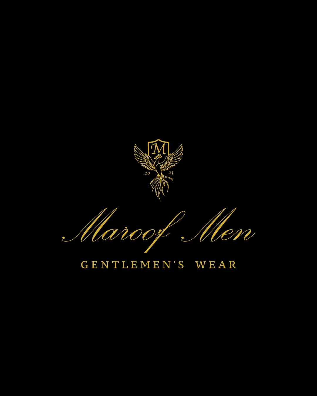
Logo review ofMaroof Men, Gentlemen's Wear
Review the detailed scores below to see what is working and what should be refined first.
Legibility
Originality
Misread
Balance
Scale
Detailed review
Logo performance breakdown
Legibility
![]() Main brand name is in an elegant and readable script font.
Main brand name is in an elegant and readable script font.![]() Secondary tagline is clear and easy to read in uppercase serif.
Secondary tagline is clear and easy to read in uppercase serif.
![]() The ornate script of 'Maroof Men' may pose minor readability issues at small sizes or from a distance.
The ornate script of 'Maroof Men' may pose minor readability issues at small sizes or from a distance.![]() Year '2023' and the 'M' inside the shield could become difficult to discern at reduced scales.
Year '2023' and the 'M' inside the shield could become difficult to discern at reduced scales.
Originality
![]() Phoenix-and-shield motif adds a custom touch fit for premium menswear.
Phoenix-and-shield motif adds a custom touch fit for premium menswear.
![]() The phoenix and shield combo is a common luxury motif and does not break substantial new ground.
The phoenix and shield combo is a common luxury motif and does not break substantial new ground.![]() No overtly unique twist on traditional elements.
No overtly unique twist on traditional elements.
Color harmony
![]() Elegant gold and black create a classy, high-contrast, harmonious palette.
Elegant gold and black create a classy, high-contrast, harmonious palette.![]() Appropriate for formal fashion branding.
Appropriate for formal fashion branding.
Gold
#CBA945
Black
#000000
Balance alignment
![]() Strong vertical alignment between logomark and wordmark.
Strong vertical alignment between logomark and wordmark.![]() Text and symbol are proportionally well-balanced.
Text and symbol are proportionally well-balanced.![]() Elegant spacing enhances a premium look.
Elegant spacing enhances a premium look.

Scalability
![]() Logo looks striking and upscale in large formats, appropriate for storefronts, formal invitations, and digital banners.
Logo looks striking and upscale in large formats, appropriate for storefronts, formal invitations, and digital banners.
![]() The detailed phoenix illustration and fine lines may lose clarity when reduced for business cards, mobile favicons, or embroidery.
The detailed phoenix illustration and fine lines may lose clarity when reduced for business cards, mobile favicons, or embroidery.![]() Complexity of logomark makes single-color reproduction more difficult.
Complexity of logomark makes single-color reproduction more difficult.
200x250 px
100×125 px
50×62 px
Misinterpretations
![]() No inappropriate or confusing alternate imagery detected.
No inappropriate or confusing alternate imagery detected.
Symbol & text fit
![]() Both logomark and typefaces share a cohesive luxury theme.
Both logomark and typefaces share a cohesive luxury theme.
![]() Proportions and visual hierarchy are unified.
Proportions and visual hierarchy are unified.
Try your own review
Review my logo
Wondering how your logo performs?
Get a clear logo score, key risks, and priority fix ideas before your client or audience sees it.
Keep exploring


