View review
Logo review ofMarrakech House Of Photography
Review the detailed scores below to see what is working and what should be refined first.
Logo performance breakdown
Legibility
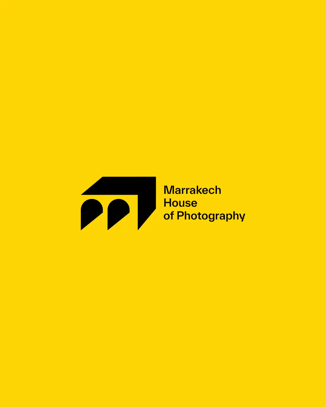
The text 'Marrakech House of Photography' is clear and easy to read.
Originality
The integration of architectural elements into a camera shape is unique.
The concept of using a camera shape is common but executed creatively here.
Color harmony
The bold color contrast is eye-catching and effective.
The bright yellow may be visually overwhelming for some applications.
Your palette is close. Explore sharper color combinations with Colorfly.design before updating the logo.
Explore palettesBalance alignment
The logo is well-balanced with the text and symbol aligned effectively.
Scalability
The logo's simplicity makes it versatile across different sizes.
Complex architectural symbol details might be lost at very small sizes.
200x250 px
100×125 px
50×62 px
Wondering how your logo performs?
Get a clear logo score, key risks, and priority fix ideas before your client or audience sees it.