What to preserve
The logo visually connects the Mauritian identity with marketplace/search functionality, using national colors and map symbolism effectively.
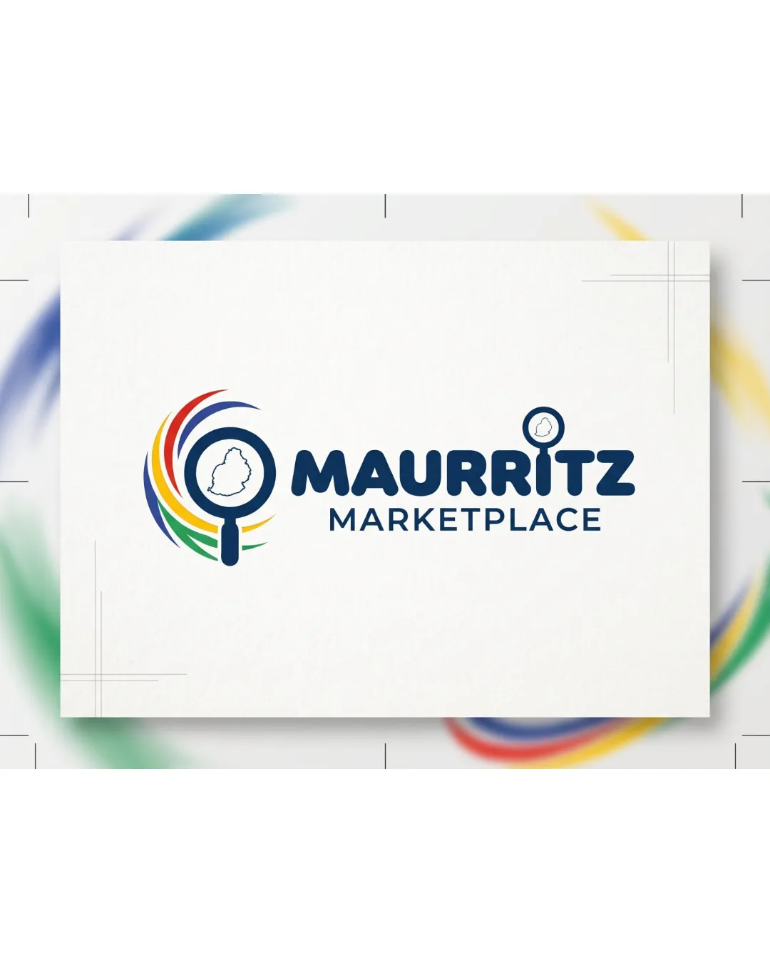
Strong, relevant, and impactful brand identity for a Mauritian marketplace, with a clear regional tie and effective symbolism. Minor adjustments could further strengthen visual cohesion.
This logo lockup shows solid execution, supported by text readability and clarity at smaller sizes; improving visual balance is the clearest next step.
Focus on the changes that matter. Keep what makes the logo work.
The logo visually connects the Mauritian identity with marketplace/search functionality, using national colors and map symbolism effectively.
lockup
The standalone mark is visually heavier and more vibrant than the reserved wordmark, creating a slight imbalance when used together.
Balance the visual weight and color usage between the mark and wordmark for improved harmony.
Logo delivers a compelling Mauritian marketplace concept by fusing national colors and local map themes with a marketplace/search motif, precisely fulfilling the brief.
Wordmark 5/5 · Layout 4/5
Symbol 4/5 · Wordmark 4/5
Estimated colors. Use the original design file for exact values.
Create a full color palette using these colors
Create new paletteSymbol 4/5 · Wordmark 4/5 · Layout 4/5
Symbol 4/5 · Wordmark 3/5
Magnifying glass and national colors are commonly used for local search/marketplace brands; however, the swirling effect and island silhouette add differentiation.
Symbol 3/5 · Wordmark 4/5 · Layout 3/5
The handle of the magnifying glass appears slightly off-center relative to the circle, impacting geometric balance.

Inspect spacing with the guide. Optical balance may differ from geometric centering.
The standalone mark is visually heavier and more vibrant than the reserved wordmark, creating a slight imbalance when used together.
Try: Refine proportions or color emphasis between mark and wordmark for a more cohesive lockup presentation.
Check: Balance the visual weight and color usage between the mark and wordmark for improved harmony.
Get a clear logo score, key risks, and priority fix ideas before your client or audience sees it.
More credits needed
Add credits to continue without losing your work.
Then $7/month. Cancel anytime.
Essential logo review with AI
Estimated progress