 View review
Logo score
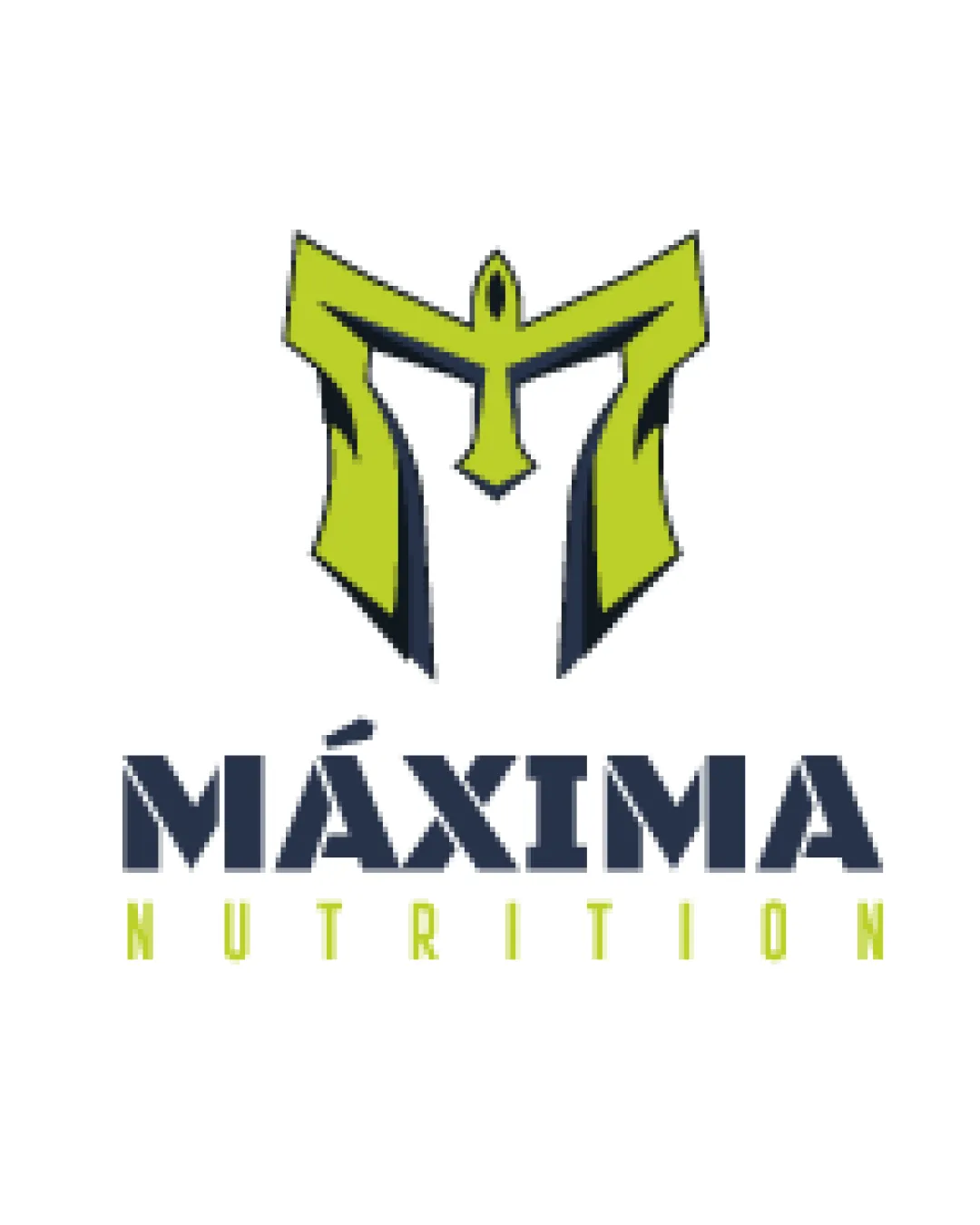
Logo review ofMáxima Nutrition
Review the detailed scores below to see what is working and what should be refined first.
Legibility
Originality
Misread
Balance
Scale
Detailed review
Logo performance breakdown
Legibility
![]() Main wordmark 'MÁXIMA' is highly readable with strong letterforms.
Main wordmark 'MÁXIMA' is highly readable with strong letterforms.![]() Supporting text 'NUTRITION' is clear and spaced for visibility.
Supporting text 'NUTRITION' is clear and spaced for visibility.
Originality
![]() Stylized 'M' as a helmet/armor integrates brand strength and industry relevance.
Stylized 'M' as a helmet/armor integrates brand strength and industry relevance.![]() Visual character stands out from basic text-only designs.
Visual character stands out from basic text-only designs.
![]() Warrior helmet concepts are somewhat common in sports/nutrition sectors, so it's not entirely unique.
Warrior helmet concepts are somewhat common in sports/nutrition sectors, so it's not entirely unique.![]() No highly creative twist or negative space innovation in the symbol.
No highly creative twist or negative space innovation in the symbol.
Color harmony
![]() Uses only two main colors with white background, ensuring a clean and harmonious appearance.
Uses only two main colors with white background, ensuring a clean and harmonious appearance.![]() Good contrast and industry-appropriate choices.
Good contrast and industry-appropriate choices.
Olive Green
#C6D01E
Gunmetal
#222B38
White
#FFFFFF
Balance alignment
![]() The logomark aligns centrally over the wordmark, creating a strong vertical axis.
The logomark aligns centrally over the wordmark, creating a strong vertical axis.![]() The weight of the symbol and bold wordmark feel visually matched.
The weight of the symbol and bold wordmark feel visually matched.
![]() 'NUTRITION' is much lighter and spaced out, making the lower area feel emptier compared to the top-heavy logomark.
'NUTRITION' is much lighter and spaced out, making the lower area feel emptier compared to the top-heavy logomark.

Scalability
![]() Bold, simple shapes enable clear scaling for larger applications like signage or apparel.
Bold, simple shapes enable clear scaling for larger applications like signage or apparel.![]() Strong contrast between symbol and background.
Strong contrast between symbol and background.
![]() Fine points and inner details in the helmet/‘M’ symbol could be lost in very small sizes (e.g., favicons or embroidery).
Fine points and inner details in the helmet/‘M’ symbol could be lost in very small sizes (e.g., favicons or embroidery).![]() 'NUTRITION' in thin font may fade or blur on small or textured outputs.
'NUTRITION' in thin font may fade or blur on small or textured outputs.
200x250 px
100×125 px
50×62 px
Misinterpretations
![]() No inappropriate or unintentional double meanings detected.
No inappropriate or unintentional double meanings detected.
Symbol & text fit
![]() Typeface choice in wordmark echoes the boldness of the logomark.
Typeface choice in wordmark echoes the boldness of the logomark.
![]() Color harmony between symbol and wordmark connects the two elements.
Color harmony between symbol and wordmark connects the two elements.
![]() Style of 'NUTRITION' is disproportionately minimal compared to the robust logomark and wordmark, slightly disrupting consistency.
Style of 'NUTRITION' is disproportionately minimal compared to the robust logomark and wordmark, slightly disrupting consistency.
Try your own review
Review my logo
Wondering how your logo performs?
Get a clear logo score, key risks, and priority fix ideas before your client or audience sees it.
Keep exploring


