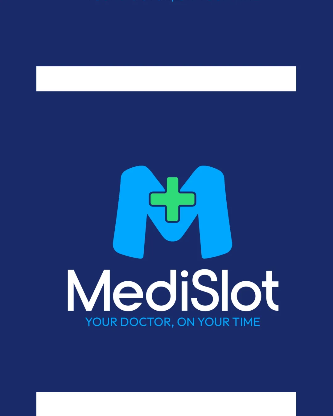
MediSlot, YOUR DOCTOR, ON YOUR TIME logo review
4.5 / 5
Logo score
Logo review of

Medislot, Your Doctor, On Your Time

Review the detailed scores below to see what is working and what should be refined first.

Combination Mark Modern, Minimalistic Healthcare
5/5
Legibility
3/5
Originality
5/5
Misread
5/5
Balance
4/5
Scale
Detailed review

Logo performance breakdown

5/5

Legibility

Checkmark icon Both primary and tagline text are clean, readable, and well contrasted against the background
Checkmark icon Font size choice is appropriate for various applications
3/5

Originality

Checkmark icon Letter M is stylized and paired with a medical cross, which connects directly to healthcare
Checkmark icon Color palette slightly differs from many generic medical logos by being brighter

Warning icon Use of M + cross is a common trope in health/medical brands and lacks significant uniqueness
Warning icon No clever or novel negative space or symbolism introduced

5/5

Color harmony

Checkmark icon Color choices work well in harmony and communicate healthcare effectively
Checkmark icon Good contrast between symbol elements and background

Chambray
#1A2B6D

Cyan
#19C1EB

Malachite
#43D86B

White
#FFFFFF

5/5

Balance alignment

Checkmark icon Solid alignment between symbol and wordmark
Checkmark icon Visual weight is evenly distributed
Checkmark icon Proximity of symbol and text maintains cohesion

logo 200x250 pixels scalability test alignment grid overlay
4/5

Scalability

Checkmark icon Bold lettermark and cross symbol retain visibility at smaller sizes
Checkmark icon Simple shapes will reproduce well for web and mobile icons
Checkmark icon Will work on merchandise, business cards, and larger signage

Warning icon Tagline may become illegible at very small scales (e.g., favicon or app icon); could cause clutter

logo 200x250 pixels scalability test

200x250 px

logo 100x125 pixels scalability test

100×125 px

logo 50x62 pixels scalability test

50×62 px

5/5

Misinterpretations

Checkmark icon No inappropriate or ambiguous forms present
Checkmark icon Symbol conveys intended meaning clearly

5 / 5

Symbol & text fit

Checkmark icon The style of the mark and the wordmark match in weight and aesthetics
Checkmark icon Color harmony ties symbol and text together

Try your own review

Wondering how your logo performs?

Get a clear logo score, key risks, and priority fix ideas before your client or audience sees it.

Review my logo