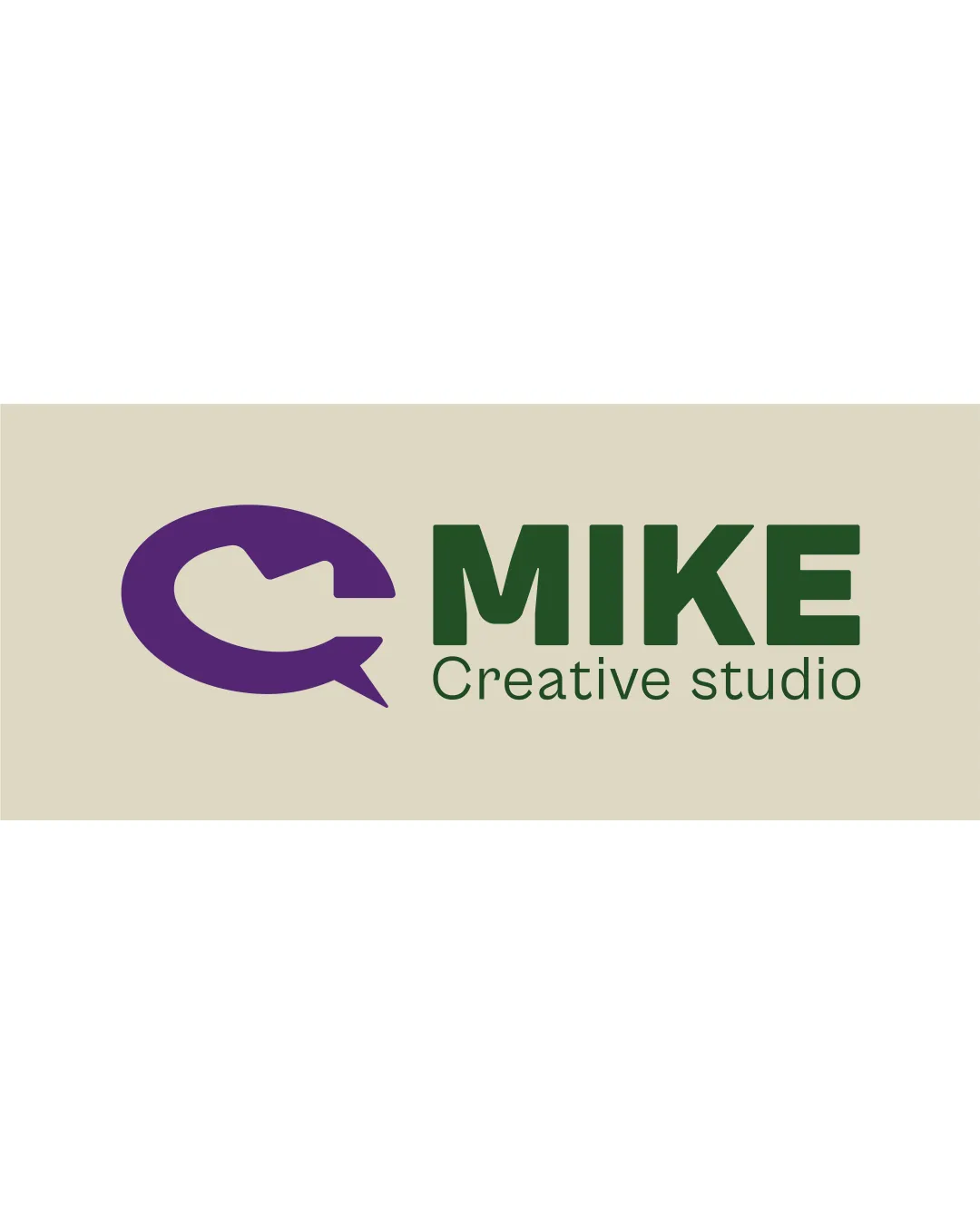
MIKE Creative studio logo review
3.0 / 5
Logo score
Logo review of

Mike Creative Studio

Usable but needs refinement for distinctiveness and more unified balance to stand out in a crowded creative field.

Objective AI feedback. Your creative decision.

Combination Mark Modern, Bold, Geometric Creative Agency
4/5
Legibility
3/5
Originality
4/5
Misread
3/5
Balance
3/5
Scale
Action plan

What to fix first

The most important fixes to handle before polishing the full presentation.

1

Refine the mark to enhance distinctiveness and memorability, possibly by evolving the microphone silhouette or integrating it more creatively with the chat bubble.

High priority

A more unique symbol would strengthen the brand's professional impression.

Impact: Addresses Lack Of Originality And Middle-tier Brand Recall. · Effort: Medium

2

Unify tagline and wordmark weights or adjust tagline placement for better balance at various sizes.

Medium priority

Visual consistency boosts recognition and adaptability.

Impact: Improves Legibility And Cohesion At Every Application Scale. · Effort: Low

Detailed review

Logo performance breakdown

4/5

Legibility

Checkmark icon Wordmark 'MIKE' is bold and highly readable.
Checkmark icon Tagline is clear at moderate sizes.

Warning icon Tagline weight is significantly lighter than main wordmark, which may reduce visibility at small sizes.

3/5

Originality

Checkmark icon Microphone-in-chat-bubble is reasonably relevant to the industry.

Warning icon Concept is fairly common among media and creative studios; lacks unique twist.

3/5

Color harmony

Checkmark icon Contrasting purple and green is distinctive.

Warning icon Palette feels a bit disjointed; background beige does not harmonize strongly with the purple and green.

Purple
#5E3160

Dark Green
#33643E

Beige
#D9D2BC

Color may be holding this logo back. Build a stronger strategic palette before updating the logo.

Build brand colors
3/5

Balance alignment

Checkmark icon Good horizontal alignment between symbol and wordmark.

Warning icon Imbalance between the visual weight of the mark and thin tagline undermines cohesiveness.

logo 200x250 pixels scalability test alignment grid overlay
3/5

Scalability

Checkmark icon Main mark and wordmark scale reasonably well.

Warning icon Fine detail in the tagline and chat bubble pointer may be lost at small sizes.

logo 200x250 pixels scalability test

200x250 px

logo 100x125 pixels scalability test

100×125 px

logo 50x62 pixels scalability test

50×62 px

4/5

Misinterpretations

Checkmark icon No obvious negative or awkward misreadings.

3 / 5

Logo structure & brief match

Checkmark icon Overall mark and wordmark relationship is direct.

Warning icon No strong thematic or stylistic integration beyond adjacency.

Checkmark icon Industry: Symbol and wordmark are appropriate for a creative/video studio but not highly distinctive.

Try your own review

Wondering how your logo performs?

Get a clear logo score, key risks, and priority fix ideas before your client or audience sees it.

Review my logo