View review
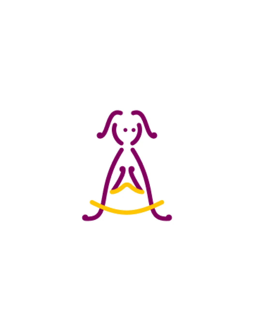
Abstract Girl Formed By Uterus And Diya/diya Flame..
A thoughtful and original logo that merges anatomy and cultural meaning, standing out in its sector, but usability and universal interpretation would benefit from refinement.
What to fix first
The most important fixes to handle before polishing the full presentation.
Fix possible misinterpretation
High priorityAbstract shape could be confusing, or misread as unrelated anatomy/animal
Impact: High · Effort: Medium
Refine inner lines for clarity
High priorityCentral elements could be mistaken for unrelated shapes at a glance, especially out of context.
Impact: Improves Immediate Recognition And Reduces Any Risk Of Awkward Anatomical Misreadings, Especially For Broader Or Conservative Audiences. · Effort: Medium
Test with small-scale and single-color versions
Medium priorityFine lines or color dependence might limit application flexibility if unaddressed.
Impact: Ensures Consistent Legibility And Reproduction Across Print And Low-resolution Uses. · Effort: Low
Logo performance breakdown
Originality
Creative, culture-aware mark with multiple meanings integrated
Distinct from generic NGO symbols
Abstractness may delay recognition for some viewers
Color harmony
Purple and yellow have strong contrast and positive, nurturing associations
May require grayscale adaptation for all media
Purple
#8D157D
Yellow
#FFC600
Your palette is close. Refine the color roles and combinations before updating the logo.
Build brand colorsBalance alignment
Balanced symmetry evokes stability and care
Centralized composition is visually grounded
Minor stroke thickness inconsistency
Scalability
Simple lines ensure good scaling
Distinct at small and large sizes
Delicate strokes may slightly thin at micro sizes
200x250 px
100×125 px
50×62 px
Misinterpretations
Anatomical and cultural fusion is generally clear
Abstract shape could be confusing, or misread as unrelated anatomy/animal
Central lines could be misinterpreted in sensitive contexts
Brief match
Uterus Symbolism: Flipped uterus referenced effectively, subtle yet clear to an informed audience.
Diya/oil Lamp: Yellow swoosh cleanly evokes diya symbolism, reinforcing warmth and light.
Girl Figure: Overall mark forms a clear, friendly abstract girl, capturing target demographic.
Wondering how your logo performs?
Get a clear logo score, key risks, and priority fix ideas before your client or audience sees it.