Wondering how your logo performs? 🧐
Get professional logo reviews in seconds and catch design issues in time.
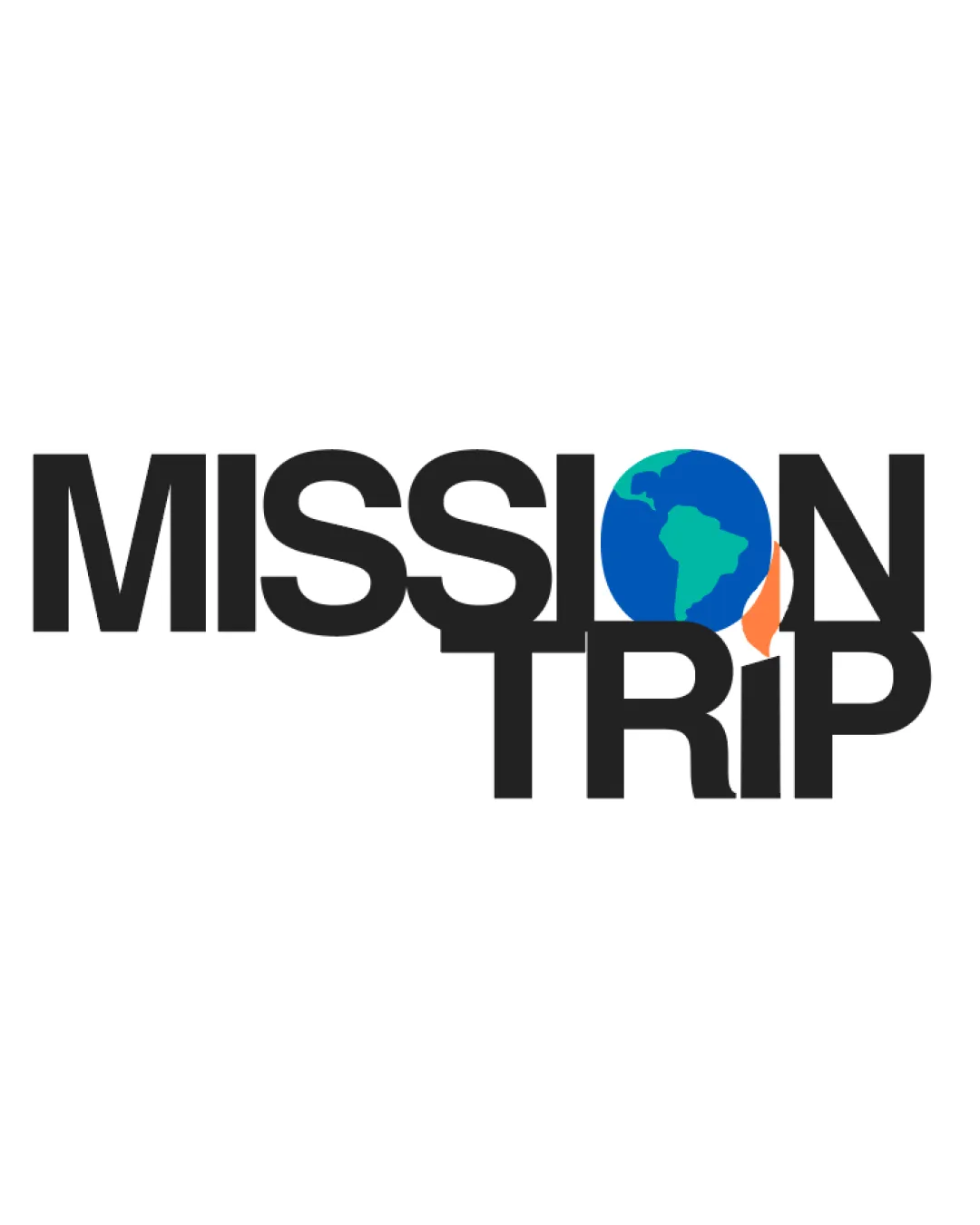
Try it Now!Logo review of MISSION TRIP
 Logo analysis by AI
Logo type:
Style:
Detected symbol:
Detected text:
Business industry:
Review requested by SVA
**If AI can recognize or misinterpret it, so can people.
Structured logo review
Legibility
![]() Text is bold and generally easy to read.
Text is bold and generally easy to read.![]() High contrast between text and background.
High contrast between text and background.
![]() Integration of the globe as 'O' and overlapping elements between 'N' and globe reduce clarity.
Integration of the globe as 'O' and overlapping elements between 'N' and globe reduce clarity.![]() Text alignment between 'MISSION' and 'TRIP' feels forced and disrupts readability.
Text alignment between 'MISSION' and 'TRIP' feels forced and disrupts readability.![]() Overlapping of the globe with both 'N' and 'T' creates minor confusion at first glance.
Overlapping of the globe with both 'N' and 'T' creates minor confusion at first glance.
Scalability versatility
![]() Bold typography maintains some visibility when scaled down.
Bold typography maintains some visibility when scaled down.
![]() Detailed globe icon loses clarity at small sizes (e.g., as a favicon or on tightly spaced business cards).
Detailed globe icon loses clarity at small sizes (e.g., as a favicon or on tightly spaced business cards).![]() Overlap and layered effect reduce clarity in embroidery or small applications.
Overlap and layered effect reduce clarity in embroidery or small applications.![]() Multiple colors may not reproduce well in single-color contexts.
Multiple colors may not reproduce well in single-color contexts.
200x250 px
100×125 px
50×62 px
Balance alignment
![]() Central placement of key visual (globe) draws attention.
Central placement of key visual (globe) draws attention.
![]() Alignment between the two words is off-balanced; 'MISSION' overhangs 'TRIP', disrupting harmony.
Alignment between the two words is off-balanced; 'MISSION' overhangs 'TRIP', disrupting harmony.![]() Overlapping globe causes congestion in the middle, making design feel cramped.
Overlapping globe causes congestion in the middle, making design feel cramped.![]() Vertical stacking leads to irregular whitespace and misplaced visual gravity.
Vertical stacking leads to irregular whitespace and misplaced visual gravity.

Originality
![]() Creative use of the globe as the letter 'O' visually ties into the travel/mission theme.
Creative use of the globe as the letter 'O' visually ties into the travel/mission theme.![]() Incorporates symbolic storytelling with minimal graphics.
Incorporates symbolic storytelling with minimal graphics.
![]() Globe-as-letter concept is somewhat common in travel-related logos, though executed better than most.
Globe-as-letter concept is somewhat common in travel-related logos, though executed better than most.![]() No notable use of negative space for additional meaning.
No notable use of negative space for additional meaning.
Aesthetic look
![]() Bold, modern, and colorful.
Bold, modern, and colorful.![]() Relatable and friendly appearance due to color and icon choice.
Relatable and friendly appearance due to color and icon choice.
![]() Overlapping elements generate unnecessary visual clutter.
Overlapping elements generate unnecessary visual clutter.![]() Stacked alignment interrupts smooth flow and can feel forced.
Stacked alignment interrupts smooth flow and can feel forced.![]() Color transitions are abrupt around the globe, disrupting cohesion.
Color transitions are abrupt around the globe, disrupting cohesion.
Dual meaning and misinterpretations
![]() No inappropriate or unintended imagery detected.
No inappropriate or unintended imagery detected.![]() Concept is clear and directly related to the industry.
Concept is clear and directly related to the industry.
Color harmony
![]() Color palette is vibrant and thematic.
Color palette is vibrant and thematic.![]() Good contrast between globe and black text enhances visibility.
Good contrast between globe and black text enhances visibility.
![]() More than three distinct colors; can feel somewhat busy especially in the icon area.
More than three distinct colors; can feel somewhat busy especially in the icon area.![]() Transition between globe and orange accent is visually harsh.
Transition between globe and orange accent is visually harsh.
Black
#222222
Blue
#0884CB
Green
#2ECF85
Orange
#F97E2E
White
#FFFFFF


