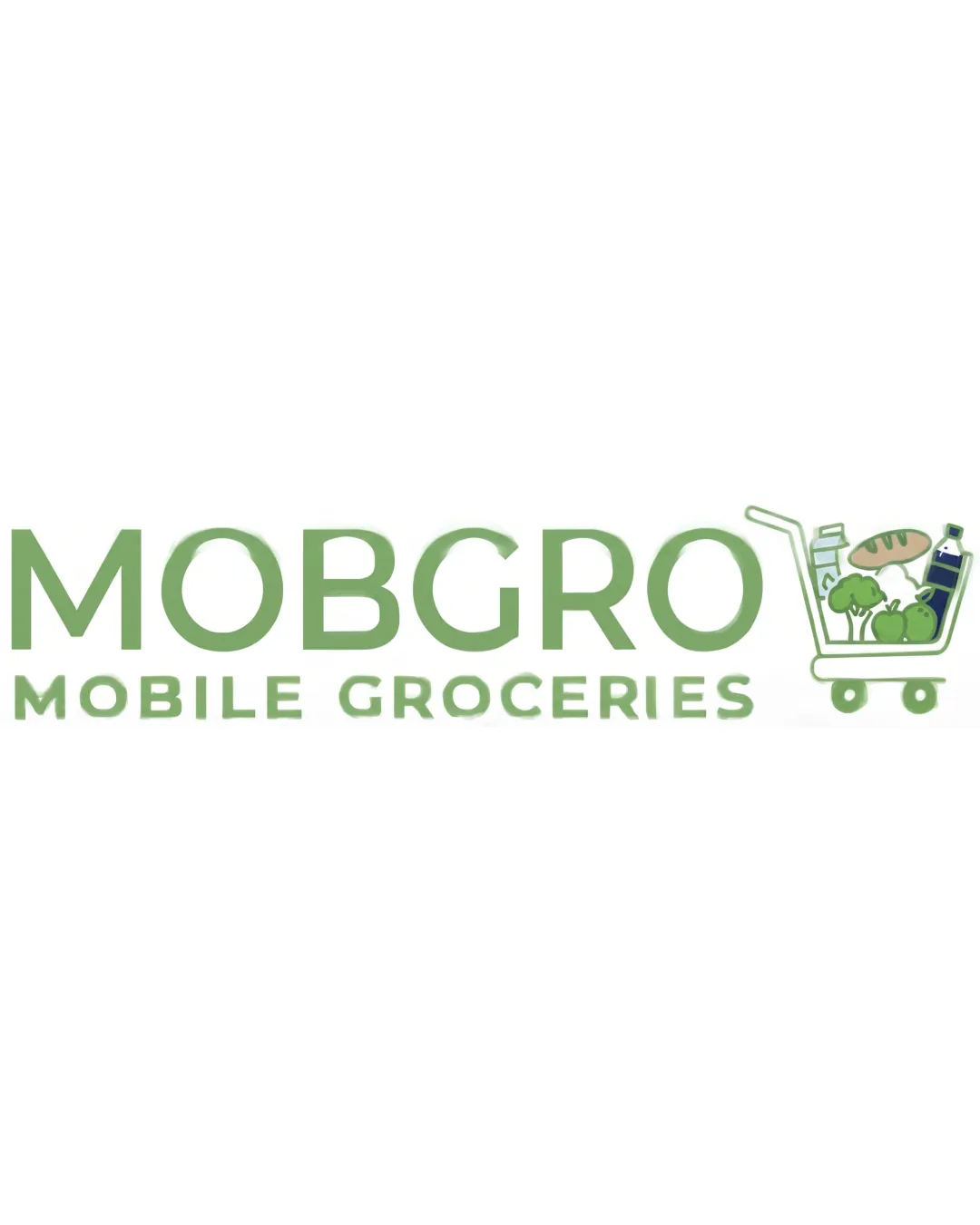
MOBGRO MOBILE GROCERIES logo review
3.7 / 5
Logo score
Logo review of

Mobgro Mobile Groceries

Functional for industry, but refinement needed for long-term brand assets or small-format applications.

Combination Mark Modern Illustrative Grocery Shopping And Delivery
4/5
Legibility
3/5
Originality
5/5
Misread
4/5
Balance
3/5
Scale
Action plan

What to fix first

The most important fixes to handle before polishing the full presentation.

1

Simplify grocery cart illustration for clarity and scalability at smaller sizes.

High priority

Fine details in the groceries may blur or disappear when scaled down; consider bolder shapes or fewer items.

Impact: Ensures The Logo Remains Readable And Recognizable On All Platforms And Sizes. · Effort: Medium

2

Refine green contrast and secondary text clarity.

Medium priority

Slightly increasing contrast or weight ensures better accessibility and retention.

Impact: Improves Subtext Readability And Overall Visual Impact, Especially In Digital Use. · Effort: Low

Detailed review

Logo performance breakdown

4/5

Legibility

Checkmark icon Primary text 'MOBGRO' is large and clear
Checkmark icon Subtext 'MOBILE GROCERIES' is readable

Warning icon Color contrast of subtext could be improved for better low-light/distance viewing

3/5

Originality

Checkmark icon Grocery-filled cart adds some personality

Warning icon Shopping cart is a common/generic industry symbol; illustrative style is not highly distinctive

4/5

Color harmony

Checkmark icon Consistent green palette fits the grocery/eco-friendly context
Checkmark icon Colors are harmonious and reinforce freshness

Warning icon Low contrast between greens could be tweaked for more visual impact

Olivine
#8BBC82

Moss Green
#B7D5A6

Fern Green
#4D6D34

White
#FFFFFF

Your palette is close. Refine the color roles and combinations before updating the logo.

Build brand colors
4/5

Balance alignment

Checkmark icon Text and icon are balanced horizontally
Checkmark icon Wordmark and symbol are visually connected

Warning icon Cart icon slightly outweighs text on the right; mild right-heaviness

logo 200x250 pixels scalability test alignment grid overlay
3/5

Scalability

Checkmark icon Simplified icon and clean text help retain detail at moderate sizes

Warning icon Detailed grocery items in cart may lose clarity when scaled down
Warning icon Gradient/fine color shading in the cart may not reproduce well in one-color use

logo 200x250 pixels scalability test

200x250 px

logo 100x125 pixels scalability test

100×125 px

logo 50x62 pixels scalability test

50×62 px

5/5

Misinterpretations

Checkmark icon No inappropriate or confusing misinterpretations detected

4 / 5

Logo structure & brief match

Checkmark icon Cart reinforces the grocery and delivery concept well with the wordmark

Warning icon Symbol-detail and wordmark style aren't perfectly integrated (slight style mismatch)

Checkmark icon Industry: Logo directly represents grocery shopping/delivery with cart and fresh products, matching the context.

Try your own review

Wondering how your logo performs?

Get a clear logo score, key risks, and priority fix ideas before your client or audience sees it.

Review my logo