MOCUANA logo review
4.2 / 5
Logo score
Logo review of

Mocuana

Distinctive, professional, and market-relevant logo with minor and easily fixable technical polish suggested for maximal versatility.

Objective AI feedback. Your creative decision.

Combination Mark Modern Minimal Nature-inspired Travel/outdoors
5/5
Legibility
4/5
Originality
5/5
Misread
4/5
Balance
4/5
Scale
Action plan

What to fix first

The most important fixes to handle before polishing the full presentation.

1

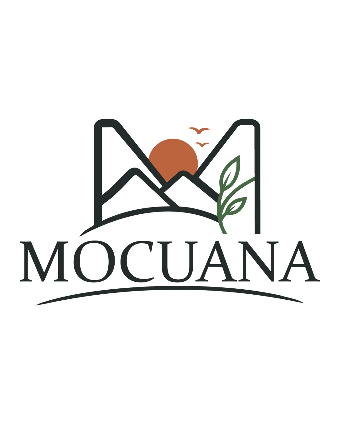
Slightly simplify small details (birds, leaves) for small-scale use

Medium priority

Tiny graphic elements lose crispness at reduced sizes

Impact: Ensures Clarity And Legibility On Tiny Merchandise Or Social Icons · Effort: Low

Detailed review

Logo performance breakdown

5/5

Legibility

Checkmark icon Wordmark is highly readable
Checkmark icon Classic serif font ensures clarity

4/5

Originality

Checkmark icon Distinctive approach with the 'M' as a mountain outline
Checkmark icon Natural elements add differentiation

Warning icon Nature/mountain + serif wordmark is a somewhat common motif in the industry

4/5

Color harmony

Checkmark icon Earthy tones complement natural theme
Checkmark icon High contrast supports clarity

Warning icon Palette is safe rather than bold; brown/orange may appear muted on some backgrounds

Black
#323532

Brown
#C1653B

Green
#5B8156

Your palette is close. Refine the color roles and combinations before updating the logo.

Build brand colors
4/5

Balance alignment

Checkmark icon Good integration of mark and type
Checkmark icon Mark is visually centered above the wordmark

Warning icon Curved underline could seem slightly disconnected or heavy at large sizes

logo 200x250 pixels scalability test alignment grid overlay
4/5

Scalability

Checkmark icon Minimal detail aids scalability
Checkmark icon Bold lines prevent collapse at small sizes

Warning icon Fine leaf and bird details may not be perfectly clear at tiny sizes

logo 200x250 pixels scalability test

200x250 px

logo 100x125 pixels scalability test

100×125 px

logo 50x62 pixels scalability test

50×62 px

5/5

Misinterpretations

Checkmark icon No ambiguous negative space or problematic shapes

5 / 5

Logo structure & brief match

Checkmark icon Mountain mark and wordmark style align well
Checkmark icon Nature theme flows into typography

Checkmark icon Industry Alignment: Fits outdoor/natural/eco brands strongly
Checkmark icon Tone: Communicates calm, reliable, and environmentally sensitive values

Try your own review

Wondering how your logo performs?

Get a clear logo score, key risks, and priority fix ideas before your client or audience sees it.

Review my logo