Abstract mirrored human connection logo logo review
3.7/5
Logo score

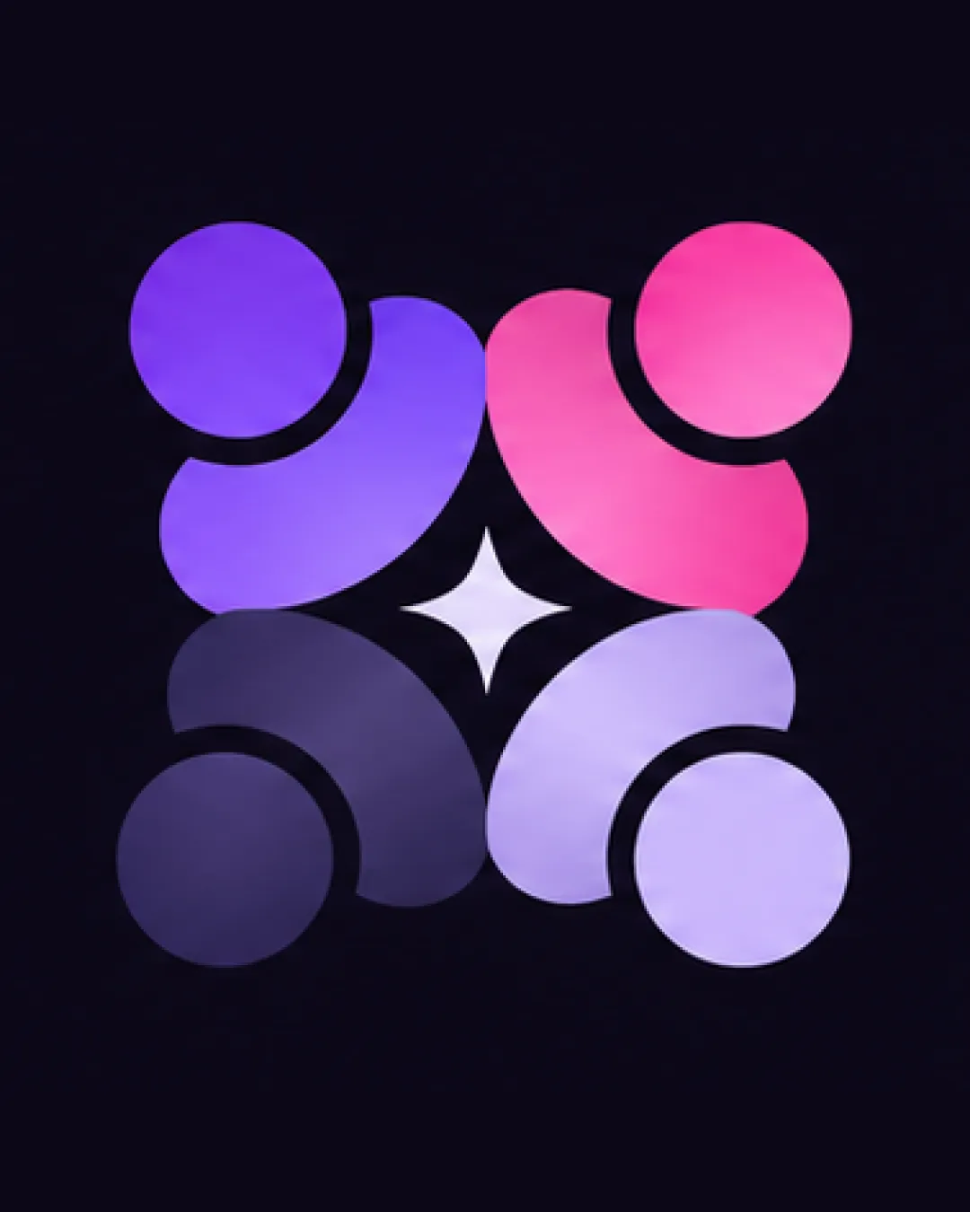
Abstract mirrored human connection logo

Essential logo review

The logo is visually distinctive and appealing, with strong symbolism, balance, and color; verify scalability and versatility in single-color applications.

This logomark shows solid execution, supported by distinctive construction and visual balance; improving clarity at smaller sizes is the clearest next step.

Symbol Modern/abstract Gradient Community/social/technology
4/5
Originality
4/5
Balance
3/5
Scale
4/5
Color
@creative803071
Your next steps

What to fix first

Focus on the changes that matter. Keep what makes the logo work.

1

entire artwork

Test logo at reduced sizes and in monochrome for clarity and recognizability.

High priority Worth testing Medium effort

Fine gradient transitions and subtle tonal contrasts between mirrored figures may lose clarity or visual impact at very small sizes or in black-and-white reproduction.

See the category review
Detailed review

Logo performance breakdown

4/5

Brief & logo match

The abstract mirrored human motif with a unifying star effectively represents community, collaboration or social tech, but practical application at small scale needs verification.

5/5

Misinterpretations

  • No credible risk of unintended interpretations.
4/5

Originality

  • Distinctive mirrored motif and expressive abstract human forms.
4/5

Color harmony

  • Gradient palette feels modern and unified; harmonious contrasting purples and pinks.
Violet#924DFF
Pink#FF5BA3
Muted Purple#72639D
Light Lavender#BFAFE2
White (center star)#FFFFFF

Estimated colors. Use the original design file for exact values.

Create a full color palette using these colors

Create new palette
4/5

Balance alignment

Available in Advanced logo reviews
3/5

Scalability

Available in Advanced logo reviews
Try your own review

Wondering how your logo performs?

Get a clear logo score, key risks, and priority fix ideas before your client or audience sees it.

Review my logo