Wondering how your logo performs? 🧐
Get professional logo reviews in seconds and catch design issues in time.
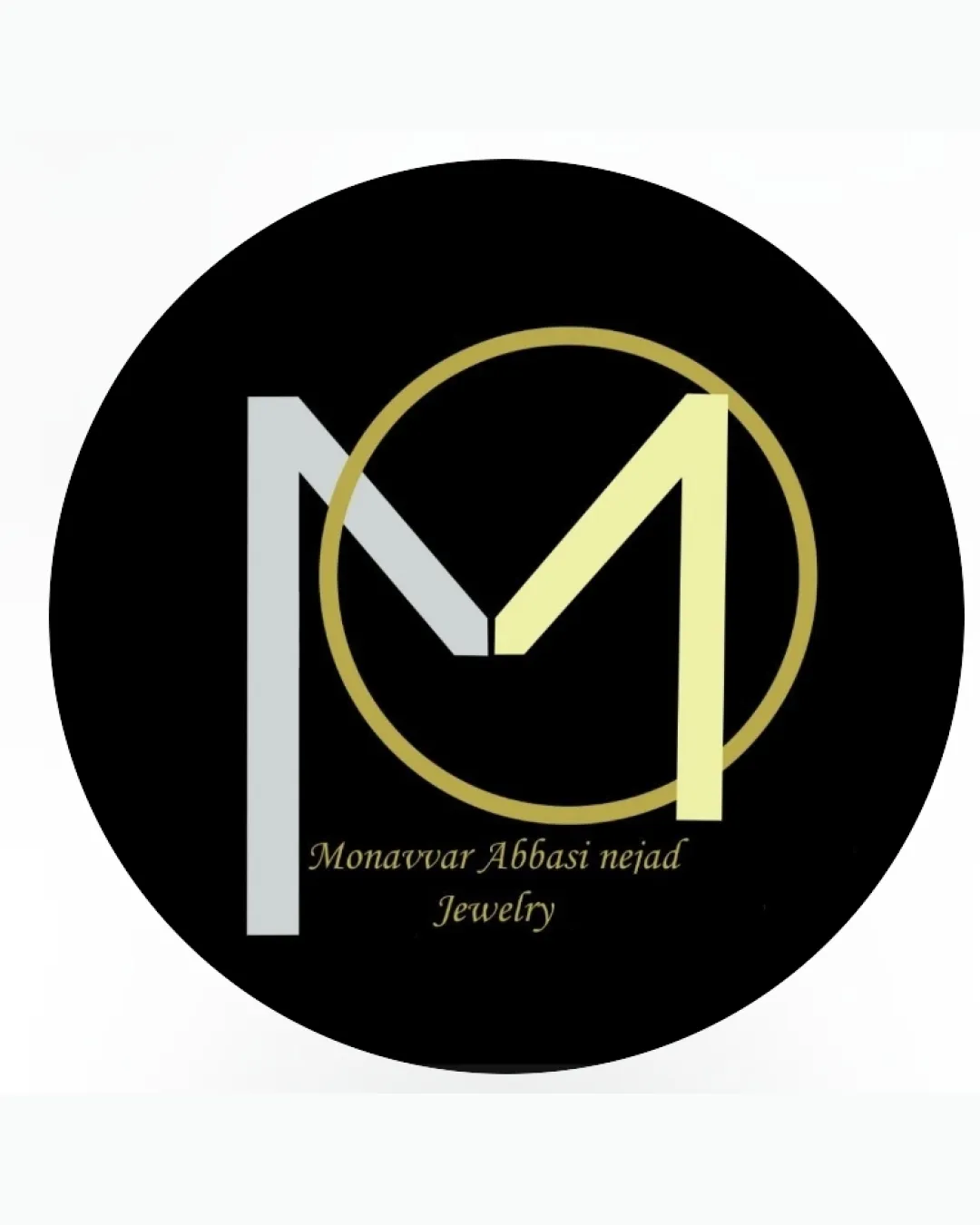
Try it Now!Logo review of Monavvar Abbasi ne jad Jewelry
 Logo analysis by AI
Logo type:
Style:
Detected symbol:
Detected text:
Business industry:
Review requested by Narcisus
**If AI can recognize or misinterpret it, so can people.
Structured logo review
Legibility
![]() Primary text is technically readable.
Primary text is technically readable.![]() Typeface matches luxury connotation.
Typeface matches luxury connotation.
![]() Script font for the name is thin, small, and loses legibility at reduced sizes.
Script font for the name is thin, small, and loses legibility at reduced sizes.![]() Color contrast between text and background is not optimal—gold-on-black can be challenging to read, especially in the small word 'Jewelry.'
Color contrast between text and background is not optimal—gold-on-black can be challenging to read, especially in the small word 'Jewelry.'![]() The word 'nejad' appears with an inconsistent gap; possible typo or spacing error.
The word 'nejad' appears with an inconsistent gap; possible typo or spacing error.
Scalability versatility
![]() Simple symbol could work for larger formats such as signage and digital banners.
Simple symbol could work for larger formats such as signage and digital banners.![]() Minimal gradients/flat color keeps it somewhat clean.
Minimal gradients/flat color keeps it somewhat clean.
![]() Thin letters and fine circle will be lost at small sizes (e.g., business cards, jewelry tags, app icons).
Thin letters and fine circle will be lost at small sizes (e.g., business cards, jewelry tags, app icons).![]() Detailed script text will not be legible in small or low-resolution applications.
Detailed script text will not be legible in small or low-resolution applications.![]() Color gradation may not reproduce well in embroidery or monochrome situations.
Color gradation may not reproduce well in embroidery or monochrome situations.
200x250 px
100×125 px
50×62 px
Balance alignment
![]() Circle frames the initials, centering the design.
Circle frames the initials, centering the design.![]() Both letterforms (M and A) are visually anchored within the ring.
Both letterforms (M and A) are visually anchored within the ring.
![]() The gold A is disproportionately thicker and brighter than the silver M, causing visual imbalance.
The gold A is disproportionately thicker and brighter than the silver M, causing visual imbalance.![]() The baseline alignment between the large initials and the text is jarring; the name almost feels ‘crowded’ under the symbol.
The baseline alignment between the large initials and the text is jarring; the name almost feels ‘crowded’ under the symbol.![]() Text is slightly off-center and awkwardly placed below the mark.
Text is slightly off-center and awkwardly placed below the mark.

Originality
![]() Stylized integration of initials is moderately distinctive.
Stylized integration of initials is moderately distinctive.![]() Circle motif offers a sense of unity, referencing jewelry forms like rings.
Circle motif offers a sense of unity, referencing jewelry forms like rings.
![]() Initial-based circle logos are extremely common in the jewelry industry; execution is not especially unique.
Initial-based circle logos are extremely common in the jewelry industry; execution is not especially unique.![]() Lacks innovative negative space usage or a creative twist.
Lacks innovative negative space usage or a creative twist.![]() Color choices and style are standard for jewelry brands.
Color choices and style are standard for jewelry brands.
Logomark wordmark fit
![]() Both elements attempt to communicate luxury through color palette and font selection.
Both elements attempt to communicate luxury through color palette and font selection.
![]() Wordmark and logomark styles clash—serif script does not harmonize with geometric initials.
Wordmark and logomark styles clash—serif script does not harmonize with geometric initials.![]() Visual weight is not balanced between the heavy circle + initials and the small, thin, light script below.
Visual weight is not balanced between the heavy circle + initials and the small, thin, light script below.
Aesthetic look
![]() Gives off a premium, modern vibe which fits the jewelry sector.
Gives off a premium, modern vibe which fits the jewelry sector.![]() Minimal color palette aids classiness.
Minimal color palette aids classiness.
![]() Heavy circle overwhelms the thin script and delicate M.
Heavy circle overwhelms the thin script and delicate M.![]() Imbalance and slight awkwardness in proportions detract from overall elegance.
Imbalance and slight awkwardness in proportions detract from overall elegance.![]() No standout visual hook—it risks being forgettable.
No standout visual hook—it risks being forgettable.
Dual meaning and misinterpretations
![]() No inappropriate or unintended visual interpretations detected.
No inappropriate or unintended visual interpretations detected.
Color harmony
![]() Color palette fits luxury/jewelry industry standard.
Color palette fits luxury/jewelry industry standard.![]() Black, gold, and silver work well together and evoke value.
Black, gold, and silver work well together and evoke value.
![]() Very pale yellow and gray may not be visible on light backgrounds; potential issues outside of dark applications.
Very pale yellow and gray may not be visible on light backgrounds; potential issues outside of dark applications.
Black
#000000
Light Gold
#EFECCA
Light Gray
#C6CACC
Gold
#E0C770


