Wondering how your logo performs? 🧐
Get professional logo reviews in seconds and catch design issues in time.
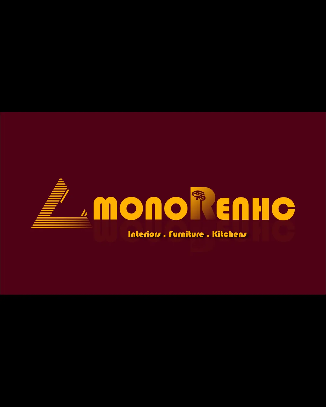
Try it Now!Logo review of MonoReno Interiors. Furniture. Kitchens.
 Logo analysis by AI
Recognized style:
Logo type:
Detected symbol:
Detected text:
Business industry:
Review requested by Odz
**If AI can recognize or misinterpret it, so can people.
Structured logo review
Legibility
![]() The name and tagline are distinguishable.
The name and tagline are distinguishable.
![]() The stylized design of the letter 'R' with the eye can hinder readability.
The stylized design of the letter 'R' with the eye can hinder readability.
Scalability versatility
![]() The bold elements suit various applications.
The bold elements suit various applications.
![]() Potential issues when reduced due to details in the symbol.
Potential issues when reduced due to details in the symbol.
200x250 px
100×125 px
50×62 px
Balance alignment
![]() Overall, elements feel mostly aligned.
Overall, elements feel mostly aligned.
![]() The symbol might appear dominant, causing slight imbalance with the text.
The symbol might appear dominant, causing slight imbalance with the text.

Originality
![]() The combination of geometric shapes with the eye element adds uniqueness.
The combination of geometric shapes with the eye element adds uniqueness.
![]() The triangular shape is somewhat common.
The triangular shape is somewhat common.
Logomark wordmark fit
![]() Styles are somewhat complementary.
Styles are somewhat complementary.
![]() Greater integration could enhance cohesion between the components.
Greater integration could enhance cohesion between the components.
Aesthetic look
![]() The logo has a professional and appealing vintage style.
The logo has a professional and appealing vintage style.
![]() The heavy use of gold could be overwhelming.
The heavy use of gold could be overwhelming.
Cultural sensitivity dual meaning
![]() No apparent cultural issues detected.
No apparent cultural issues detected.
![]() The eye symbol may have different interpretations.
The eye symbol may have different interpretations.
Color harmony
![]() Warm gold works well against the dark background.
Warm gold works well against the dark background.
![]() High contrast might not suit all mediums.
High contrast might not suit all mediums.


