Wondering how your logo performs? 🧐
Get professional logo reviews in seconds and catch design issues in time.
Try it Now!Logo review of More Philosophy
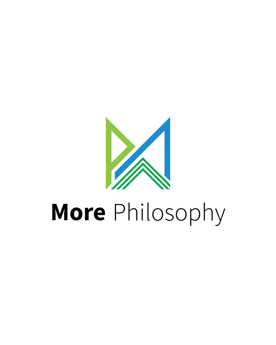
 Logo analysis by AI
Logo type:
Style:
Detected symbol:
Detected text:
Business industry:
Review requested by NaodT
**If AI can recognize or misinterpret it, so can people.
Structured logo review
Legibility
Text 'More Philosophy' is clear and highly legible
Font selection ensures readability at small sizes
Scalability versatility
Bold geometric lines maintain clarity at medium and large sizes
Logo will display well on digital platforms, stationery, and some signage
Thin lines inside the monogram may lose detail at very small sizes (e.g. favicon or embroidery)
Multi-line design may blur on small merchandise or low-resolution applications

200x250 px

100×125 px

50×62 px
Balance alignment
Monogram is visually anchored above the centered text
Wordmark feels balanced due to bold 'More' vs regular 'Philosophy'
Slight asymmetry in monogram (top left P) creates minor imbalance


Originality
Combines abstract geometric shapes to form unique representation of 'P' and 'M'
Monogram approach is common; geometric treatment is moderately distinctive but not highly original
Does not utilize negative space in a clever or industry-relevant way
Logomark wordmark fit
Font and symbol both use geometric characteristics, achieving reasonable harmony
Color and weight between logomark (colored lines) and wordmark (flat black) feel somewhat disconnected
Aesthetic look
Modern, clean, and uncluttered structure
Pleasant use of whitespace
Color palette, while fresh, could become generic across similar education or consulting brands
Dual meaning and misinterpretations
No inappropriate symbols, poses, or ambiguous meanings detected
Color harmony
Green and blue are harmonious and professional
Sparing use of color avoids visual clutter
Slight disconnect between colored logomark and black wordmark may feel less unified
Green
#6EC04A
Blue
#2590D6
Black
#000000


