Wondering how your logo performs? 🧐
Get professional logo reviews in seconds and catch design issues in time.
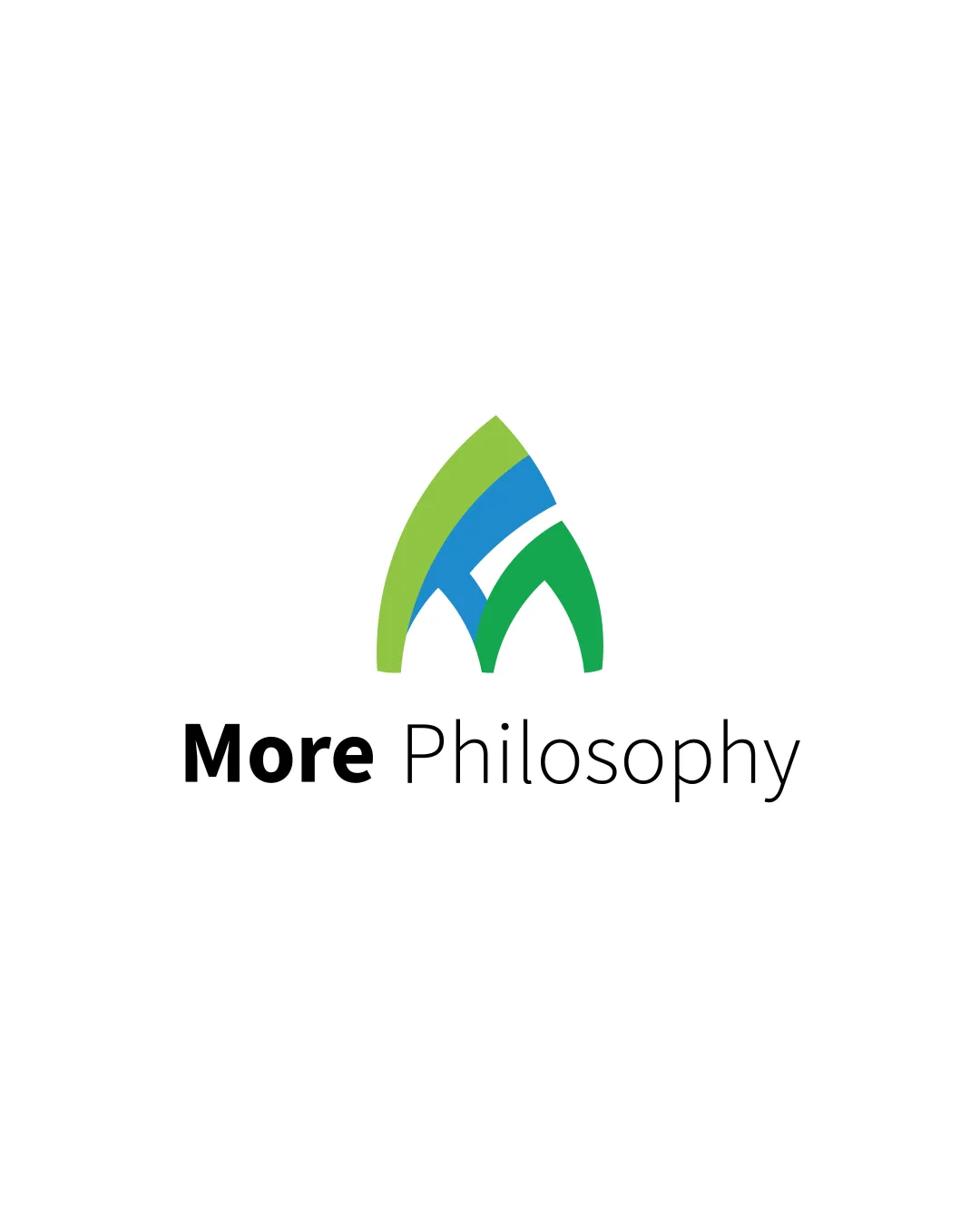
Try it Now!Logo review of More Philosophy
 Logo analysis by AI
Logo type:
Style:
Detected symbol:
Negative space:
Detected text:
Business industry:
Review requested by NaodT
**If AI can recognize or misinterpret it, so can people.
Structured logo review
Legibility
![]() All text is highly readable with clear distinction between the bold and regular font weights.
All text is highly readable with clear distinction between the bold and regular font weights.![]() Good typographic contrast between 'More' and 'Philosophy' adds hierarchy and emphasis.
Good typographic contrast between 'More' and 'Philosophy' adds hierarchy and emphasis.
Scalability versatility
![]() The symbol is simple and avoids excessive detail.
The symbol is simple and avoids excessive detail.![]() Logo will work on most print and digital applications.
Logo will work on most print and digital applications.
![]() Multiple color segments in the symbol may complicate small-size usage such as embroidery or small icons.
Multiple color segments in the symbol may complicate small-size usage such as embroidery or small icons.![]() The narrow negative space and detail may get lost at very small scales, such as in smartphone app icons.
The narrow negative space and detail may get lost at very small scales, such as in smartphone app icons.
200x250 px
100×125 px
50×62 px
Balance alignment
![]() The mark is well-centered above the wordmark, and the overall layout feels visually stable.
The mark is well-centered above the wordmark, and the overall layout feels visually stable.![]() Good alignment in text arrangement.
Good alignment in text arrangement.
![]() The symbol's asymmetry (due to the blue, green, and light green arrangements) creates a very slight visual tilt, detracting from perfect harmony.
The symbol's asymmetry (due to the blue, green, and light green arrangements) creates a very slight visual tilt, detracting from perfect harmony.

Originality
![]() Clever use of negative space to form the 'M' within an abstract, leaf-like or philosophical arch shape.
Clever use of negative space to form the 'M' within an abstract, leaf-like or philosophical arch shape.
![]() Leaf and arch motifs are fairly common, so the concept, while somewhat unique, still skirts generic territory.
Leaf and arch motifs are fairly common, so the concept, while somewhat unique, still skirts generic territory.
Logomark wordmark fit
![]() The style of the logomark complements the clean sans-serif of the wordmark.
The style of the logomark complements the clean sans-serif of the wordmark.![]() Color segmentation in the symbol does not conflict with the black text, keeping the palette harmonious.
Color segmentation in the symbol does not conflict with the black text, keeping the palette harmonious.
![]() The symbol feels slightly more playful and organic than the strictly geometric, business-like wordmark, creating a minor style mismatch.
The symbol feels slightly more playful and organic than the strictly geometric, business-like wordmark, creating a minor style mismatch.
Aesthetic look
![]() Bold, aesthetically pleasing colors and a modern minimalism lend professionalism.
Bold, aesthetically pleasing colors and a modern minimalism lend professionalism.![]() Effective whitespace and a non-busy presentation.
Effective whitespace and a non-busy presentation.
![]() Three distinct colors in the symbol add a touch of busyness that could have been mitigated by using fewer hues.
Three distinct colors in the symbol add a touch of busyness that could have been mitigated by using fewer hues.
Dual meaning and misinterpretations
![]() No unintentional inappropriate symbols detected.
No unintentional inappropriate symbols detected.![]() Abstract nature leaves little room for negative interpretation.
Abstract nature leaves little room for negative interpretation.
Color harmony
![]() The green and blue hues are fresh and harmonious, lending a modern educational feel.
The green and blue hues are fresh and harmonious, lending a modern educational feel.![]() Black text grounds the colorful symbol and adds professionalism.
Black text grounds the colorful symbol and adds professionalism.
![]() Presence of three distinct colors (not including black) in the symbol edges towards excess, risking complication for single-color or black-and-white applications.
Presence of three distinct colors (not including black) in the symbol edges towards excess, risking complication for single-color or black-and-white applications.
Pastel Green
#8BC34A
Blue
#2196F3
Green
#43A047
Black
#000000