 View review
Logo score
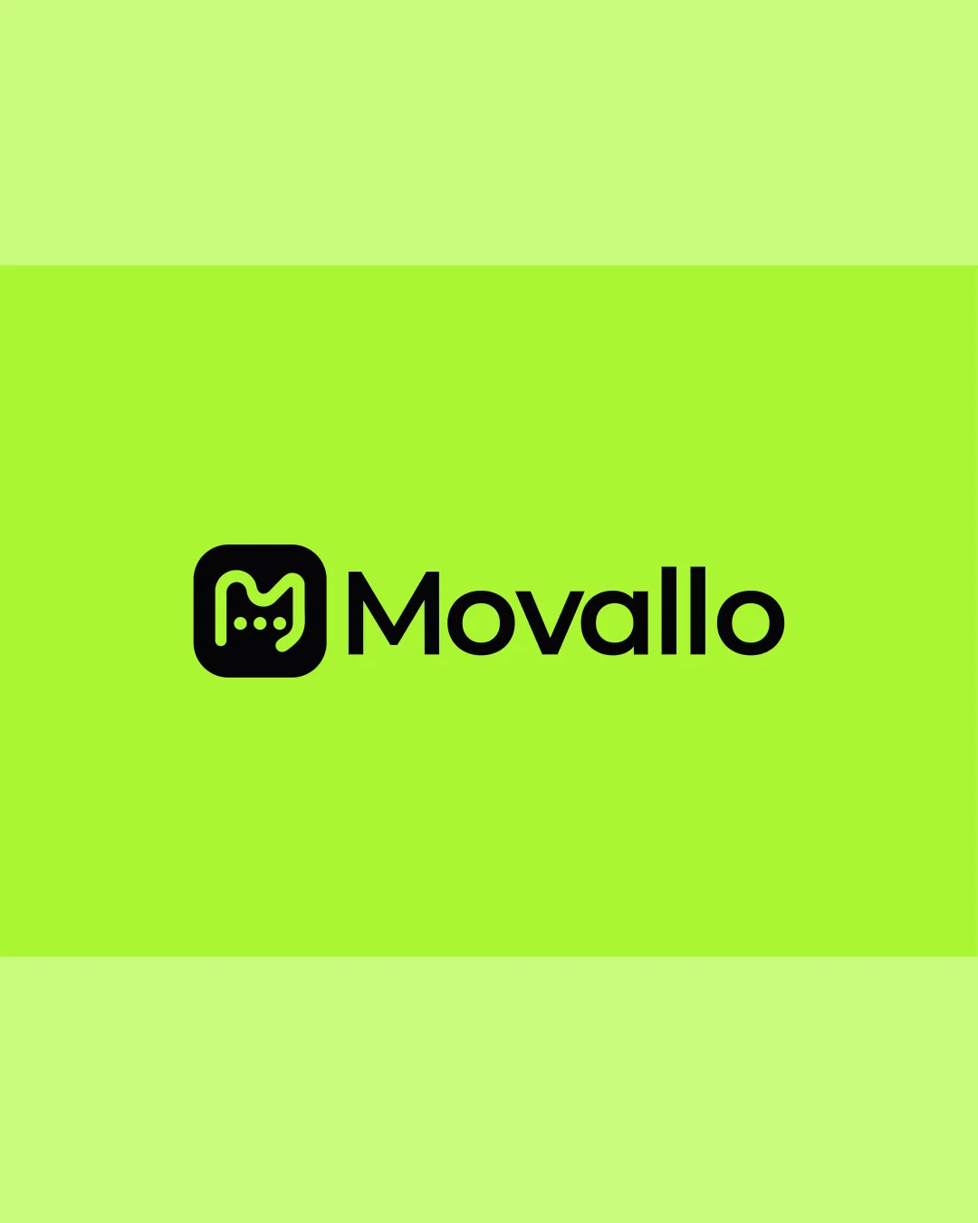
Logo review ofMovallo
Review the detailed scores below to see what is working and what should be refined first.
Legibility
Originality
Misread
Balance
Scale
Detailed review
Logo performance breakdown
Legibility
![]() Text is highly legible with a clean, sans-serif typeface.
Text is highly legible with a clean, sans-serif typeface.![]() Color contrast between text and background is excellent, ensuring readability.
Color contrast between text and background is excellent, ensuring readability.
Originality
![]() Abstracted motion path within the 'M' is a creative and subtle touch, relating to the name and possible tech/movement concept.
Abstracted motion path within the 'M' is a creative and subtle touch, relating to the name and possible tech/movement concept.![]() Distinct from many generic 'M' logos by introducing the dotted route.
Distinct from many generic 'M' logos by introducing the dotted route.
![]() Rounded square background is a fairly common approach for tech and app logos, slightly reducing uniqueness.
Rounded square background is a fairly common approach for tech and app logos, slightly reducing uniqueness.
Color harmony
![]() Strong contrast between black and lime green creates visual interest.
Strong contrast between black and lime green creates visual interest.![]() Simple and limited palette feels cohesive and bold.
Simple and limited palette feels cohesive and bold.
![]() Neon green may be visually fatiguing in large applications or across extended brand collateral; may need variations for broader use.
Neon green may be visually fatiguing in large applications or across extended brand collateral; may need variations for broader use.
Lime
#BFFF33
Rich Black
#1E1E20
Your palette is close. Explore sharper color combinations with Colorfly.design before updating the logo.
Explore palettesBalance alignment
![]() The weight of the logomark and wordmark is generally harmonious.
The weight of the logomark and wordmark is generally harmonious.![]() Distance between the logomark and wordmark is well-proportioned.
Distance between the logomark and wordmark is well-proportioned.
![]() Logomark's visual density could slightly overpower the wordmark in some settings—especially at smaller scales.
Logomark's visual density could slightly overpower the wordmark in some settings—especially at smaller scales.

Scalability
![]() Simplicity of the mark allows for decent scalability.
Simplicity of the mark allows for decent scalability.![]() Works well on digital platforms and signage.
Works well on digital platforms and signage.
![]() Thin lines within the symbol may lose clarity when reduced to small sizes such as favicons or app icons.
Thin lines within the symbol may lose clarity when reduced to small sizes such as favicons or app icons.![]() Dots inside the logomark may become indistinct on embroidery or small merchandise.
Dots inside the logomark may become indistinct on embroidery or small merchandise.
200x250 px
100×125 px
50×62 px
Misinterpretations
![]() No inappropriate or unintended visual associations detected.
No inappropriate or unintended visual associations detected.![]() Symbol easily relates to motion or tech with conceptual clarity.
Symbol easily relates to motion or tech with conceptual clarity.
Symbol & text fit
![]() Visual style of the logomark and wordmark are consistent and modern.
Visual style of the logomark and wordmark are consistent and modern.
![]() Both elements display similar visual weights and geometric characteristics.
Both elements display similar visual weights and geometric characteristics.
Try your own review
Review my logo
Wondering how your logo performs?
Get a clear logo score, key risks, and priority fix ideas before your client or audience sees it.
Keep exploring


