Consider very slight weight strengthening for the crescent mark's smallest lines to improve micro-scale resilience.
Fine lines may partially disappear at very small sizes.
Improves logo usability at favicon, signage, and miniature scale.
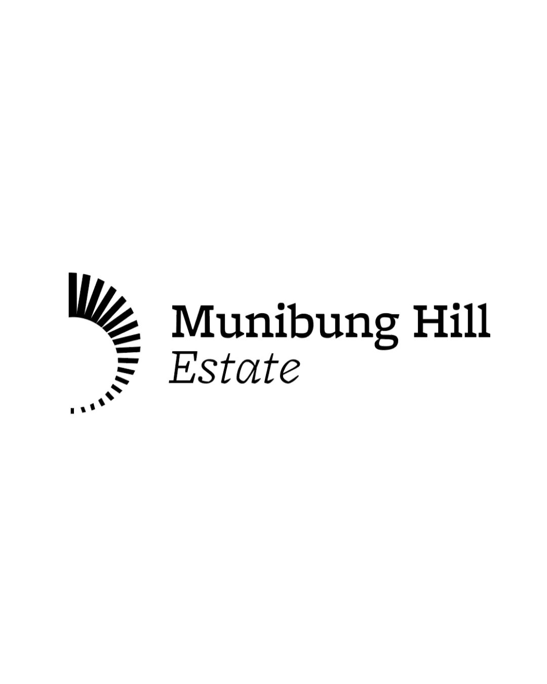
Distinctive, elegant, and clearly site-relevant; minor tweaks will further improve an already strong identity.
Focus on the changes that matter. Keep what makes the logo work.
Fine lines may partially disappear at very small sizes.
Improves logo usability at favicon, signage, and miniature scale.
Currently mostly balanced, but slight tweak could optimize presentation.
Ensures highest optical harmony in all lockup uses.
Abstract mark effectively suggests hill contours and elevation.

Inspect spacing with the guide. Optical balance may differ from geometric centering.
Get a clear logo score, key risks, and priority fix ideas before your client or audience sees it.
More credits needed
Add credits to continue without losing your work.
Then $7/month. Cancel anytime.
Essential logo review with AI
Estimated progress