Mystic Sparkle logo review
3.8/5
Logo score

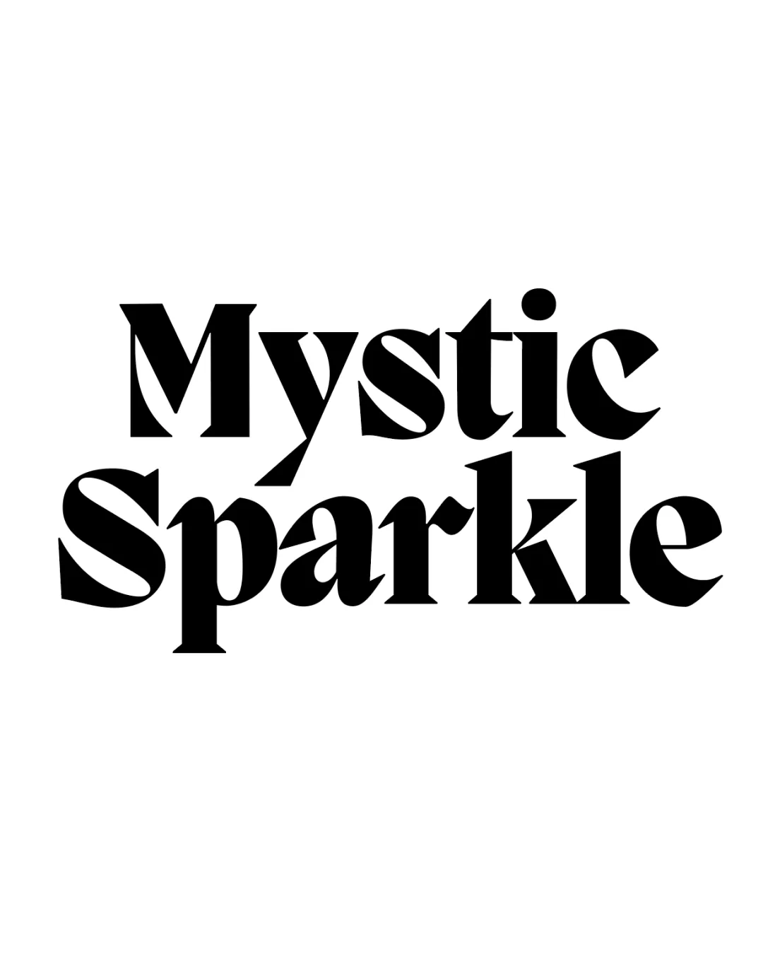
Mystic Sparkle

Essential logo review

A striking, readable, and expressive wordmark that effectively suggests energy and personality, but would benefit from some typographic balance adjustments.

This wordmark shows solid execution, supported by distinctive construction and text readability; improving visual balance is the clearest next step.

Wordmark Modern Serif, Bold, Stylized Food & Beverage
4/5
Legibility
4/5
Originality
3/5
Balance
4/5
Scale
@creative122004
Your next steps

What to fix first

Focus on the changes that matter. Keep what makes the logo work.

1

overall

Refine or slightly adjust some letterforms or counter shapes to improve typographic balance without losing distinctive style.

Medium priority Visible issue Medium effort

The exaggerated angled terminals and inconsistent stroke weights in several letters (e.g., 'S', 'k', 'l') create some optical imbalance, impacting overall visual harmony.

See the category review

Detailed review

Logo performance breakdown

4/5

Brief & logo match

The bold, edgy serif wordmark brings energy and a lively attitude that fits the 'fun' and slightly mystical mocktail concept, though it leans more on gothic drama than playful sparkle.

5/5

Misinterpretations

  • No visible risk of misreading or negative interpretation.
4/5

Legibility

  • Letterforms are readable despite unique cuts and high contrast.
4/5

Originality

  • Dramatic, angled serifs and terminals create distinctive personality.
4/5

Scalability

Available in Advanced logo reviews
3/5

Balance alignment

Available in Advanced logo reviews
Try your own review

Wondering how your logo performs?

Get a clear logo score, key risks, and priority fix ideas before your client or audience sees it.

Review my logo