View review
Logo review ofNaéla, Modest Fashion
Review the detailed scores below to see what is working and what should be refined first.
Logo performance breakdown
Legibility
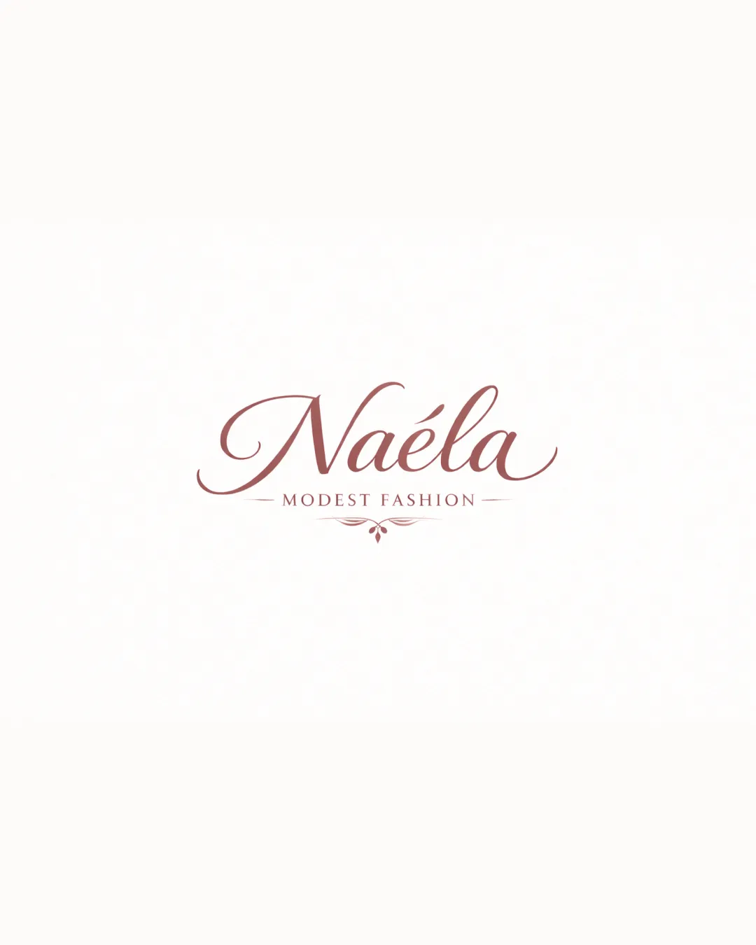
Primary wordmark 'Naéla' is distinct and stylish in script
'MODEST FASHION' is legible in a contrasting, all-caps serif
Script could be less readable at very small sizes due to some flourishes
Accent on 'é' may cause minor confusion in quick glances

Originality
Custom script implies some brand personality
Ornamental underline is tastefully implemented
Script wordmark and vintage ornament are common in the fashion industry
Lacks a truly distinctive symbol or custom element
Color harmony
Sensible, gentle monochromatic palette
Colors reinforce brand femininity and modesty
Rose Taupe
#AD7A7B
Seashell
#F7F5F3
Balance alignment
Ornament and divider create a visually pleasing axis
Good alignment between both text elements and decorative detail
Scalability
Simple color palette aids versatility
Minimal iconography keeps it relatively clear
Thin flourishes and delicate script won’t hold up in tiny applications (e.g., favicons, embroidery)
Ornament below text will be lost at small sizes
200x250 px
100×125 px
50×62 px
Misinterpretations
No inappropriate dual meanings or questionable imagery detected
Symbol & text fit
Ornamental divider fits the elegant tone of the script
Style, color, and weight complement each other
Ornamental element is quite subtle and may appear as an afterthought rather than a strong brand asset
Wondering how your logo performs?
Get a clear logo score, key risks, and priority fix ideas before your client or audience sees it.