View review
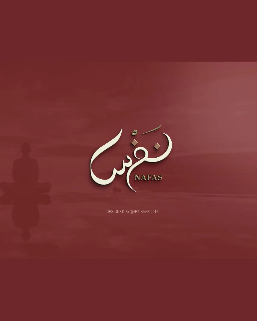
Nafas
A sophisticated, distinctive bilingual logo—well-crafted for its context, requiring only detail refinements for full versatility.
What to fix first
The most important fixes to handle before polishing the full presentation.
Slightly simplify fine details or effects in the Arabic calligraphy for better small-size legibility.
High priorityFine strokes and shadows may blur at small sizes.
Impact: Ensures Clarity, Maintaining Logo Versatility Across Applications. · Effort: Medium
Consider subtle adjustment to typographic contrast between the English wordmark and Arabic calligraphy for stronger unity.
Medium priorityImproves cohesion between traditional and modern styles.
Impact: Further Harmonizes The Visual System. · Effort: Low
Logo performance breakdown
Legibility
English 'NAFAS' is clear and elegant
Arabic calligraphy is visually appealing
Legibility of Arabic word depends on familiarity with the script; small size may slightly reduce clarity
Originality
Creative bilingual execution
Elegant, artistic style
Relies on traditional calligraphic forms, not radically unique in concept
Color harmony
Warm ivory and gold stand out well against the dark red background
Cohesive, calming atmosphere
Monotone red background could reduce contrast in certain media
Dark Red
#8B393B
Ivory
#F6E4C5
Gold
#98713D
Your palette is close. Refine the color roles and combinations before updating the logo.
Build brand colorsBalance alignment
Good centering and alignment between calligraphy and wordmark
Slight imbalance between large calligraphic form and smaller English text
Scalability
Distinctive large shapes in calligraphy
Wordmark remains readable
Text effects and fine lines in calligraphy may lose clarity at small sizes
200x250 px
100×125 px
50×62 px
Misinterpretations
No problematic shapes or readings detected
Logo structure & brief match
English and Arabic elements harmonize well
Consistent color palette and shadowing effects
Contrast between traditional and contemporary typefaces could be adjusted for even better integration
Industry Fit: The calming, reflective style is well-suited for wellness, mindfulness, or meditation sectors.
Bilingual Clarity: Effectively integrates Arabic and English for broad accessibility.
Wondering how your logo performs?
Get a clear logo score, key risks, and priority fix ideas before your client or audience sees it.