Wondering how your logo performs? 🧐
Get professional logo reviews in seconds and catch design issues in time.
Try it Now!Logo review of Naples Premium Transport
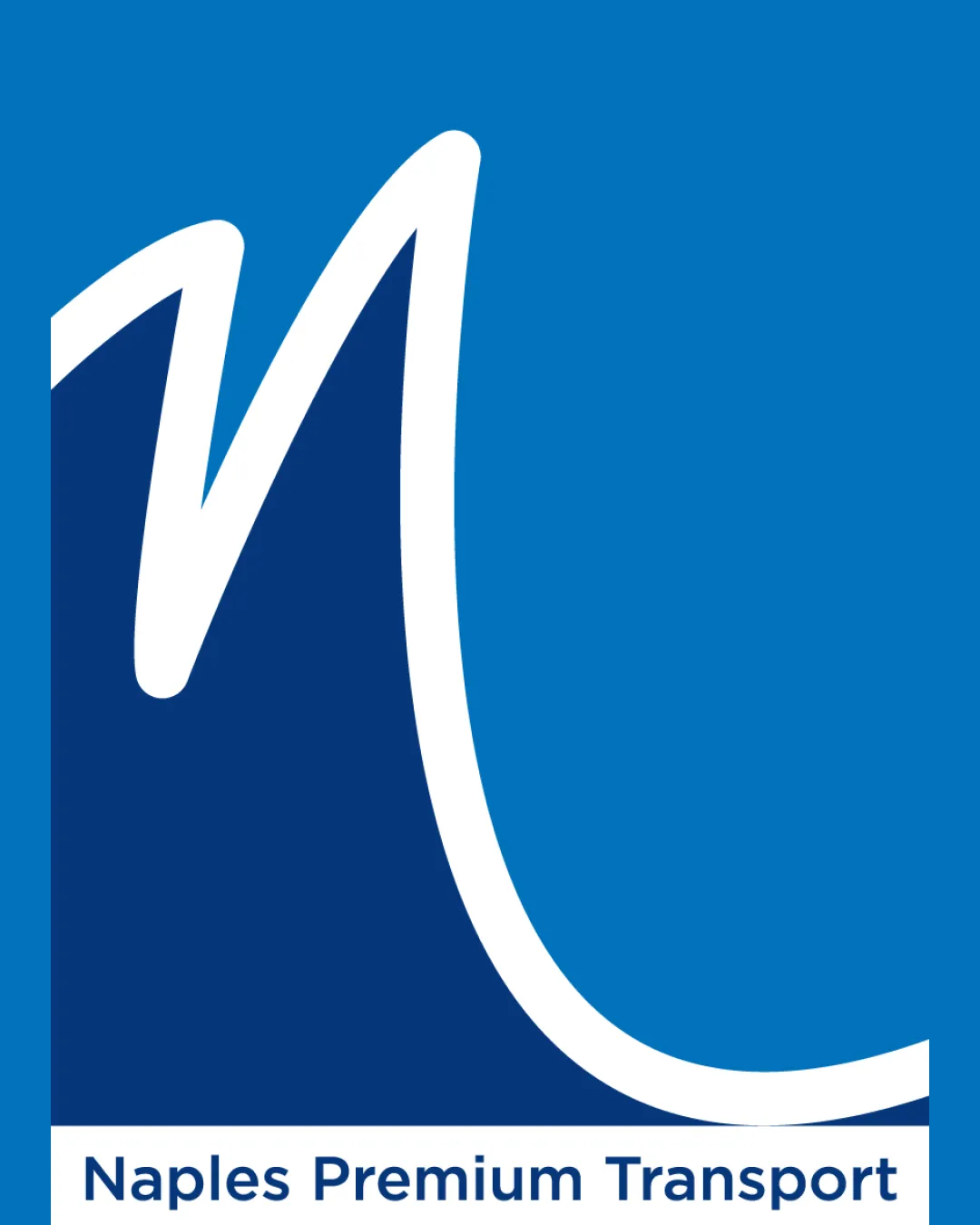
 Logo analysis by AI
Logo type:
Style:
Detected symbol:
Detected text:
Business industry:
Review requested by SuP4y
**If AI can recognize or misinterpret it, so can people.
Structured logo review
Legibility
Text is highly readable with good contrast on a white background.
Font choice is clean and contemporary, aiding professional perception.
Scalability versatility
Bold lines and simple shapes ensure some degree of scalability.
Would work well in larger sizes such as signage or vehicle wraps.
Thick central swoosh may lose detail in very small scales (e.g., favicons).
Long horizontal shape of the logomark paired with wordmark may make square or circular applications awkward.
White border may disappear on light backgrounds without careful implementation.

200x250 px

100×125 px

50×62 px
Balance alignment
Logomark and wordmark are aligned vertically, giving a clear separation between symbol and text.
Overall composition creates visual flow.
Disproportionately large logomark compared to the small wordmark creates a sense of imbalance.
Symbolic curve visually overpowers the company name, leading to a lack of equilibrium.


Originality
Abstract curve is somewhat distinctive and stylized.
Avoids common transport clichés like wheels, vehicles, or arrows.
Concept of a swoosh or curve is widely used and lacks a clear, unique tie to Naples or transportation.
'N' monogram approach is common and could be more customized.
Logomark wordmark fit
Clear relationship between symbol and business name via the use of the initial letter.
Style of logomark (organic and bold) does not match the geometric, modern sans-serif of the wordmark.
Size difference causes the logomark to dominate rather than complement the wordmark.
Lack of consistent design language between the logomark and wordmark.
Aesthetic look
Visually appealing use of blue tones, conveying professionalism and trust.
Curved line introduces a dynamic, energetic feel.
Blocky lower half and sharp division can feel abrupt and unrefined.
Minimalism is somewhat undermined by the thick white curve and color blocking, creating slight visual heaviness.
Dual meaning and misinterpretations
No inappropriate shapes or unintended visual interpretations detected.
Color harmony
Good use of harmonious blues and a clean white that maintains contrast.
Professional, trustworthy color palette appropriate for transport sector.
Color blocking between two strong blues is slightly monotonous and lacks visual interest.
Cerulean Blue
#0082C8
Prussian Blue
#003366
White
#FFFFFF


