 View review
Logo score
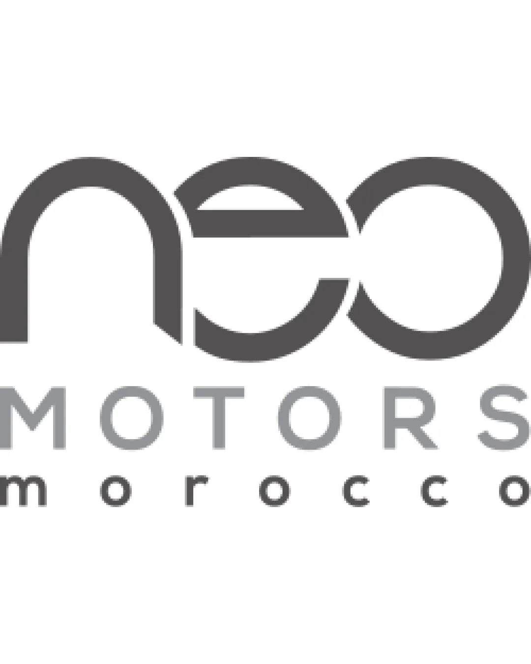
Logo review ofNeo Motors Morocco
Review the detailed scores below to see what is working and what should be refined first.
Legibility
Originality
Misread
Balance
Scale
Detailed review
Logo performance breakdown
Legibility
![]() The word 'MOTORS' and 'morocco' are clear and easy to read at various sizes.
The word 'MOTORS' and 'morocco' are clear and easy to read at various sizes.
![]() The 'neo' portion uses abstract letterforms which could confuse at a distance or reduced size.
The 'neo' portion uses abstract letterforms which could confuse at a distance or reduced size.![]() Lowercase styling of 'neo' blends together, especially the 'e' and 'o', reducing immediate legibility.
Lowercase styling of 'neo' blends together, especially the 'e' and 'o', reducing immediate legibility.
Originality
![]() Modern geometric approach to letterforms adds a degree of uniqueness.
Modern geometric approach to letterforms adds a degree of uniqueness.![]() No literal car icons, which avoids cliches in the automotive space.
No literal car icons, which avoids cliches in the automotive space.
![]() Circular geometric style is common in tech and automotive sectors and offers limited differentiation.
Circular geometric style is common in tech and automotive sectors and offers limited differentiation.![]() No unique symbol or negative space concept; relies solely on stylized typography.
No unique symbol or negative space concept; relies solely on stylized typography.
Color harmony
![]() Limited grayscale palette is harmonious and professional.
Limited grayscale palette is harmonious and professional.![]() No clashes or overuse of color, maintaining elegance.
No clashes or overuse of color, maintaining elegance.
Dove Gray
#535353
Silver
#A9A9A9
White
#FFFFFF
Balance alignment
![]() Text-centric structure anchors the alignment, with 'neo' and 'MOTORS' horizontally balanced.
Text-centric structure anchors the alignment, with 'neo' and 'MOTORS' horizontally balanced.![]() Subtext 'morocco' is visually centered and spaced evenly.
Subtext 'morocco' is visually centered and spaced evenly.
![]() The visual weight of 'neo' is much heavier than the lines below, creating mild hierarchy imbalance.
The visual weight of 'neo' is much heavier than the lines below, creating mild hierarchy imbalance.![]() The width of 'neo' far exceeds the lower text, giving a slightly top-heavy appearance.
The width of 'neo' far exceeds the lower text, giving a slightly top-heavy appearance.

Scalability
![]() Bold line weight and minimal detail support clear scaling for most applications.
Bold line weight and minimal detail support clear scaling for most applications.![]() Monochromatic palette ensures adaptability on various backgrounds.
Monochromatic palette ensures adaptability on various backgrounds.
![]() Highly stylized 'neo' could lose legibility on very small surfaces like embroidery or favicon.
Highly stylized 'neo' could lose legibility on very small surfaces like embroidery or favicon.![]() Geometric letterforms might blur at small sizes if not properly spaced.
Geometric letterforms might blur at small sizes if not properly spaced.
200x250 px
100×125 px
50×62 px
Misinterpretations
![]() No explicit inappropriate or ambiguous forms detected.
No explicit inappropriate or ambiguous forms detected.![]() Stylized letters are abstract but remain within acceptable interpretation.
Stylized letters are abstract but remain within acceptable interpretation.
Try your own review
Review my logo
Wondering how your logo performs?
Get a clear logo score, key risks, and priority fix ideas before your client or audience sees it.
Keep exploring


