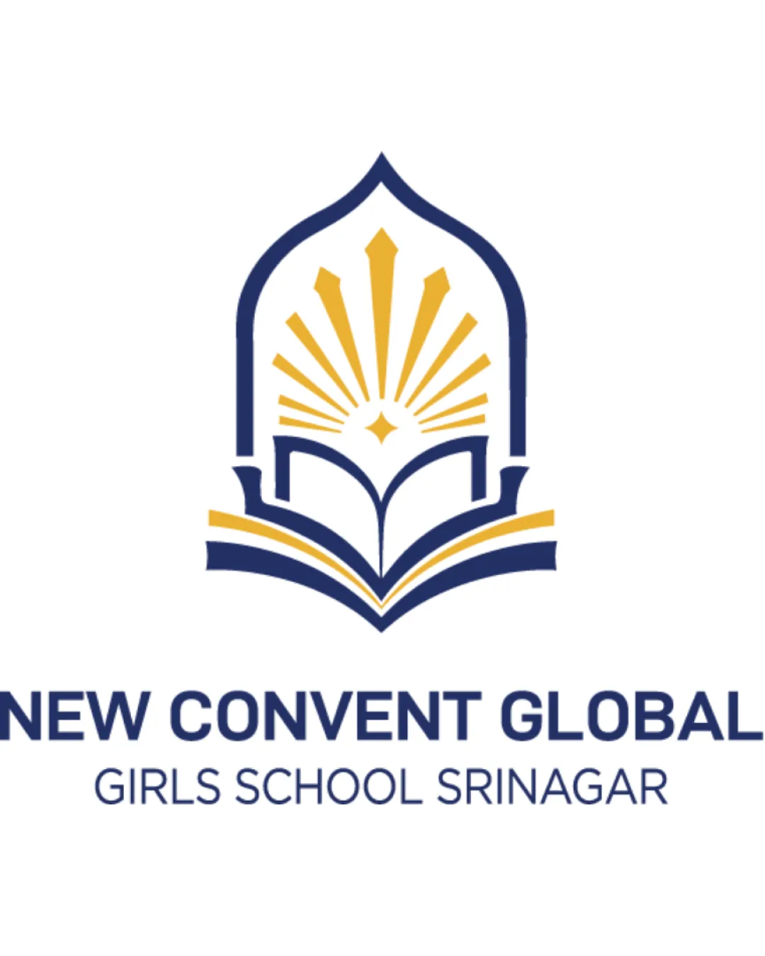
NEW CONVENT GLOBAL GIRLS SCHOOL SRINAGAR logo review
4/5
Logo score

NEW CONVENT GLOBAL GIRLS SCHOOL SRINAGAR

@creative788918 Essential logo review

Strong, appropriate, professional logo with minor enhancement potential for distinctiveness and small-scale usability.

Combination Mark Modern Educational, Institutional Education
4.5/5
Legibility
3/5
Originality
4.5/5
Balance
4/5
Scale
Your next steps

What to fix first

Focus on the changes that matter. Keep what makes the logo work.

1

Slightly thicken or space the radiant rays in the mark for better clarity at small sizes.

Medium priority Low effort

Ensures the symbol remains legible at micro and digital sizes.

Improves scalability and versatile use on collateral.
2

Explore subtle ways to increase the mark's uniqueness or add local characteristics.

Medium priority Medium effort

Differentiates the school brand visually from other institutions.

Boosts memorability in a crowded education sector.

Detailed review

Logo performance breakdown

Not scored

Brief & logo match

Appropriate scholastic imagery and formal style align with the educational sector.

4.5/5

Legibility

  • Primary name is highly readable in bold sans-serif type.
  • Secondary text is clear and well-spaced.
  • Slight size drop on 'GIRLS SCHOOL SRINAGAR' may reduce legibility at very small scales.
3/5

Originality

  • Appropriate use of school symbolism and local architectural shape.
  • Book-and-rays concept is widely used in education logos—moderate originality.
4.5/5

Color harmony

  • Navy blue and gold palette conveys trust and prestige.
  • High contrast ensures visibility.
  • Palette is common for academic sector—could stand out more.
Navy Blue#002D62
Gold#FFC72C
White#FFFFFF

Estimated colors. Use the original design file for exact values.

Create a full color palette using these colors

Create new palette

4.5/5

Balance alignment

  • Symbol and wordmark are well-centered and proportionate.
  • Vertical structure reinforces academic formality.
  • Secondary text could be slightly more visually integrated with the primary name.
Uploaded logoAlignment guide overlay

Inspect spacing with the guide. Optical balance may differ from geometric centering.

4/5

Scalability

  • Mark and text are clear at moderate and large sizes.
  • Simple shapes favor clean scaling.
  • Some fine rays in the mark could merge at very tiny sizes—suggest minor simplification for micro use.
5/5

Misinterpretations

  • No negative or confusing secondary shapes apparent.
4/5

Symbol & text fit

  • Mark visually supports the educational mission of the wordmark.
  • Color and weight are consistent.
  • Mark could further personalize or localize for stronger distinctiveness.
Try your own review

Wondering how your logo performs?

Get a clear logo score, key risks, and priority fix ideas before your client or audience sees it.

Review my logo