Wondering how your logo performs? 🧐
Get professional logo reviews in seconds and catch design issues in time.
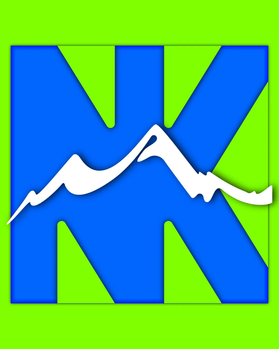
Try it Now!Logo review of NK
 Logo analysis by AI
Logo type:
Style:
Detected symbol:
Negative space:
Detected text:
Business industry:
Review requested by 369evention7777777
**If AI can recognize or misinterpret it, so can people.
Structured logo review
Legibility
![]() NK letters are easily distinguishable and bold.
NK letters are easily distinguishable and bold.![]() Mountain element is clearly visible.
Mountain element is clearly visible.
![]() Mountain silhouette slightly cuts into the legibility of the NK letters, especially at smaller sizes.
Mountain silhouette slightly cuts into the legibility of the NK letters, especially at smaller sizes.
Scalability versatility
![]() Simple, bold shapes will scale decently for signage and apparel.
Simple, bold shapes will scale decently for signage and apparel.![]() Color contrast maintains visibility at a variety of sizes.
Color contrast maintains visibility at a variety of sizes.
![]() Finite detail in the mountain silhouette may become muddled or lost at very small sizes such as favicons or embroidery.
Finite detail in the mountain silhouette may become muddled or lost at very small sizes such as favicons or embroidery.![]() High color contrast may not adapt as well to monochrome or single-color applications.
High color contrast may not adapt as well to monochrome or single-color applications.
200x250 px
100×125 px
50×62 px
Balance alignment
![]() Overall composition feels steady, symmetrical NK shape frames the mountain well.
Overall composition feels steady, symmetrical NK shape frames the mountain well.![]() Strong geometric balance in monogram.
Strong geometric balance in monogram.
![]() Mountain silhouette introduces a dynamic diagonal that disrupts perfect horizontal alignment.
Mountain silhouette introduces a dynamic diagonal that disrupts perfect horizontal alignment.

Originality
![]() Combination of letters and mountain is somewhat unique.
Combination of letters and mountain is somewhat unique.![]() Mountain silhouette in negative space is a creative touch.
Mountain silhouette in negative space is a creative touch.
![]() The ‘mountain in letters’ concept is seen frequently in outdoor and adventure branding.
The ‘mountain in letters’ concept is seen frequently in outdoor and adventure branding.![]() NK monogram itself is rendered in a basic geometric style, lacking highly distinctive features.
NK monogram itself is rendered in a basic geometric style, lacking highly distinctive features.
Aesthetic look
![]() Bold colors grab attention.
Bold colors grab attention.![]() Clean edges, distinct shapes.
Clean edges, distinct shapes.
![]() Color combination feels somewhat harsh and dated.
Color combination feels somewhat harsh and dated.![]() Background and main logo colors compete visually; could be sleeker.
Background and main logo colors compete visually; could be sleeker.![]() Overall look may appear amateurish due to high saturation and simple geometry.
Overall look may appear amateurish due to high saturation and simple geometry.
Dual meaning and misinterpretations
![]() No inappropriate or confusing symbols detected.
No inappropriate or confusing symbols detected.![]() Mountain motif is clear for the industry.
Mountain motif is clear for the industry.
Color harmony
![]() Colors are highly contrasting and attention-grabbing.
Colors are highly contrasting and attention-grabbing.
![]() Neon green and bright blue create a jarring effect, lacking sophistication and harmony.
Neon green and bright blue create a jarring effect, lacking sophistication and harmony.![]() Color palette may hinder adaptation to all backgrounds and uses.
Color palette may hinder adaptation to all backgrounds and uses.![]() Gradient/3D shadow effects add unnecessary visual noise.
Gradient/3D shadow effects add unnecessary visual noise.
Neon Green
#39FF14
Blue
#0074D9
White
#FFFFFF


