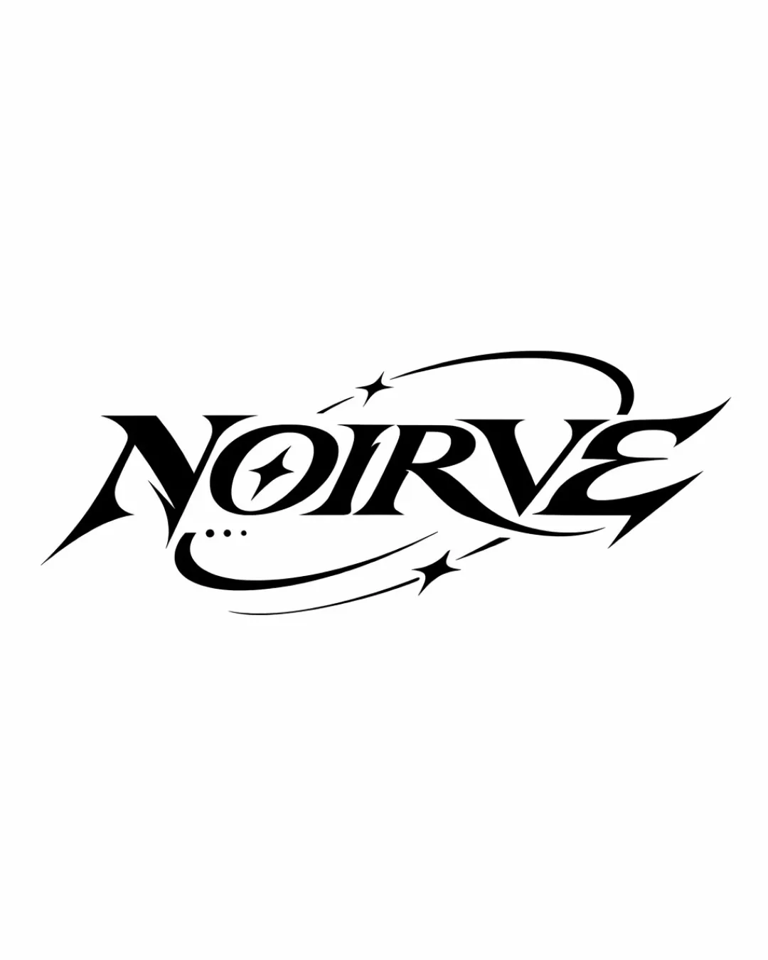
NOIRVE logo review
3.3/5
Logo score

NOIRVE

Essential logo review

A dynamic, original wordmark that quickly signals boldness and energy, but its extreme stylization and wide spread mean legibility and spatial efficiency should be checked before production.

This wordmark has a workable foundation; improving text readability is the clearest next step.

Wordmark Bold Stylized Inscription With Dynamic Swashes And Custom Details Fitness / Active Lifestyle
3/5
Legibility
4/5
Originality
3/5
Balance
3/5
Scale
@creative322803
Your next steps

What to fix first

Focus on the changes that matter. Keep what makes the logo work.

1

wordmark

Test the logo at reduced sizes to confirm quick legibility in signage and apparel contexts.

High priority Worth testing Medium effort

The stylized 'O' with a star-like cutout and the sharp, aggressive typeface could cause momentary hesitation in reading, especially at small sizes or fast glances.

See the category review
Detailed review

Logo performance breakdown

4/5

Brief & logo match

The aggressive, energetic forms convincingly express a bold and modern fitness brand, but the stylization may slightly challenge quick legibility and versatile use.

5/5

Misinterpretations

  • No unintended readings or problematic associations.
4/5

Originality

  • Distinct custom letterforms and energetic swashes elevate the wordmark above generic fitness logos.
3/5

Legibility

Available in Advanced logo reviews
3/5

Balance alignment

Available in Advanced logo reviews
3/5

Scalability

This review includes a score but no supporting explanation for this category.

Try your own review

Wondering how your logo performs?

Get a clear logo score, key risks, and priority fix ideas before your client or audience sees it.

Review my logo