 View review
Logo score
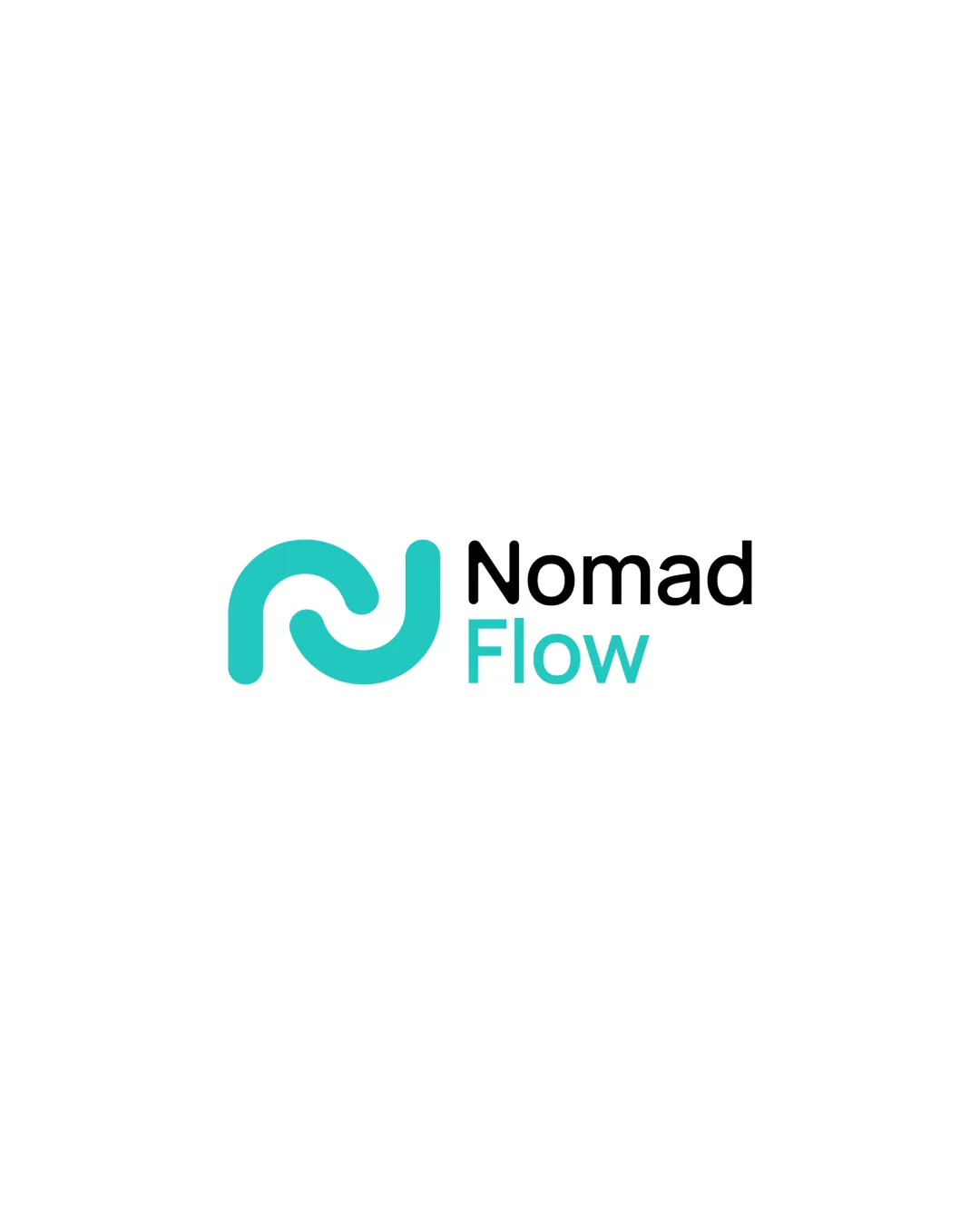
Logo review ofNomad Flow
Review the detailed scores below to see what is working and what should be refined first.
Legibility
Originality
Misread
Balance
Scale
Detailed review
Logo performance breakdown
Legibility
![]() Clear, sans-serif typeface ensures high readability.
Clear, sans-serif typeface ensures high readability.![]() Good contrast between the black and turquoise text against the white background.
Good contrast between the black and turquoise text against the white background.
Originality
![]() Subtle integration of N and F gives some personality.
Subtle integration of N and F gives some personality.![]() Modern abstract form separates it from completely generic icons.
Modern abstract form separates it from completely generic icons.
![]() Abstract, flowing monograms are a popular trope in tech and startup branding, so this execution isn't highly unique.
Abstract, flowing monograms are a popular trope in tech and startup branding, so this execution isn't highly unique.![]() No discernible use of negative space or unique twist that makes the mark instantly memorable.
No discernible use of negative space or unique twist that makes the mark instantly memorable.
Color harmony
![]() Colors are harmonious, limited, and consistent throughout the identity.
Colors are harmonious, limited, and consistent throughout the identity.![]() Turquoise pops against the black and white, creating a fresh, clean look.
Turquoise pops against the black and white, creating a fresh, clean look.
Turquoise
#19C9C3
Black
#000000
White
#FFFFFF
Balance alignment
![]() The symbol and wordmark are well-aligned horizontally, maintaining a balanced left-to-right flow.
The symbol and wordmark are well-aligned horizontally, maintaining a balanced left-to-right flow.![]() Visual weight is evenly distributed between the symbol and text.
Visual weight is evenly distributed between the symbol and text.

Scalability
![]() Logo mark is simple and bold, which retains clarity at small sizes.
Logo mark is simple and bold, which retains clarity at small sizes.![]() Minimal details adapt well to various applications like mobile icons and business cards.
Minimal details adapt well to various applications like mobile icons and business cards.![]() Works effectively on both white and colored backgrounds due to the strong color contrast.
Works effectively on both white and colored backgrounds due to the strong color contrast.
![]() The relatively thin line weight in the symbol may lose some definition at extremely small sizes or in embroidery.
The relatively thin line weight in the symbol may lose some definition at extremely small sizes or in embroidery.![]() The use of color in the symbol and the word 'Flow' may present issues when using limited or monochrome printing.
The use of color in the symbol and the word 'Flow' may present issues when using limited or monochrome printing.
200x250 px
100×125 px
50×62 px
Misinterpretations
![]() No inappropriate or ambiguous visual interpretations detected.
No inappropriate or ambiguous visual interpretations detected.![]() Abstract mark remains professional and neutral.
Abstract mark remains professional and neutral.
Symbol & text fit
![]() Logomark’s round, geometric style is echoed in the friendly, rounded sans-serif typeface.
Logomark’s round, geometric style is echoed in the friendly, rounded sans-serif typeface.
![]() Color from the logomark is carried into the wordmark, creating cohesion.
Color from the logomark is carried into the wordmark, creating cohesion.
Try your own review
Review my logo
Wondering how your logo performs?
Get a clear logo score, key risks, and priority fix ideas before your client or audience sees it.
Keep exploring


