Wondering how your logo performs? 🧐
Get professional logo reviews in seconds and catch design issues in time.
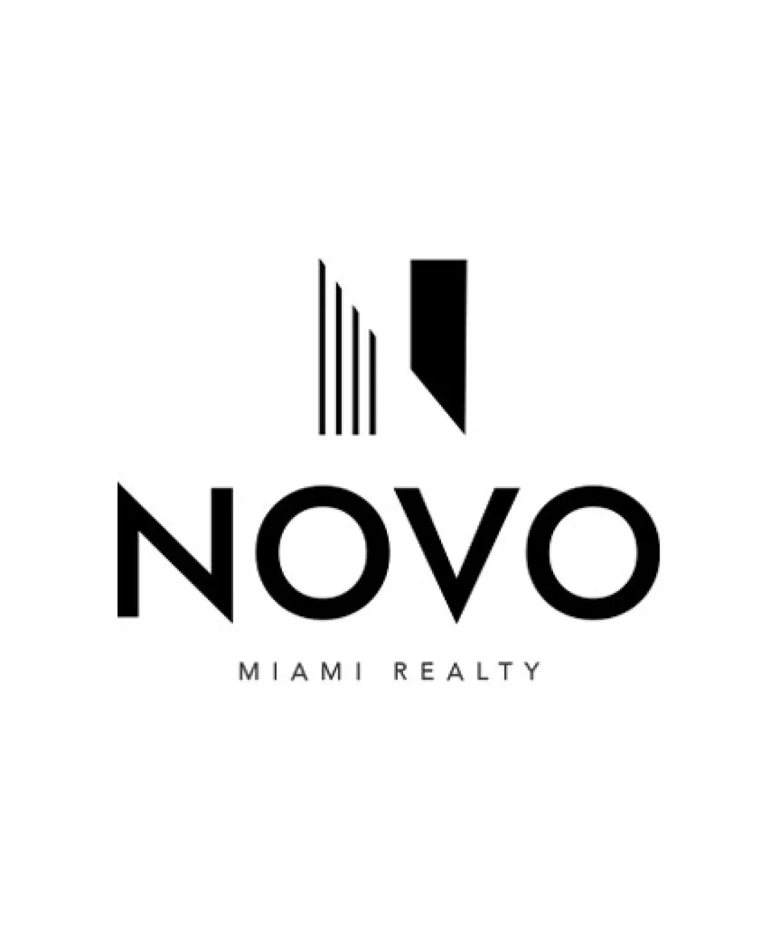
Try it Now!Logo review of NOVO MIAMI REALTY
 Logo analysis by AI
Logo type:
Style:
Detected symbol:
Negative space:
Detected text:
Business industry:
Review requested by Agentimage
**If AI can recognize or misinterpret it, so can people.
Structured logo review
Legibility
![]() Clear, bold sans-serif font ensures high readability
Clear, bold sans-serif font ensures high readability![]() Both the main name and the descriptor are easily distinguished
Both the main name and the descriptor are easily distinguished
Scalability versatility
![]() Minimal details ensure good scaling on various applications
Minimal details ensure good scaling on various applications![]() Logo mark is recognizable at both large and small sizes
Logo mark is recognizable at both large and small sizes
![]() Thin vertical bars in the symbol may lose clarity at very small sizes, such as embroidery or favicons
Thin vertical bars in the symbol may lose clarity at very small sizes, such as embroidery or favicons
200x250 px
100×125 px
50×62 px
Balance alignment
![]() Central alignment of symbol and type achieves harmony
Central alignment of symbol and type achieves harmony![]() Consistent stroke weight creates visual coherence
Consistent stroke weight creates visual coherence
![]() Slight imbalance between the heavy mass of the 'N' symbol and the lightness of the thin bars
Slight imbalance between the heavy mass of the 'N' symbol and the lightness of the thin bars

Originality
![]() Custom stylized 'N' adds uniqueness
Custom stylized 'N' adds uniqueness![]() Integration of architectural elements enhances relevance
Integration of architectural elements enhances relevance
![]() Building-shaped logos are common in real estate, somewhat reducing distinctiveness
Building-shaped logos are common in real estate, somewhat reducing distinctiveness
Logomark wordmark fit
![]() Logomark and wordmark share a modern look and clean geometry
Logomark and wordmark share a modern look and clean geometry![]() Symbol directly connects to the first letter of the name, reinforcing brand identity
Symbol directly connects to the first letter of the name, reinforcing brand identity
Aesthetic look
![]() Minimalist, sophisticated appearance
Minimalist, sophisticated appearance![]() Consistent color palette and clean lines create visual appeal
Consistent color palette and clean lines create visual appeal
Dual meaning and misinterpretations
![]() No inappropriate or confusing visual elements identified
No inappropriate or confusing visual elements identified
Color harmony
![]() Monochrome palette is timeless and versatile
Monochrome palette is timeless and versatile![]() High contrast ensures strong visibility
High contrast ensures strong visibility
Black
#000000
White
#FFFFFF


