Category Fit
Good fitStrong, clearly related to interior or spatial problem-solving.
Symbol's meaning aligns with market expectations.
Visually distinctive and conceptually on-brief; suitable for client presentation after minor tweaks.
The most important fixes to handle before polishing the full presentation.
Helps prevent any potential confusion with the brand name at smaller sizes.
Impact: Improves Instant Comprehension And Lowers Chance Of Misreading. · Effort: Medium
Ensures the geometric person symbol remains clear and identifiable at tiny scale.
Impact: Improves Mark Recognition Across All Digital Applications. · Effort: Medium
Single-color may be limiting for all uses, though it's a strong lead for now.
Impact: Adds Visual Flexibility For Future Brand Collateral. · Effort: Low
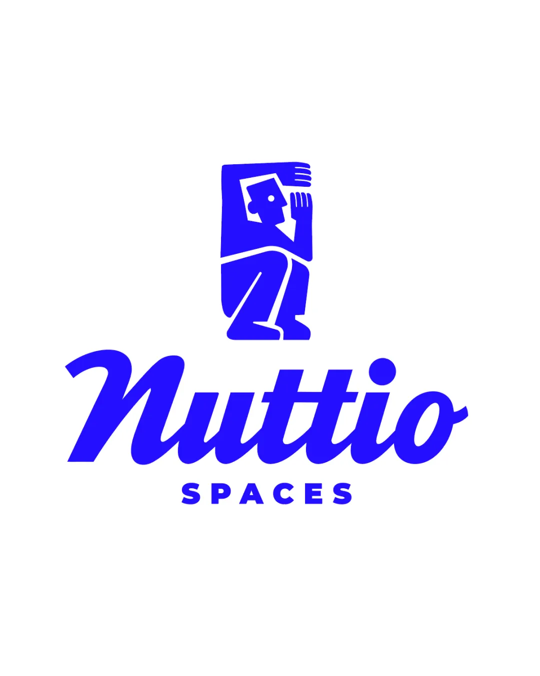
'Nuttio' is clear with distinctive script.
'SPACES' in uppercase is readable.
Slight risk of 'Nuttio' script being misread due to connected letterforms.
Crouching person symbol is unique and concept-relevant.
Distinctive script style.
Geometric human figures are not uncommon in interior-related brands.
Cohesive and energetic blue palette.
Strong contrast on white background.
Monochrome palette is bold but may limit flexibility for some brand contexts.
Blue
#1700FF
White
#FFFFFF
Your palette is close. Explore sharper color combinations with Colorfly.design before updating the logo.
Explore palettes Good alignment between mark and text.
Weight of logomark and wordmark is balanced.
The space above 'SPACES' could be tighter for cohesion.
Simple mark is recognizable at small sizes.
Works well in single color.
Details in the mark (face/limbs) may get lost at favicon size.
200x250 px
100×125 px
50×62 px
No unintended or inappropriate misinterpretations detected.
Mark and wordmark complement each other visually and conceptually.
Interior Design For Small Studio Apartments & Home Offices: The crouching figure inside a rectangle cleverly represents compact living, directly reflecting the brand's specialization in small spaces.
Category-appropriate with moderate differentiation.
Logo clearly signals an interior/small-spaces focus and is visually distinct from generically minimal marks, though geometric figures are somewhat common in the space.
Strong, clearly related to interior or spatial problem-solving.
Symbol's meaning aligns with market expectations.
Moderate; geometric human motifs have some category use, though this execution is playful.
May risk blending in without supporting brand voice.
Inviting, creative approach that avoids luxury clichés.
Signaling creativity and approachability fits the niche target.
Where the logo is ready to use, where it needs adjustment, and where it may break in real applications.
Good legibility and presence.
Face/hand details may blur; suggest a simplified small-scale mark.
Logo is well-suited for monochrome reproduction.
Mark remains recognizable, but consider slightly bolder lines.
Bold color and form are effective in print.
A practical checklist of the logo versions to prepare before sending the final files to a client or team.
Primary usage for most applications.
For one-color print scenarios and versatile backgrounds.
Required for avatars, app icons, and small-format uses.
Handy for constrained or tall/narrow spaces.
Ensures recognizability at tiny scale without detail loss.
A playful, geometric person crouched inside a rectangle sits above the friendly 'Nuttio' script and the modern sans-serif 'SPACES', rendered in energetic blue.
Nuttio uses a distinctive italic cursive style, conveying creativity and approachability, while 'SPACES' grounds it with a bold, stable all-caps sans-serif.
The crouching, geometric human figure inside a box abstractly symbolizes compact, optimized living and working environments.
A playful, compact logo that visually embodies maximized living and working in small spaces.
The geometric figure in a box cleverly captures the brand's 'small space' niche.
Blue script and modern font combination project energy and friendliness.
Get a clear logo score, key risks, and priority fix ideas before your client or audience sees it.