OFT wordmark logo logo review
3.3/5
Logo score

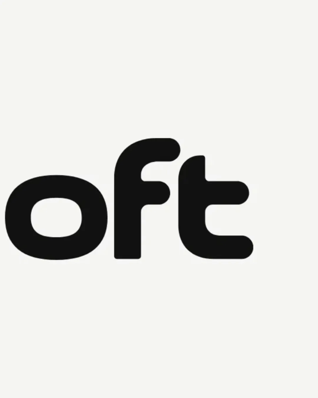
OFT wordmark logo

Essential logo review

The logo features a clear, friendly wordmark style but fails to show the full brand and risks generic appearance; full brand inclusion and minor differentiators are needed.

This wordmark has a workable foundation; improving distinctiveness is the clearest next step.

Wordmark Rounded Geometric Sans-serif Social App / Meetings
3/5
Legibility
2/5
Originality
4/5
Balance
5/5
Scale
Your next steps

What to fix first

Focus on the changes that matter. Keep what makes the logo work.

1

wordmark

Adjust artwork to include the entire brand name for clarity and completeness.

High priority Visible issue Low effort

The leftmost part is cropped, making it unclear whether there is a missing initial letter; only 'oft' is visible, so the full brand name cannot be verified.

See the category review

Detailed review

Logo performance breakdown

3/5

Brief & logo match

The logo's approachable wordmark suits a friendship app but lacks the full name and any meeting-related visual cues, limiting its distinctiveness and clarity.

5/5

Scalability

  • Bold, clean lines scale well at most sizes
5/5

Misinterpretations

  • No unintended meanings detected
4/5

Balance alignment

  • Letters are evenly weighted and well aligned
Uploaded logoAlignment guide overlay

Inspect spacing with the guide. Optical balance may differ from geometric centering.

3/5

Legibility

Available in Advanced logo reviews
2/5

Originality

Available in Advanced logo reviews
Try your own review

Wondering how your logo performs?

Get a clear logo score, key risks, and priority fix ideas before your client or audience sees it.

Review my logo