Wondering how your logo performs? 🧐
Get professional logo reviews in seconds and catch design issues in time.
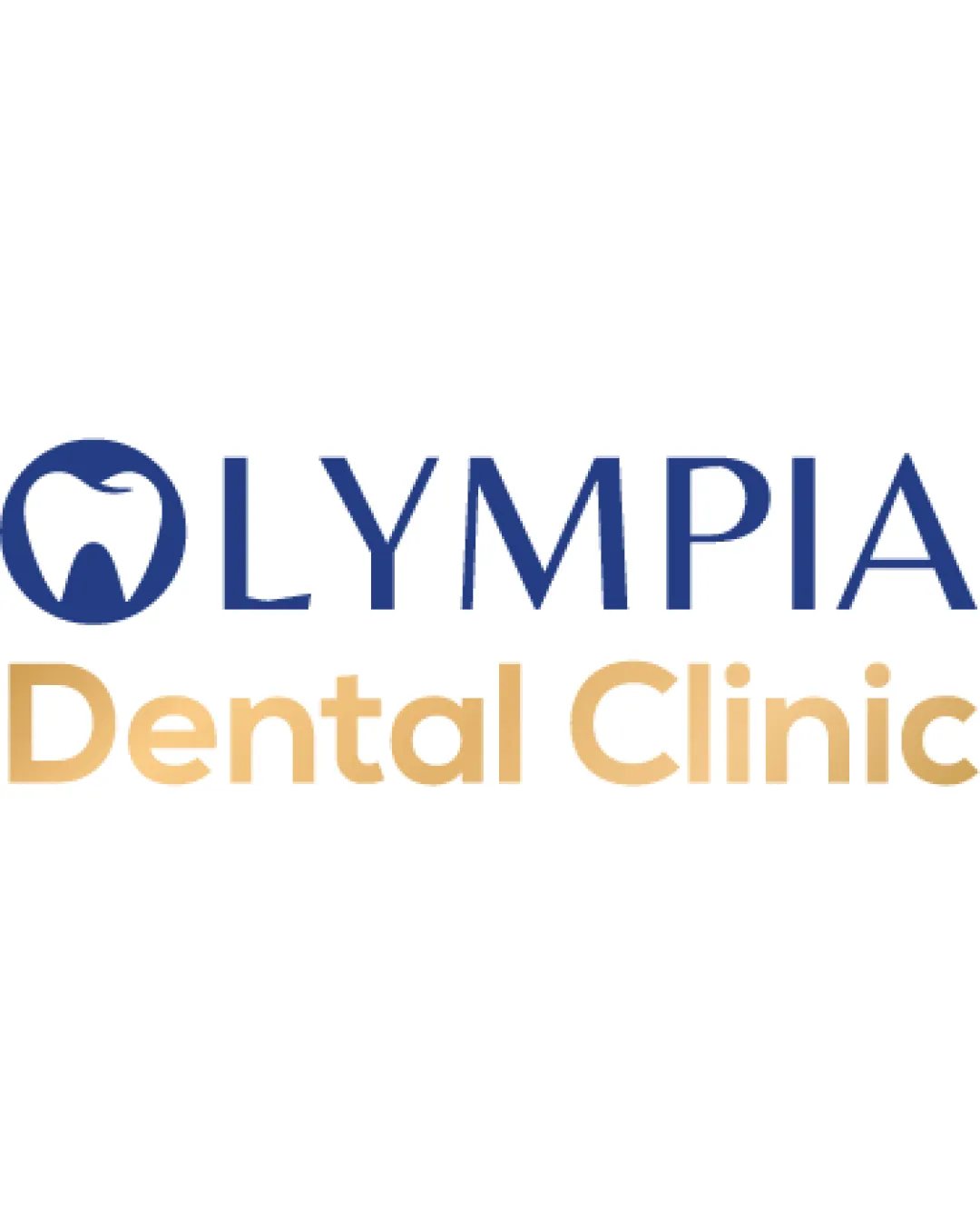
Try it Now!Logo review of OLYMPIA Dental Clinic
 Logo analysis by AI
Recognized style:
Logo type:
Detected symbol:
Detected text:
Business industry:
Review requested by Kolohoho
**If AI can recognize or misinterpret it, so can people.
Structured logo review
Legibility
![]() Clear and readable text with good font choice.
Clear and readable text with good font choice.
Scalability versatility
![]() Simple design allows scalability across different media.
Simple design allows scalability across different media.
![]() The detailed tooth symbol may lose some clarity at very small sizes.
The detailed tooth symbol may lose some clarity at very small sizes.
200x250 px
100×125 px
50×62 px
Balance alignment
![]() Good balance between symbol and text, visually aligned.
Good balance between symbol and text, visually aligned.

Originality
![]() Integration of tooth symbol into the letter is clever.
Integration of tooth symbol into the letter is clever.
![]() Tooth symbols are common in the dental industry, reducing uniqueness.
Tooth symbols are common in the dental industry, reducing uniqueness.
Logomark wordmark fit
![]() The text and symbol create a cohesive and unified appearance.
The text and symbol create a cohesive and unified appearance.
Aesthetic look
![]() Aesthetic and professional look suitable for a dental clinic.
Aesthetic and professional look suitable for a dental clinic.
Cultural sensitivity dual meaning
![]() No cultural sensitivity issues detected.
No cultural sensitivity issues detected.
Color harmony
![]() The blue and gold colors complement each other well.
The blue and gold colors complement each other well.
![]() Might be slightly generic and not stand out boldly.
Might be slightly generic and not stand out boldly.


