 View review
Logo score
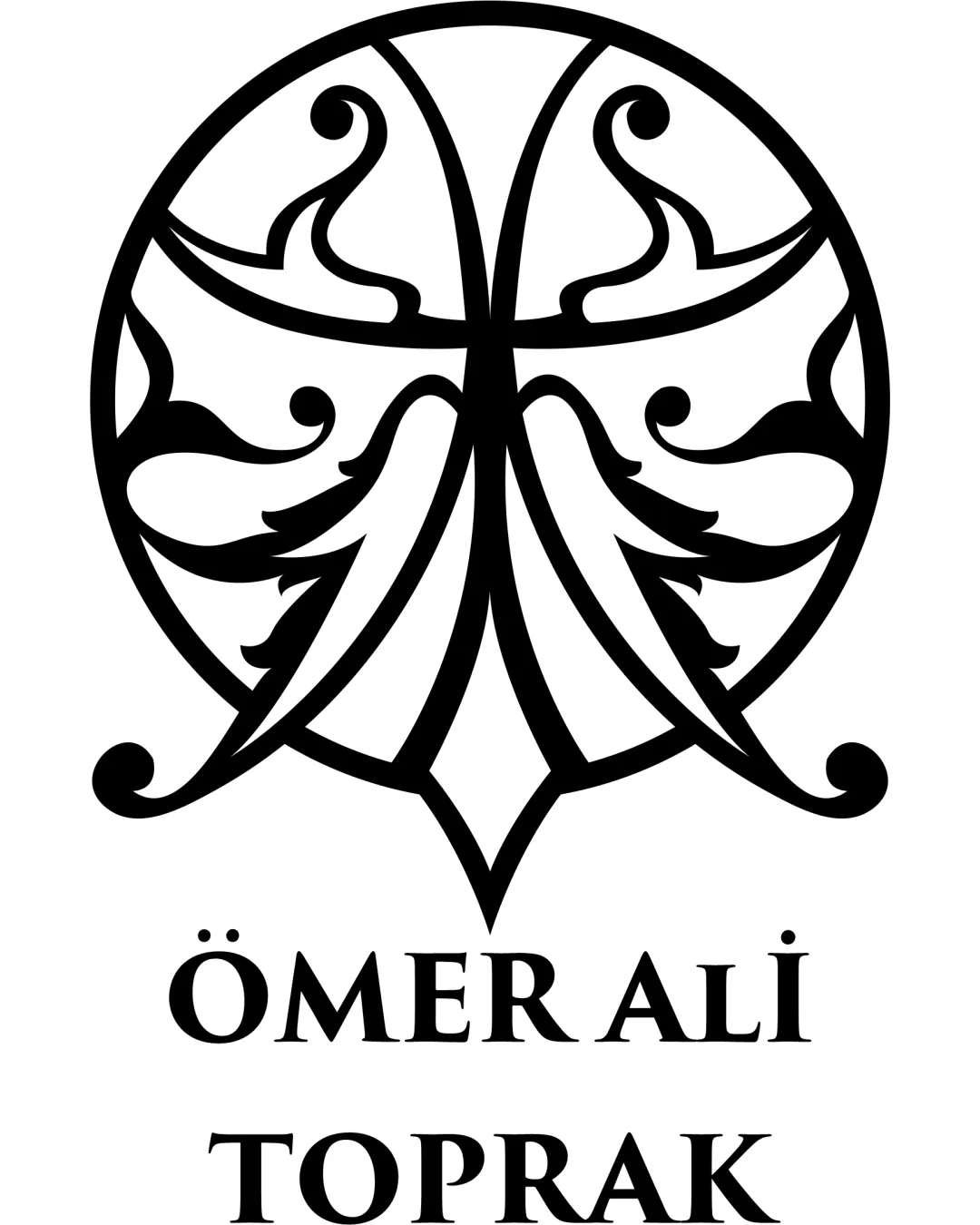
Logo review ofÖmer Ali̇ Toprak
Review the detailed scores below to see what is working and what should be refined first.
Legibility
Originality
Misread
Balance
Scale
Detailed review
Logo performance breakdown
Legibility
![]() Text is clear and highly readable
Text is clear and highly readable![]() Lettering uses generous spacing and high contrast
Lettering uses generous spacing and high contrast
Originality
![]() Distinct ornamental style distinguishes the logo
Distinct ornamental style distinguishes the logo![]() Use of abstract botanical forms is unique compared to more generic marks
Use of abstract botanical forms is unique compared to more generic marks
![]() Ornamental circular motifs are somewhat common in classic and artisan branding
Ornamental circular motifs are somewhat common in classic and artisan branding
Color harmony
![]() Classic black and white palette provides timeless elegance
Classic black and white palette provides timeless elegance![]() Strong contrast maximizes visual clarity
Strong contrast maximizes visual clarity
Black
#000000
White
#FFFFFF
Balance alignment
![]() Strong vertical symmetry in the logomark
Strong vertical symmetry in the logomark![]() Text is centered neatly below the symbol
Text is centered neatly below the symbol
![]() Letterform weight feels lighter than the heavy central emblem, creating slight imbalance
Letterform weight feels lighter than the heavy central emblem, creating slight imbalance

Scalability
![]() Bold lines maintain reasonable clarity at medium sizes
Bold lines maintain reasonable clarity at medium sizes![]() Single-color design aids simple reproduction
Single-color design aids simple reproduction
![]() Intricate line work within the emblem may become muddled at small sizes, particularly for embroidery or favicon use
Intricate line work within the emblem may become muddled at small sizes, particularly for embroidery or favicon use![]() Fine internal details risk loss of clarity on very small applications
Fine internal details risk loss of clarity on very small applications
200x250 px
100×125 px
50×62 px
Misinterpretations
![]() No inappropriate or accidental negative imagery
No inappropriate or accidental negative imagery
Symbol & text fit
![]() Traditional typeface matches the classic, ornate feel of the emblem
Traditional typeface matches the classic, ornate feel of the emblem
![]() Both elements communicate sophistication and heritage
Both elements communicate sophistication and heritage
![]() Slight difference in visual weight between logomark and wordmark
Slight difference in visual weight between logomark and wordmark
Try your own review
Review my logo
Wondering how your logo performs?
Get a clear logo score, key risks, and priority fix ideas before your client or audience sees it.
Keep exploring


