 View review
Logo score
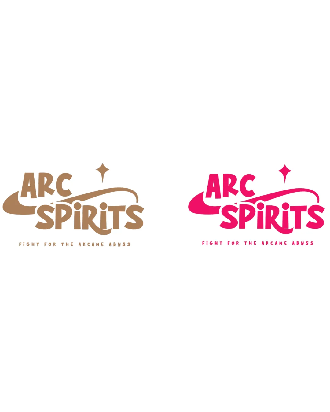
Logo review ofArc Spirits, Fight For The Arcane Abyss
Review the detailed scores below to see what is working and what should be refined first.
Legibility
Originality
Misread
Balance
Scale
Detailed review
Logo performance breakdown
Legibility
![]() Main text 'ARC SPIRITS' is bold and easy to read.
Main text 'ARC SPIRITS' is bold and easy to read.![]() Distinct letterforms enhance clarity.
Distinct letterforms enhance clarity.
![]() Tagline is small and can become difficult to read at smaller sizes or from a distance.
Tagline is small and can become difficult to read at smaller sizes or from a distance.
Originality
![]() The arc and diamond motif give a unique fantasy/magical atmosphere.
The arc and diamond motif give a unique fantasy/magical atmosphere.![]() Distinctive letterforms, especially in ‘SPIRITS’.
Distinctive letterforms, especially in ‘SPIRITS’.
![]() Comet/arc and star elements are common in fantasy/game branding.
Comet/arc and star elements are common in fantasy/game branding.![]() Logo risks blending in with other arcane/fantasy-oriented brands if not further differentiated.
Logo risks blending in with other arcane/fantasy-oriented brands if not further differentiated.
Color harmony
![]() Strong distinction between different logo versions, each with two primary colors.
Strong distinction between different logo versions, each with two primary colors.![]() Colors convey energy and theme appropriate to industry.
Colors convey energy and theme appropriate to industry.
![]() Color choice may limit adaptability against varying backgrounds.
Color choice may limit adaptability against varying backgrounds.![]() Vivid pink version may not be suitable for all applications or professional contexts.
Vivid pink version may not be suitable for all applications or professional contexts.
Teak
#B7996E
Cerise Pink
#EC2477
White
#FFFFFF
Your palette is close. Explore sharper color combinations with Colorfly.design before updating the logo.
Explore palettesBalance alignment
![]() Good alignment between arc, star, and main text.
Good alignment between arc, star, and main text.![]() Elements are visually cohesive and readable together.
Elements are visually cohesive and readable together.
![]() Swoosh underlines and overlaps create slight visual heaviness on the left, making it feel marginally unbalanced.
Swoosh underlines and overlaps create slight visual heaviness on the left, making it feel marginally unbalanced.![]() Spacing between tagline and main logo is rather wide, creating a disconnect.
Spacing between tagline and main logo is rather wide, creating a disconnect.

Scalability
![]() Bold lines ensure logo retains some clarity at medium scales, works for digital banners and packaging.
Bold lines ensure logo retains some clarity at medium scales, works for digital banners and packaging.
![]() Tagline and fine details (diamond, swoosh terminals) risk becoming indistinct or messy at small sizes such as favicon or embroidery.
Tagline and fine details (diamond, swoosh terminals) risk becoming indistinct or messy at small sizes such as favicon or embroidery.![]() Complex to apply in extremely small formats without simplification.
Complex to apply in extremely small formats without simplification.
200x250 px
100×125 px
50×62 px
Misinterpretations
![]() No inappropriate dual meanings or offensive imagery detected.
No inappropriate dual meanings or offensive imagery detected.![]() Abstract elements remain safe and relevant to theme.
Abstract elements remain safe and relevant to theme.
Symbol & text fit
![]() Swoosh and diamond integrate naturally with the text.
Swoosh and diamond integrate naturally with the text.
![]() Visual language matches wordmark style.
Visual language matches wordmark style.
![]() Swoosh shape could feel slightly forced, making the top heavier than the base.
Swoosh shape could feel slightly forced, making the top heavier than the base.
Try your own review
Review my logo
Wondering how your logo performs?
Get a clear logo score, key risks, and priority fix ideas before your client or audience sees it.
Keep exploring