View review
Logo score
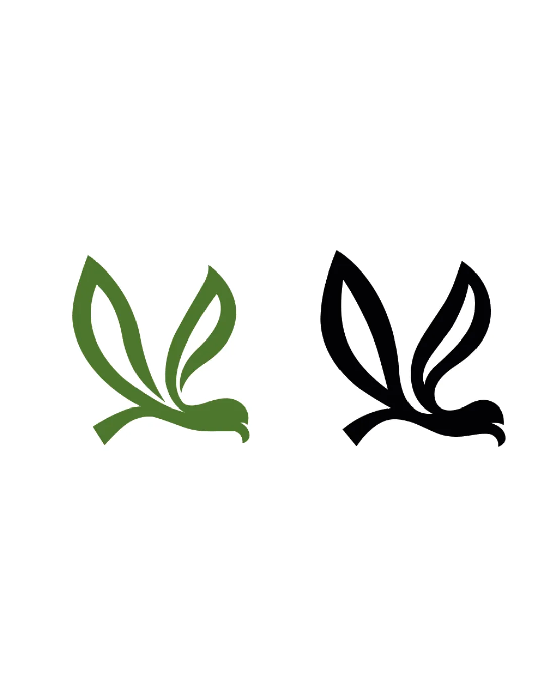
Logo review ofStylized Bird Formed With Leaf Elements
Review the detailed scores below to see what is working and what should be refined first.
Originality
Misread
Balance
Scale
Detailed review
Logo performance breakdown
Originality
![]() Organic fusion of bird and leaves is relevant and clever for an environmental industry.
Organic fusion of bird and leaves is relevant and clever for an environmental industry.![]() The negative space enhances visual interest and concept delivery.
The negative space enhances visual interest and concept delivery.
![]() Bird with leaf wings is not groundbreaking and has been explored in eco-related branding.
Bird with leaf wings is not groundbreaking and has been explored in eco-related branding.
Color harmony
![]() Very effective use of a single color for the logo plus background, keeping the palette clean.
Very effective use of a single color for the logo plus background, keeping the palette clean.![]() Green connotes nature and sustainability, enhancing suitability for eco-based industries.
Green connotes nature and sustainability, enhancing suitability for eco-based industries.
Olive Green
#547239
Black
#000000
White
#FFFFFF
Balance alignment
![]() Design displays a symmetric flow and natural sense of movement.
Design displays a symmetric flow and natural sense of movement.![]() Wings/leaves are proportionately sized and create a visually pleasing composition.
Wings/leaves are proportionately sized and create a visually pleasing composition.
![]() The central 'body' area is a bit heavier than the wingtips, causing minor imbalance on the right leg.
The central 'body' area is a bit heavier than the wingtips, causing minor imbalance on the right leg.![]() Curve transitions could be visually smoother for a more refined finish.
Curve transitions could be visually smoother for a more refined finish.

Scalability
![]() The logo uses bold, simple lines which will scale cleanly for small applications like favicons or embroidery.
The logo uses bold, simple lines which will scale cleanly for small applications like favicons or embroidery.![]() Minimalist style ensures good visibility on large formats such as billboards and banners.
Minimalist style ensures good visibility on large formats such as billboards and banners.![]() Monochrome variant provided, supporting versatile use across light and dark backgrounds.
Monochrome variant provided, supporting versatile use across light and dark backgrounds.
200x250 px
100×125 px
50×62 px
Misinterpretations
![]() No inappropriate shapes or unintended connotations are visible.
No inappropriate shapes or unintended connotations are visible.![]() Dual meaning is clear and intentional, referencing both a bird and foliage.
Dual meaning is clear and intentional, referencing both a bird and foliage.
Try your own review
Review my logo
Wondering how your logo performs?
Get a clear logo score, key risks, and priority fix ideas before your client or audience sees it.
Keep exploring