Wondering how your logo performs? 🧐
Get professional logo reviews in seconds and catch design issues in time.
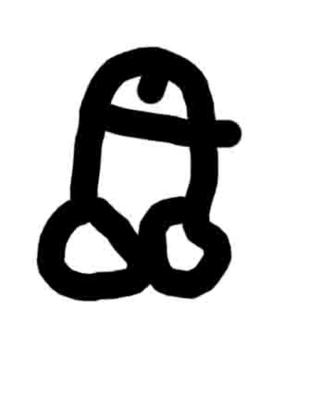
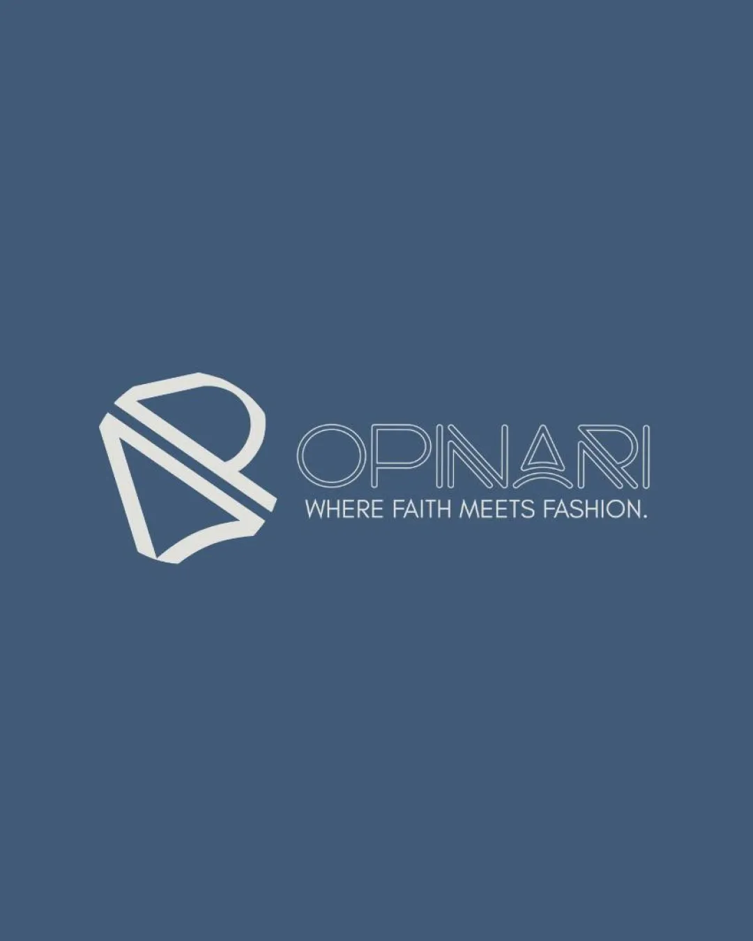
Try it Now!Logo review of OPINARI, WHERE FAITH MEETS FASHION.
 Logo analysis by AI
Logo type:
Style:
Detected symbol:
Negative space:
Detected text:
Business industry:
Review requested by Agosdatcom
**If AI can recognize or misinterpret it, so can people.
Structured logo review
Legibility
![]() Tagline is readable and clear against the background
Tagline is readable and clear against the background![]() Main wordmark uses high-contrast, minimalist lines
Main wordmark uses high-contrast, minimalist lines
![]() Letterforms in 'OPINARI' may be difficult to read at small sizes due to thin line weight and unconventional stylization, particularly in the A and R
Letterforms in 'OPINARI' may be difficult to read at small sizes due to thin line weight and unconventional stylization, particularly in the A and R
Scalability versatility
![]() Simple geometric logo and line art enable print at larger scales such as signage and billboards
Simple geometric logo and line art enable print at larger scales such as signage and billboards![]() Solid performance for digital mockups and apparel tags
Solid performance for digital mockups and apparel tags
![]() Thin lines and intricate details may lose clarity at small sizes, particularly in favicon or embroidery contexts
Thin lines and intricate details may lose clarity at small sizes, particularly in favicon or embroidery contexts![]() Tagline will likely become illegible on smaller applications
Tagline will likely become illegible on smaller applications
200x250 px
100×125 px
50×62 px
Balance alignment
![]() Logomark aligns left to the wordmark and tagline, creating a clear visual hierarchy
Logomark aligns left to the wordmark and tagline, creating a clear visual hierarchy![]() Typography and symbol have a consistent visual weight and distribution
Typography and symbol have a consistent visual weight and distribution
![]() Logomark’s weight and complexity slightly outweigh the lightweight wordmark, creating a subtle imbalance
Logomark’s weight and complexity slightly outweigh the lightweight wordmark, creating a subtle imbalance

Originality
![]() Abstract combination of initial letters in the logomark demonstrates inventive thinking
Abstract combination of initial letters in the logomark demonstrates inventive thinking![]() Distinct custom-made typeface especially in the ‘A’ and ‘R’
Distinct custom-made typeface especially in the ‘A’ and ‘R’
![]() Geometric shield/monogram concepts are becoming increasingly common in modern branding, reducing uniqueness
Geometric shield/monogram concepts are becoming increasingly common in modern branding, reducing uniqueness
Logomark wordmark fit
![]() Thin, linear style of both wordmark and logomark provides stylistic unity
Thin, linear style of both wordmark and logomark provides stylistic unity![]() Logomark visually echoes shapes within the wordmark (notably the A)
Logomark visually echoes shapes within the wordmark (notably the A)
![]() Logomark slightly overpowers the delicate typeface, which could cause issues in horizontal layouts
Logomark slightly overpowers the delicate typeface, which could cause issues in horizontal layouts
Aesthetic look
![]() Cohesive, modern, and stylish design appropriate for the fashion industry
Cohesive, modern, and stylish design appropriate for the fashion industry![]() Minimal color palette keeps it visually clean
Minimal color palette keeps it visually clean
![]() Letter details verge on being overstyled, risking trendiness over timelessness
Letter details verge on being overstyled, risking trendiness over timelessness
Dual meaning and misinterpretations
![]() No inappropriate, violent, or ambiguous elements detected
No inappropriate, violent, or ambiguous elements detected![]() Shield motif connects positively with the faith-based concept
Shield motif connects positively with the faith-based concept
Color harmony
![]() Excellent, simple two-tone color palette creates high contrast and brand flexibility
Excellent, simple two-tone color palette creates high contrast and brand flexibility![]() Blues and off-whites reinforce a calm, trustworthy fashion aesthetic
Blues and off-whites reinforce a calm, trustworthy fashion aesthetic
dark blue
#446385
off white
#EDF2F7