 View review
Logo score
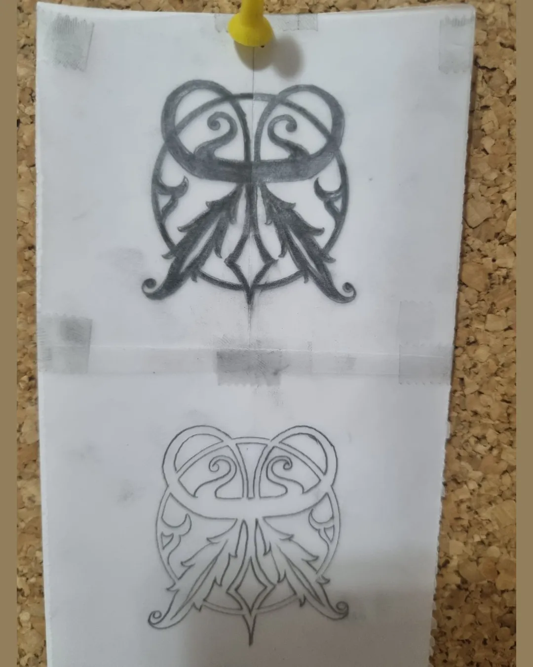
Logo review ofOrnate Symmetrical Emblem With Two Mirrored Feathe..
Review the detailed scores below to see what is working and what should be refined first.
Originality
Misread
Balance
Scale
Action plan
What to fix first
The most important fixes to handle before polishing the full presentation.
1
Fix possible misinterpretation
High priorityAmbiguous symbol could be misread as a mask, animal face, or unrelated icon, risking brand confusion.
Impact: High · Effort: Medium
Detailed review
Logo performance breakdown
Originality
![]() Custom, ornamental arrangement is uncommon.
Custom, ornamental arrangement is uncommon.![]() Stylized feather and swirl motif is visually unique in execution.
Stylized feather and swirl motif is visually unique in execution.
![]() Draws on generic tattoo/tribal or heraldic visual languages, reducing perceived uniqueness.
Draws on generic tattoo/tribal or heraldic visual languages, reducing perceived uniqueness.![]() No clear, recognizable symbol increases risk of blending into generic decorative marks.
No clear, recognizable symbol increases risk of blending into generic decorative marks.
Color harmony
![]() Limited monochrome palette is cohesive and versatile.
Limited monochrome palette is cohesive and versatile.![]() No jarring or clashing colors present.
No jarring or clashing colors present.
DarkGray
#333333
White
#FFFFFF
Balance alignment
![]() Mostly symmetrical and visually centered, giving a stable, balanced feel.
Mostly symmetrical and visually centered, giving a stable, balanced feel.![]() Frame and mirrored motif provide overall harmony.
Frame and mirrored motif provide overall harmony.
![]() Hand-drawn imperfections and line width variations disrupt perfect symmetry.
Hand-drawn imperfections and line width variations disrupt perfect symmetry.

Scalability
![]() Simple color scheme increases application flexibility.
Simple color scheme increases application flexibility.![]() Design retains core shape at moderate sizes.
Design retains core shape at moderate sizes.
![]() Extremely intricate details and thin lines risk vanishing at small scale, making it unsuitable for embroidery, stamps, or mobile icons.
Extremely intricate details and thin lines risk vanishing at small scale, making it unsuitable for embroidery, stamps, or mobile icons.![]() Fine elements may not reproduce well in single-color or low-resolution applications.
Fine elements may not reproduce well in single-color or low-resolution applications.
200x250 px
100×125 px
50×62 px
Misinterpretations
![]() No obvious offensive imagery on initial viewing.
No obvious offensive imagery on initial viewing.![]() Mirrored shapes and negative space create visual intrigue.
Mirrored shapes and negative space create visual intrigue.
![]() Ambiguous symbol could be misread as a mask, animal face, or unrelated icon, risking brand confusion.
Ambiguous symbol could be misread as a mask, animal face, or unrelated icon, risking brand confusion.
Try your own review
Review my logo
Wondering how your logo performs?
Get a clear logo score, key risks, and priority fix ideas before your client or audience sees it.
Keep exploring


