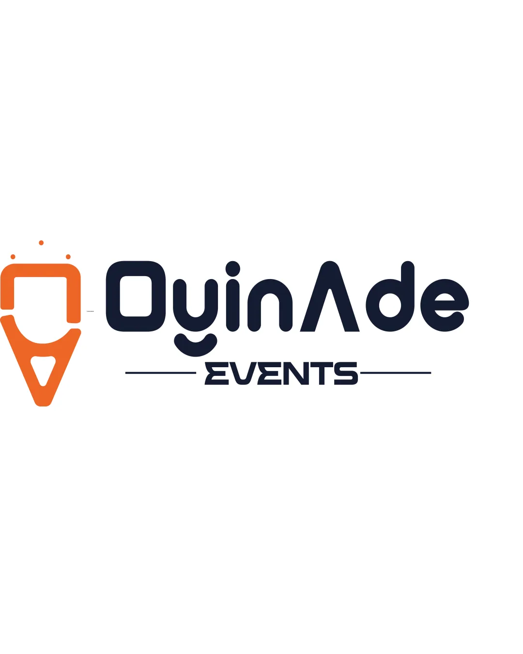
OyinAde EVENTS logo review
3.5 / 5
Logo score
Logo review of

Oyinade Events

Functional, modern, and readable logo, but needs a stronger, more distinctive concept for top-tier professional impact.

Combination Mark Modern With Geometric Sans-serif Typography Events
4/5
Legibility
3/5
Originality
4/5
Misread
3.5/5
Balance
4/5
Scale
Action plan

What to fix first

The most important fixes to handle before polishing the full presentation.

1

Refine the icon to better reflect the events theme or add a subtle, relevant detail.

High priority

Current abstract icon lacks unique connection to events, limiting memorability.

Impact: Greater Distinctiveness And Immediate Industry Recognition. · Effort: Medium

2

Slightly enhance icon-wordmark visual connection; consider minor realignment or base anchoring for 'EVENTS'.

Medium priority

Minor visual tweaks would support polish and brand perception.

Impact: Improves Overall Balance And Professional Cohesion. · Effort: Low

Detailed review

Logo performance breakdown

4/5

Legibility

Checkmark icon 'OyinAde EVENTS' is largely readable and clear

Warning icon The uppercase 'A' as a stylized 'nA' may create a visual break in the word, momentarily slowing recognition

3/5

Originality

Checkmark icon Distinctive type and icon combination

Warning icon Abstract icon is generic and does not clearly convey a unique story or memorable association

4/5

Color harmony

Checkmark icon Strong and simple palette with good contrast

Orange
#FF7300

Charcoal Blue
#181F34

Your palette is close. Refine the color roles and combinations before updating the logo.

Build brand colors
3.5/5

Balance alignment

Checkmark icon Overall horizontal alignment is good; mark and wordmark are well-related

Warning icon Vertical alignment between icon and wordmark feels slightly disconnected; 'EVENTS' could be more firmly anchored

logo 200x250 pixels scalability test alignment grid overlay
4/5

Scalability

Checkmark icon Minimal details enable easy use at small sizes
Checkmark icon Few fragile elements

Warning icon The icon's dotted accents may be lost at very small sizes

logo 200x250 pixels scalability test

200x250 px

logo 100x125 pixels scalability test

100×125 px

logo 50x62 pixels scalability test

50×62 px

4/5

Misinterpretations

Checkmark icon No plausible unintended or problematic readings

3.5 / 5

Logo structure & brief match

Checkmark icon Color contrast separates mark and wordmark well

Warning icon Conceptual relationship between mark and name is unclear; mark could reflect the business type better

Checkmark icon Industry Association: Suitable for events sector but mark meaning could be clearer.
Checkmark icon Modern Appeal: Typography and color convey a contemporary, energetic feel.

Try your own review

Wondering how your logo performs?

Get a clear logo score, key risks, and priority fix ideas before your client or audience sees it.

Review my logo