Wondering how your logo performs? 🧐
Get professional logo reviews in seconds and catch design issues in time.
Try it Now!Logo review of P, C
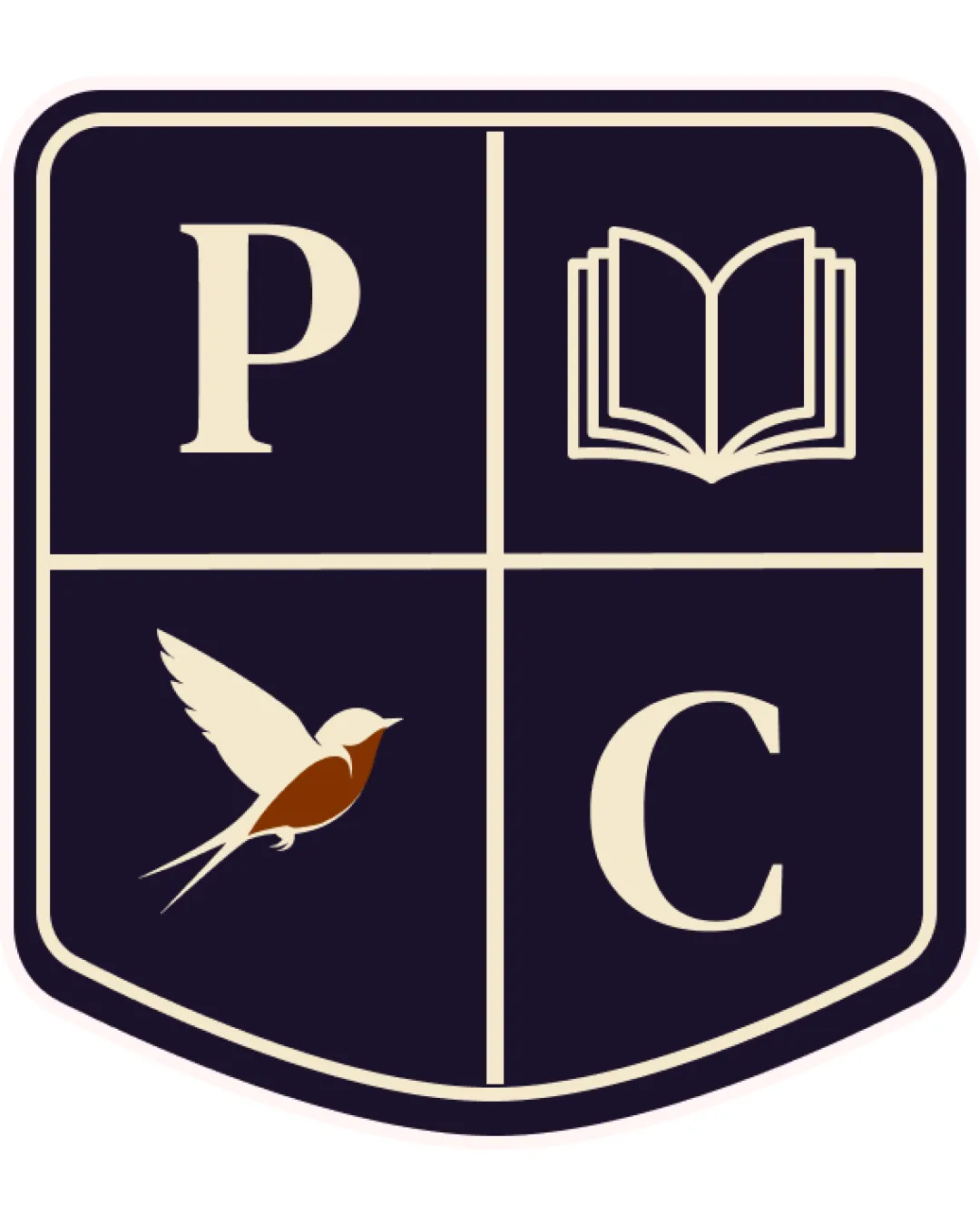
 Logo analysis by AI
Logo type:
Style:
Detected symbol:
Detected text:
Business industry:
Review requested by Joaogoncalvesds
**If AI can recognize or misinterpret it, so can people.
Structured logo review
Legibility
Letterforms 'P' and 'C' are highly readable due to their clear, serif style.
Sufficient contrast between the text and the background enhances readability.
Scalability versatility
Simplified, bold elements will reproduce well in medium-to-large sizes such as signage and banners.
Shield form is easily adaptable to school merchandise or crests.
Intricate elements such as the lined book and the detailed bird may lose clarity and become indistinct at small scales, such as business cards or digital favicons.
Multiple icons within the shield would be hard to distinguish at reduced sizes.

200x250 px

100×125 px

50×62 px
Balance alignment
Symmetrical shield layout with quadrant separation provides an organized, classic arrangement.
Visual weight of icons and letters is mostly consistent.
Slight imbalance from detailed bird icon, which visually competes with simpler icons and letters; the bird occupies more space and adds unnecessary visual complexity.


Originality
Heraldic crest is appropriate for education sector and looks traditional.
Generic combination of shield, book, and bird—commonplace motifs in educational logos.
No distinctive or creative twist to make the crest unique among similar institutional identities.
Logomark wordmark fit
Serif letters are traditional, reasonably matching the academic theme of the book and shield.
Mismatch of stylistic detail: bird is more intricate compared to the minimal line-work of the book and simplicity of the letterforms, creating stylistic inconsistency.
Aesthetic look
Classic and dignified aesthetic; color palette reflects seriousness and tradition.
The multi-symbol arrangement makes the design visually dense and a bit outdated compared to contemporary minimalist logos.
Decorative but lacks a modern touch or memorable uniqueness.
Dual meaning and misinterpretations
No apparent risk of inappropriate or confusing interpretations.
Color harmony
Consistent and harmonious palette of navy, cream, and a muted brown accent fits the academic theme.
Color contrast is clear and not overwhelming, maintaining dignity.
Ebony
#18152C
Almond
#EFE1C2
Russet
#984B1E


