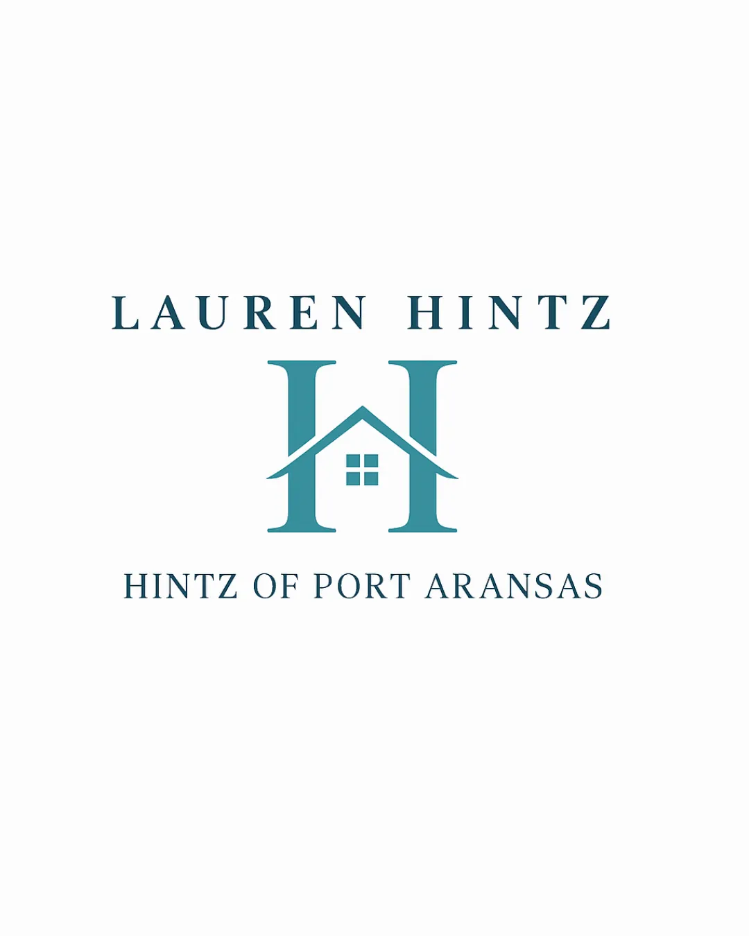
LAUREN HINTZ, HINTZ OF PORT ARANSAS logo review
4.3/5
Logo score
Logo review of

Lauren Hintz, Hintz Of Port Aransas

Review the detailed scores below to see what is working and what should be refined first.

Combination Mark Classic, Clean, Real Estate Thematic Real Estate
5/5
Legibility
3/5
Originality
5/5
Misread
4/5
Balance
4/5
Scale
Detailed review

Logo performance breakdown

5/5

Legibility

  • Text is set in a clear, sharp serif font ensuring high readability at a variety of sizes
  • Good contrast between text and background
3/5

Originality

  • Integrating a house roof with the 'H' letterform is a clean, industry-relevant touch
  • House-shaped monograms are a common trope in real estate branding, so this approach feels safe rather than innovative
  • Overall design lacks any surprising or distinctly unique features beyond the immediate industry cliche
5/5

Color harmony

  • Monochromatic palette is sophisticated and easily adaptable
  • Excellent contrast delivers strong visual impact
Teal#408891
White#FFFFFF

Estimated colors. Use the original design file for exact values.

Create a full color palette using these colors

Create new palette

4/5

Balance alignment

  • Elements are well-aligned vertically and horizontally
  • Monogram is visually centered between the two lines of text
  • Visual weight of the logomark slightly overrides the wordmark, especially with the emphasis on the 'H' symbol
Uploaded logoAlignment guide overlay

Inspect spacing with the guide. Optical balance may differ from geometric centering.

4/5

Scalability

  • Simple, bold structure of the 'H' and house symbol ensures it maintains clarity at smaller sizes
  • Would reproduce well on signage, print collateral, and digital applications
  • Thin roof lines on the house may be partially lost at very small sizes (e.g., favicon, small badges)
  • Window details could blur or fill in at very small scales
Uploaded logo at 200 pixels wide
200 × 250 px
Uploaded logo at 100 pixels wide
100 × 125 px
Uploaded logo at 50 pixels wide
50 × 63 px

Compare the detail at different sizes. Labels show the full image dimensions.

5/5

Misinterpretations

  • No unintended imagery or inappropriate shapes present
4/5

Symbol & text fit

  • Serif typeface complements the formal, architectural style of the house/H symbol well
  • The size ratio between the logomark and wordmarks skews slightly heavy toward the symbol; could be balanced further for better cohesion

Black & white

Does the shape still work without color?

These tests are available only for logos uploaded in vector (SVG) format.

Background contrast

Find the surfaces where your logo stays clear.

These tests are available only for logos uploaded in vector (SVG) format.

Blur & silhouette

A 3px blur softens fine details so you can check whether the overall shape stays recognizable. If key gaps close or elements merge, the logo may rely too heavily on detail.

These tests are available only for logos uploaded in vector (SVG) format.

Try your own review

Wondering how your logo performs?

Get a clear logo score, key risks, and priority fix ideas before your client or audience sees it.

Review my logo