PADELIUM, play the difference logo review
4.3 / 5
Logo score
Logo review of

Padelium, Play The Difference

Review the detailed scores below to see what is working and what should be refined first.

Objective AI feedback. Your creative decision.

Combination Mark Modern, Geometric, Minimalist Sports
4/5
Legibility
4/5
Originality
5/5
Misread
4/5
Balance
3/5
Scale
Detailed review

Logo performance breakdown

4/5

Legibility

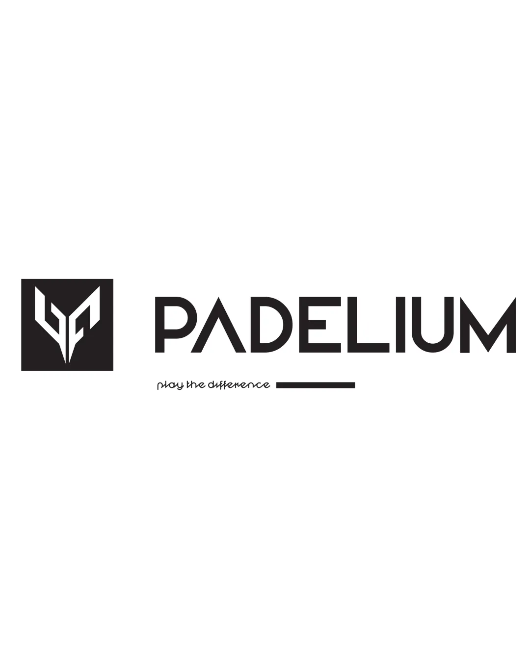
Checkmark icon Primary wordmark 'PADELIUM' is highly readable with strong geometric characters.
Checkmark icon Contrast is high with black text on white background.

Warning icon Tagline 'play the difference' is thin, script-based, and diminutive, making it difficult to read at small sizes or from a distance.


4/5

Originality

Checkmark icon Monogram/symbol is distinctively geometric, appropriate for a modern sports brand.
Checkmark icon Negative space is used creatively to form a stylized letter or shape.

Warning icon Angular monogram style is somewhat reminiscent of other sports or tech logos—could further differentiate by emphasizing padel-specific iconography.

5/5

Color harmony

Checkmark icon Uses a simple, extremely effective black and white palette well-suited for branding and versatility.

Black
#000000

White
#FFFFFF

4/5

Balance alignment

Checkmark icon Main wordmark and symbol are visually aligned and balanced horizontally.
Checkmark icon Square symbol provides a suitable anchor to the left of the text, improving overall proportion.

Warning icon Tagline positioned under the wordmark creates a slight visual imbalance because of the varying line weights and font styles.

logo 200x250 pixels scalability test alignment grid overlay
3/5

Scalability

Checkmark icon Monogram and main wordmark scale well and remain clear at reduced sizes.
Checkmark icon Monogram could be used as a standalone icon for social media or product tags.

Warning icon Tagline and accompanying underline will lose legibility and detail at favicon or embroidery scale.
Warning icon Thin lines in the symbol's negative space could blur when printed very small or embroidered.

logo 200x250 pixels scalability test

200x250 px

logo 100x125 pixels scalability test

100×125 px

logo 50x62 pixels scalability test

50×62 px

5/5

Misinterpretations

Checkmark icon No inappropriate, confusing or problematic forms detected in the overall composition.

5 / 5

Symbol & text fit

Checkmark icon Both the logomark and wordmark use sharp angles and geometric forms, creating strong visual cohesion.
Checkmark icon Weight and sizing between the mark and type feel harmonious.

Try your own review

Wondering how your logo performs?

Get a clear logo score, key risks, and priority fix ideas before your client or audience sees it.

Review my logo