phirkini clothing logo logo review

phirkini clothing logo

Essential logo review

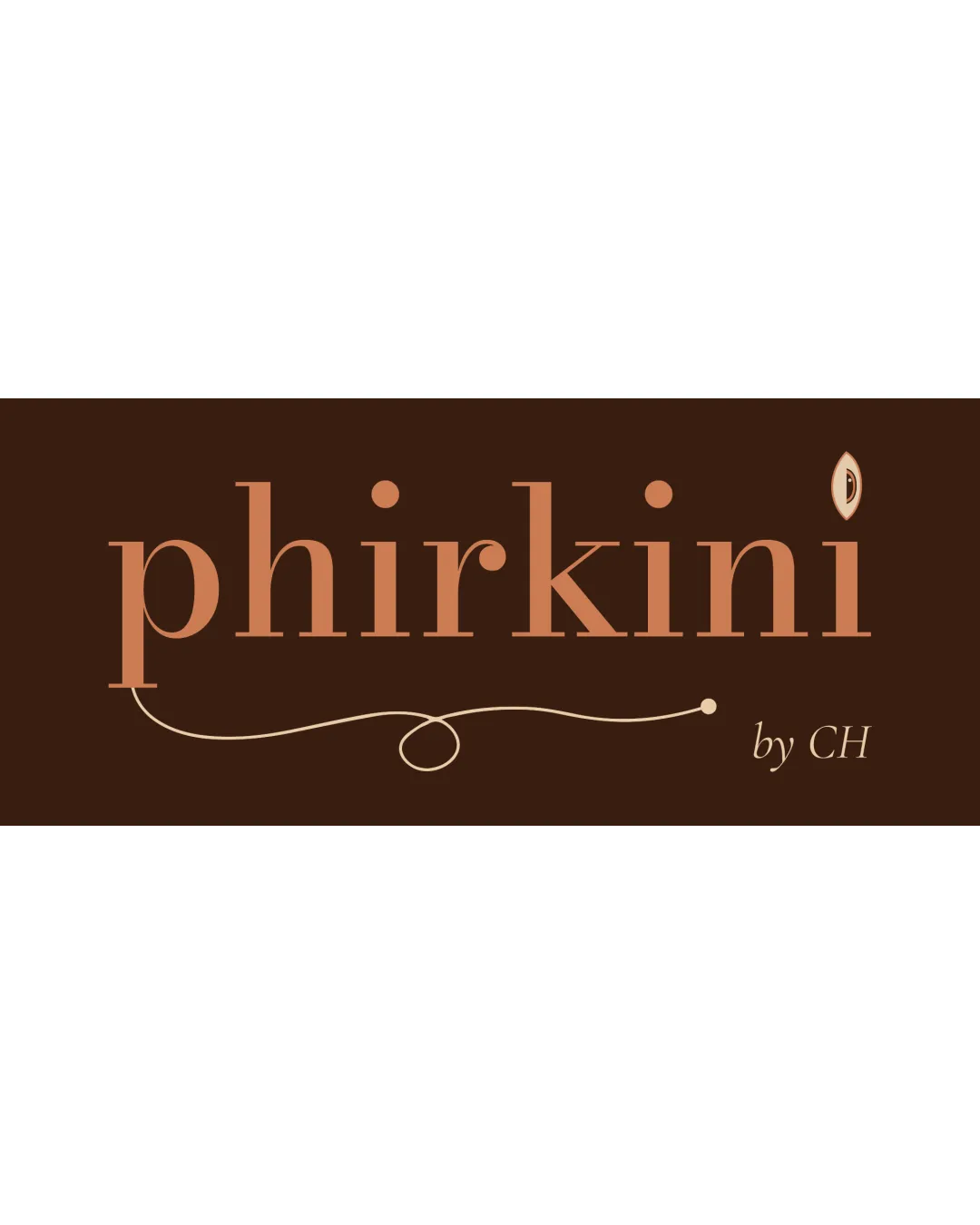
The logo has elegant typography and overall appeal for a women’s clothing brand, but the proprietary accent mark may cause unintended interpretations, holding back professional launch until addressed.

This logo lockup needs revision to address a serious risk of misinterpretation.

Wordmark Serif, Elegant, Minimal Fashion/apparel
4/5
Legibility
3.6/5
Originality
3/5
Balance
3/5
Scale
4/5
Color
3/5
Style consistency
Your next steps

What to fix first

Focus on the changes that matter. Keep what makes the logo work.

1

Standalone mark last 'i'

Reevaluate the dot replacement for broader cultural sensitivity, considering alternate feminine motifs.

High priority Visible issue Medium effort

The stylized shape above the last 'i' resembles an eye or, potentially, a yonic symbol, which could be unintentionally interpreted as suggestive or intimate by some viewers.

How to check

Gather feedback from varied audiences to confirm if the mark evokes unwanted associations.

See the category review
Detailed review

Logo performance breakdown

3/5

Brief & logo match

Elegance and feminine flourish suit the fashion goal, but the symbol’s possible misinterpretation challenges its fit for the diverse, young audience described.

4/5

Legibility

Wordmark 4/5 · Layout 4/5

  • Main wordmark is clear and readable.
4/5

Color harmony

Symbol 4/5 · Wordmark 4/5

  • Warm palette is appealing and evokes both sophistication and approachability.
peach/copper#C29373
dark brown#442212

Estimated colors. Use the original design file for exact values.

Create a full color palette using these colors

Create new palette
3.6/5

Originality

Symbol 4/5 · Wordmark 3/5

  • Curved accent and unique mark add distinctive flair to a classic serif logo.
3/5

Balance alignment

Symbol 3/5 · Wordmark 3/5 · Layout 3/5

  • The flourish beneath 'phirkini' is visually elegant but its left side and lower curve are more prominent, making the base slightly unbalanced at medium sizes.

    Optional refinement flourish under 'phirkini'
Uploaded logoAlignment guide overlay

Inspect spacing with the guide. Optical balance may differ from geometric centering.

3/5

Scalability

Symbol 3/5 · Wordmark 3/5 · Layout 3/5

Available in Advanced logo reviews
3/5

Style consistency

Available in Advanced logo reviews
2/5

Misinterpretations

  • The stylized shape above the last 'i' resembles an eye or, potentially, a yonic symbol, which could be unintentionally interpreted as suggestive or intimate by some viewers.

    Visible issue Standalone mark last 'i'

    Try: Reevaluate the dot replacement for broader cultural sensitivity, considering alternate feminine motifs.

    Check: Gather feedback from varied audiences to confirm if the mark evokes unwanted associations.

Try your own review

Wondering how your logo performs?

Get a clear logo score, key risks, and priority fix ideas before your client or audience sees it.

Review my logo