 View review
Logo score
Logo review of
Pixel
Review the detailed scores below to see what is working and what should be refined first.
Objective AI feedback. Your creative decision.
Legibility
Originality
Misread
Balance
Scale
Detailed review
Logo performance breakdown
Legibility
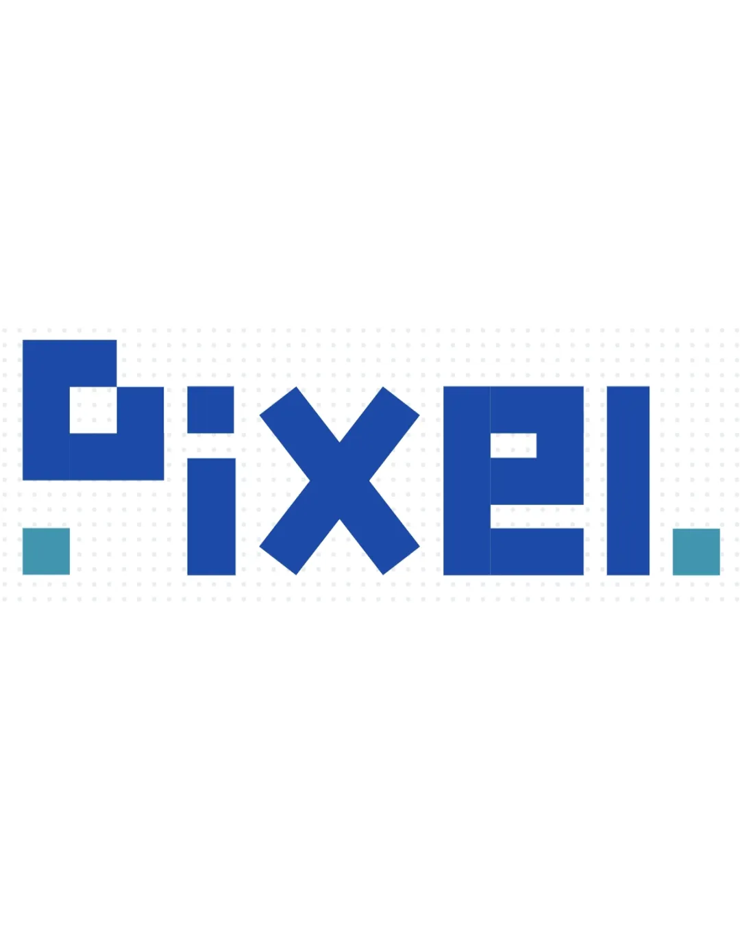
 The unique pixelated geometric type is bold and catches attention. High contrast between text and background aids readability.
 The extreme geometric abstraction makes some letters (notably 'P', 'E', and 'L') less immediately recognizable. The stylized period at the start may confuse the viewer, as it could be mistaken for a part of the word.
Originality
Pixel-inspired letters create a unique and industry-relevant look. Grid structure is an appropriate modern reference for tech/digital industries.
Pixel/block style is relatively common for tech themes—while executed well, it's still somewhat expected.
Color harmony
Restricted palette of blue tones is harmonious and modern. Contrast is strong against white, and the color choice fits a tech/digital context.
Cobalt Blue
#2356B5
Sky Blue
#57B6C6
White
#FFFFFF
Balance alignment
Logo has strong visual weight symmetry due to consistent geometry and spacing. Dots at both ends provide horizontal balance.

Scalability
Bold, blocky shapes scale well for large applications such as billboards and digital banners. Simple forms remain identifiable at small sizes.
Small details in the geometric abstraction (such as the smaller rectangles) could blur or become indistinct in embroidery or at favicon size. Fine differentiation between 'E' and 'L' may be lost at tiny scales.
200x250 px
100×125 px
50×62 px
Misinterpretations
No inappropriate shapes or misleading connotations. The pixel motif is clear.
Try your own review
Review my logo
Wondering how your logo performs?
Get a clear logo score, key risks, and priority fix ideas before your client or audience sees it.
Keep exploring


