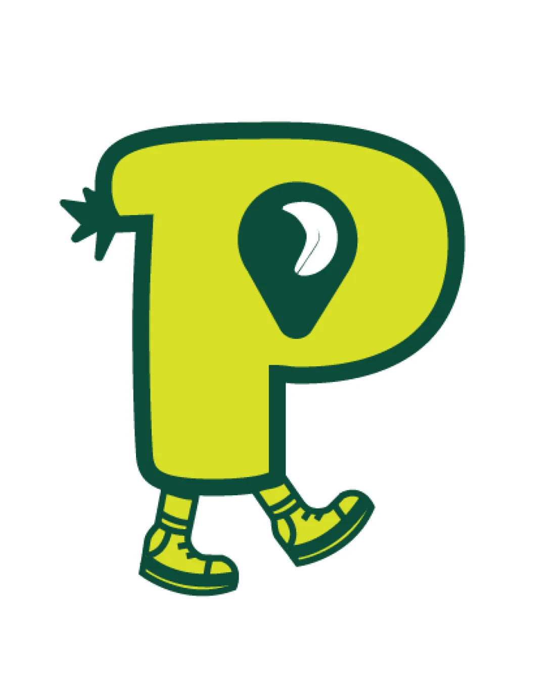
walking yellow letter 'P' mascot with a nature/map.. logo review
4.3/5
Logo score
Logo review of

Walking Yellow Letter 'p' Mascot With A Nature/map..

Distinctive, fun, and well-targeted mascot lettermark, well suited to kids' nature games. Minor tweaks will further improve flexibility and polish.

Mascot Playful Illustrative Mascot Kids Gaming
4.5/5
Originality
5/5
Misread
4/5
Balance
4/5
Scale
Your next steps

What to fix first

Focus on the changes that matter. Keep what makes the logo work.

1

Simplify shoe and leg detailing for maximum clarity at small digital sizes.

High priority Low effort

Current small details may blur in mobile icon sizes.

Improves icon scalability and legibility.
2

Consider introducing a friendly accent color in shoes or pin.

Medium priority Low effort

A well-chosen accent can increase personality without cluttering.

Adds richness and enhances playful character.

Detailed review

Logo performance breakdown

Not scored

Brief & logo match

From the original review
  • Youthful/kids Audience

    Highly appropriate, playful mascot style appeals directly to children.

  • Mobile Game

    Simple, bold shape is strong for app icons and digital use.

  • Nature/adventure Theme

    Map-pin and leaf emphasize adventure and environmental focus.

  • Parkventures Name

    The 'P' is clear and dominant, supporting brand initial.

4.5/5

Originality

  • Playful walking letterform with map pin/leaf is distinctive and memorable.
  • Mascot as a letter is not unprecedented but the nature combination is fresh.
4.5/5

Color harmony

  • High-contrast, playful palette fits target audience and nature theme.
  • Limited color usage; supporting palette could enhance detail.
Lime Yellow#D7DF23
Dark Green#094C3A

Estimated colors. Use the original design file for exact values.

Create a full color palette using these colors

Create new palette

4/5

Balance alignment

  • Consistent thickness and visual balance maintained throughout.
  • Slightly left-heavy due to tail shape on the 'P'.
Uploaded logoAlignment guide overlay

Inspect spacing with the guide. Optical balance may differ from geometric centering.

4/5

Scalability

  • Bold outline and simple shapes support reduction.
  • Small details in legs and shoe laces may lose clarity at very small sizes.
Uploaded logo at 200 pixels wide
200 × 250 px
Uploaded logo at 100 pixels wide
100 × 125 px
Uploaded logo at 50 pixels wide
50 × 63 px

Compare the detail at different sizes. Labels show the full image dimensions.

5/5

Misinterpretations

  • No confusing or inappropriate secondary readings present.

Black & white

Does the shape still work without color?

These tests are available only for logos uploaded in vector (SVG) format.

Background contrast

Find the surfaces where your logo stays clear.

These tests are available only for logos uploaded in vector (SVG) format.

Blur & silhouette

A 3px blur softens fine details so you can check whether the overall shape stays recognizable. If key gaps close or elements merge, the logo may rely too heavily on detail.

These tests are available only for logos uploaded in vector (SVG) format.

Try your own review

Wondering how your logo performs?

Get a clear logo score, key risks, and priority fix ideas before your client or audience sees it.

Review my logo