Wondering how your logo performs? 🧐
Get professional logo reviews in seconds and catch design issues in time.
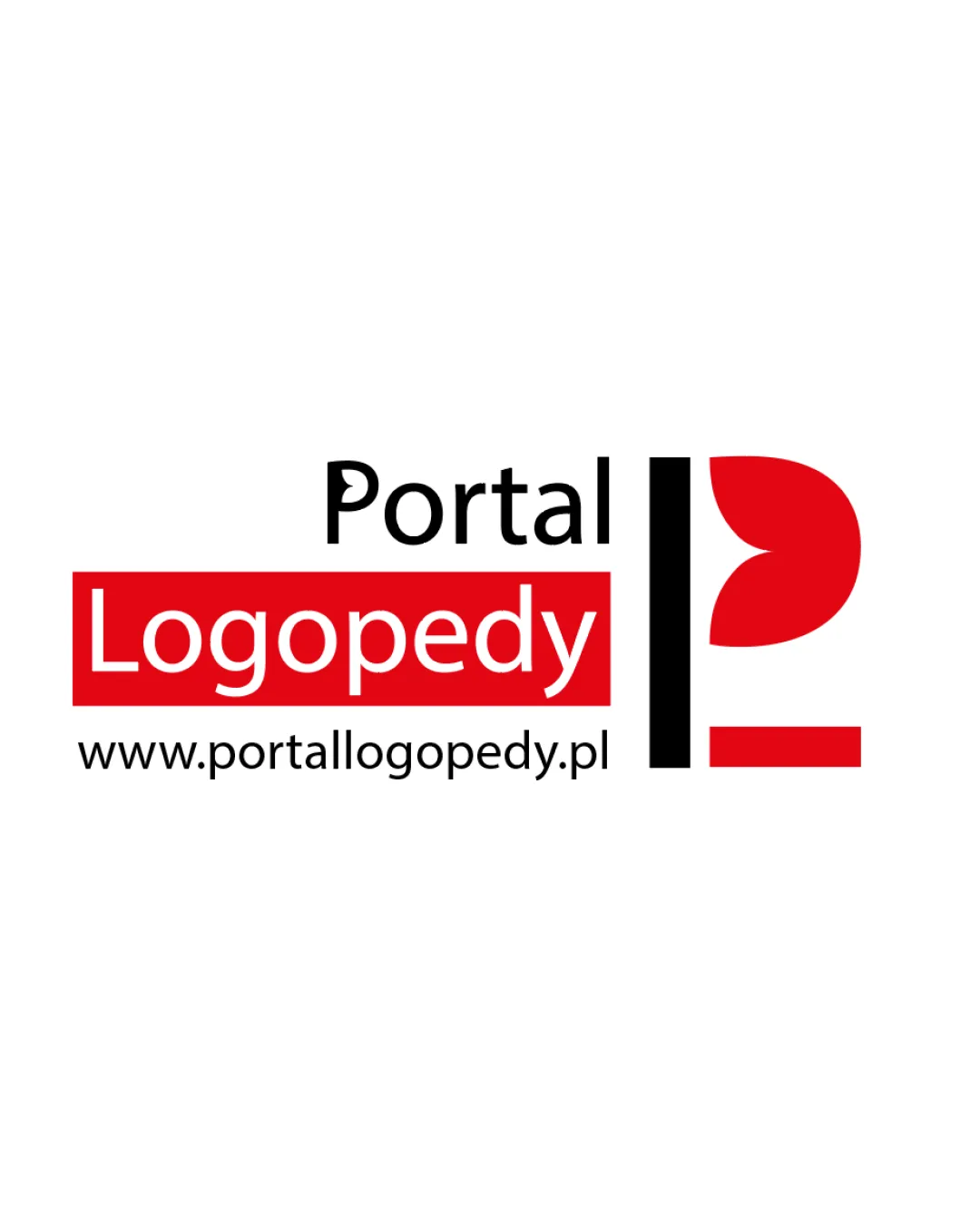
Try it Now!Logo review of Portal Logopedy www.portallogopedy.pl
 Logo analysis by AI
Recognized style:
Logo type:
Detected symbol:
Detected text:
Business industry:
Review requested by Riczi
**If AI can recognize or misinterpret it, so can people.
Structured logo review
Legibility
The text is clear and easy to read.
Scalability versatility
The design is simple and can scale well.
The symbol may lose detail if reduced too much.

200x250 px

100×125 px

50×62 px
Balance alignment
The text and symbol are well-aligned.
Slight imbalance due to the large symbol size compared to the text.


Originality
The abstract shape adds some uniqueness.
The symbol resembles common forms like 'P', reducing originality.
Aesthetic look
The colors and design are visually pleasing.
Cultural sensitivity dual meaning
No cultural sensitivity issues detected.
Color harmony
The use of red and black is bold and effective.
Could feel too aggressive for some audiences.

